
12/18/13 . . . by Bob Karrow
——————————– SECTION ONE ——————————–
WAVE COUNTS
- If you aren’t familiar with my unorthodox wave counting method, there is a simple explanation (KISS) at the beginning of the glossary. The glossary also contains ideas and details that don’t appear in the blog.
CHARTS
- Pages 1 and 2 – are of the same indexes (groups #1 through #5). These charts consist of monthly, weekly and daily charts. The monthly charts have a wave count beginning with the bear market bottom of 1974 through the present. Each set of succeeding charts consists of shorter time frames. The sets range from a 33 year view to 1.5 years.
- Page 3 – are charts of my key indicators.
- Pages 4 and 5 – are charts of 10 different market indexes. Page 4 are daily charts and page 5 are weekly charts. There are some interesting charts on these pages. Each sector chart shows the following key indicators.
- Price chart
- Cumulative line of advances minus declines
- Cumulative line of up volume minus down volume
- New highs minus new lows
- Pages 6 through 7 – are various indicators. Don’t let all these indicators confuse you. They simply are an indication of the general health of the market. Watch for a divergence between the indicators and the price index. Some indicators consist of oscillators where you watch for extreme overbought or oversold conditions.
- Page 8 – is various indexes or exchanges showing the percentage of stocks above the 50 day and 200 day moving average lines.
- The more interesting indicators have an * in the title bar.
TWEETS
- My tweets are frequent and my blog updates are infrequent.
- Tweets are very short and may contain a link to a chart that will explain my point.
BLOG PROBLEM
- I’ve noticed that sometimes a chart appears squished and unreadable. Just use the refresh button on your browser and it should be OK. If not, let me know. I have no idea what’s causing this occasional problem.
——————————– SECTION TWO ——————————–
Sentiment is usually a good indicator of showing when you are in the “area” of a market low or peak. But as I’ve said before, sentiment can go farther than anticipated even into all time extremes before a market correction takes place. That’s exactly what’s taking place presently as we keep going deeper into extremes of bullishness.
The “crowd” is always wrong at market peaks and lows and the crowd is on the extreme side of bullishness presently. At some point they will be proven wrong . . . but when will that take place?
In the chart below you can see we are going into the area of an all time low on the percentage of bears in the Investors Intelligence survey. This chart begins in the late 1980s.
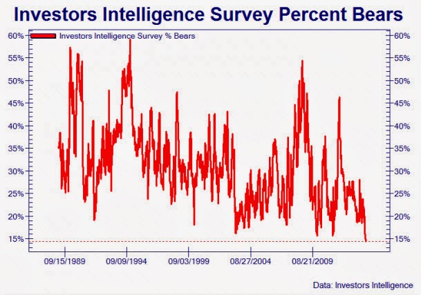
Investor Intelligence Bears
Below is a chart from Ned Davis Research that shows margin debt vs nominal GDP. It shows that as this ratio rises into the neighborhood of a new all-time high, market peaks have occurred in the past. This is an interesting chart and one that I hadn’t seen before. Ned Davis Research produces some interesting charts and it only costs about $40,000 per year for their minimum subscription. It’s for institutions only.
Margin debt is money that is loaned to margin accounts to buy stock. As optimism rises, investors are more inclined to use margin to buy stocks.
“A debit in your account that is owed to the broker. The debit is secured with stocks and bonds which regulators have authorized for use as collateral.”
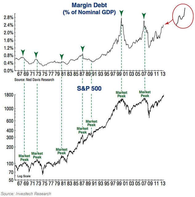
Margin Debt vs GDP
The following is from Yardeni Research, Inc. on market sentiment (PDF).
Stock Market Indicators – Bull:Bear Ratios
I need to stress again that even though we may be at all time extremes in sentiment that doesn’t mean the stock market is going to promptly turn and correct. I’ve seen sentiment extremes go on for a long period of time before a correction took place.
——————————– SECTION THREE ——————————–
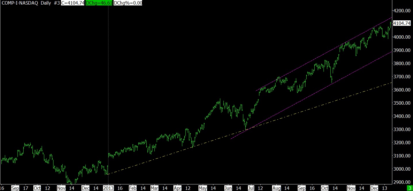
As for myself, I’m waiting for an obvious wave count or a break in the rising channels to call an end to this bull market. We’ve been in 3rd step up for a long time, but it just keeps going and going. The refusal of this market to correct is what is fueling the rising sentiment.
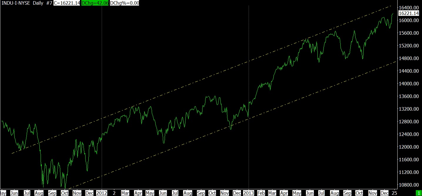
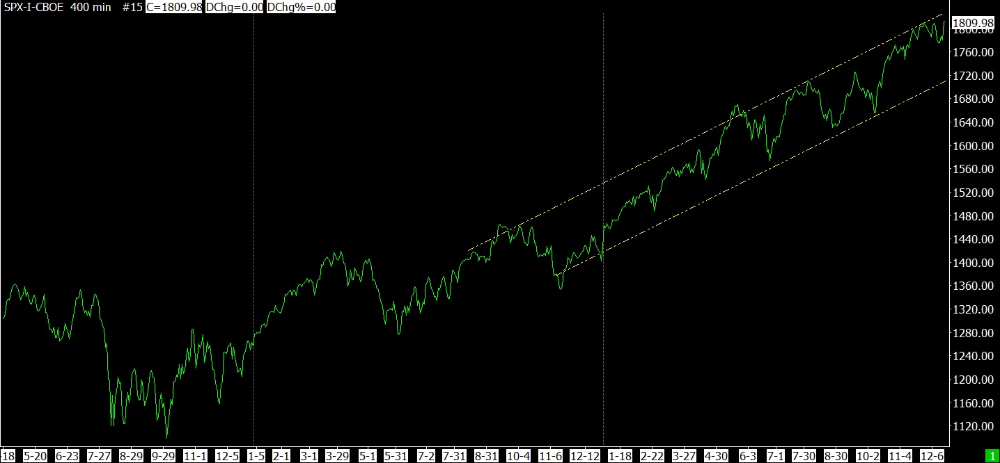
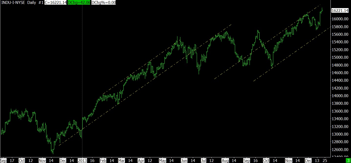
Following are some charts showing the market bumping up against the top of most of its trendlines. Some of these charts have starting points in 2009.
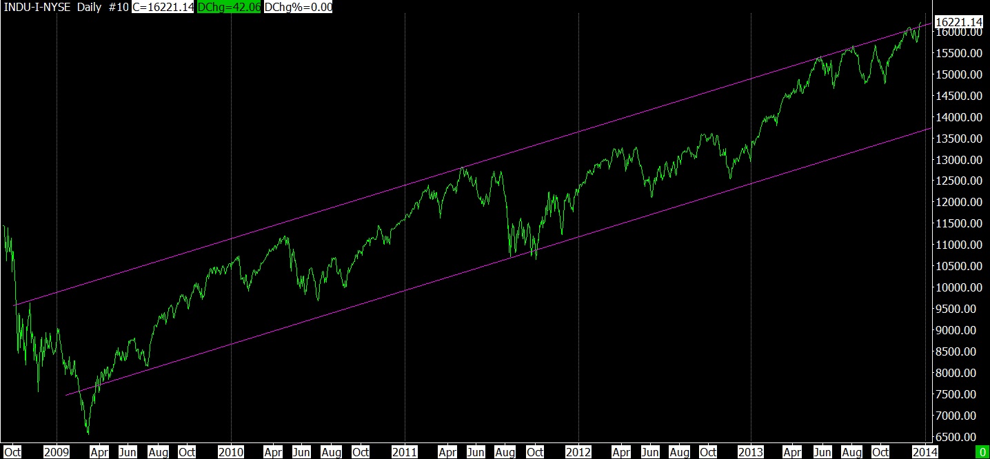
12-20-13 DJ IND DAILY SINCE 2009
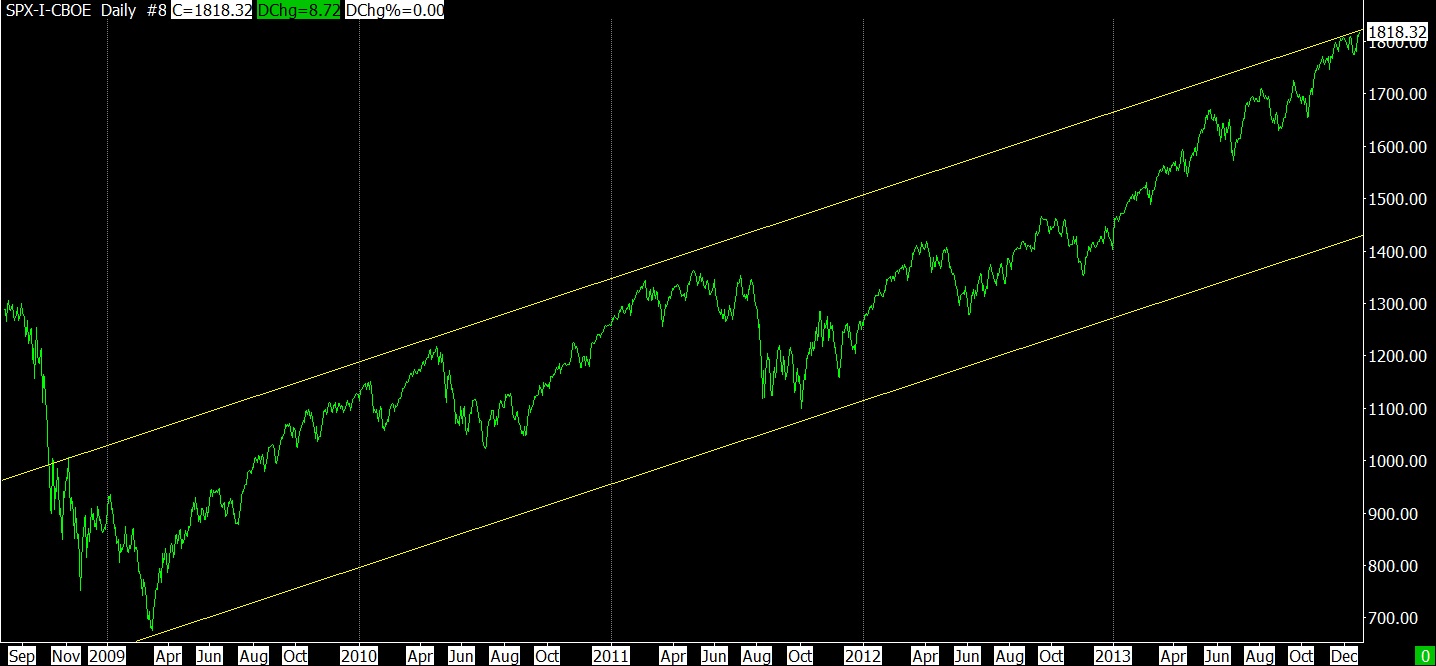
12-20-13 SPX DAILY SINCE 2009
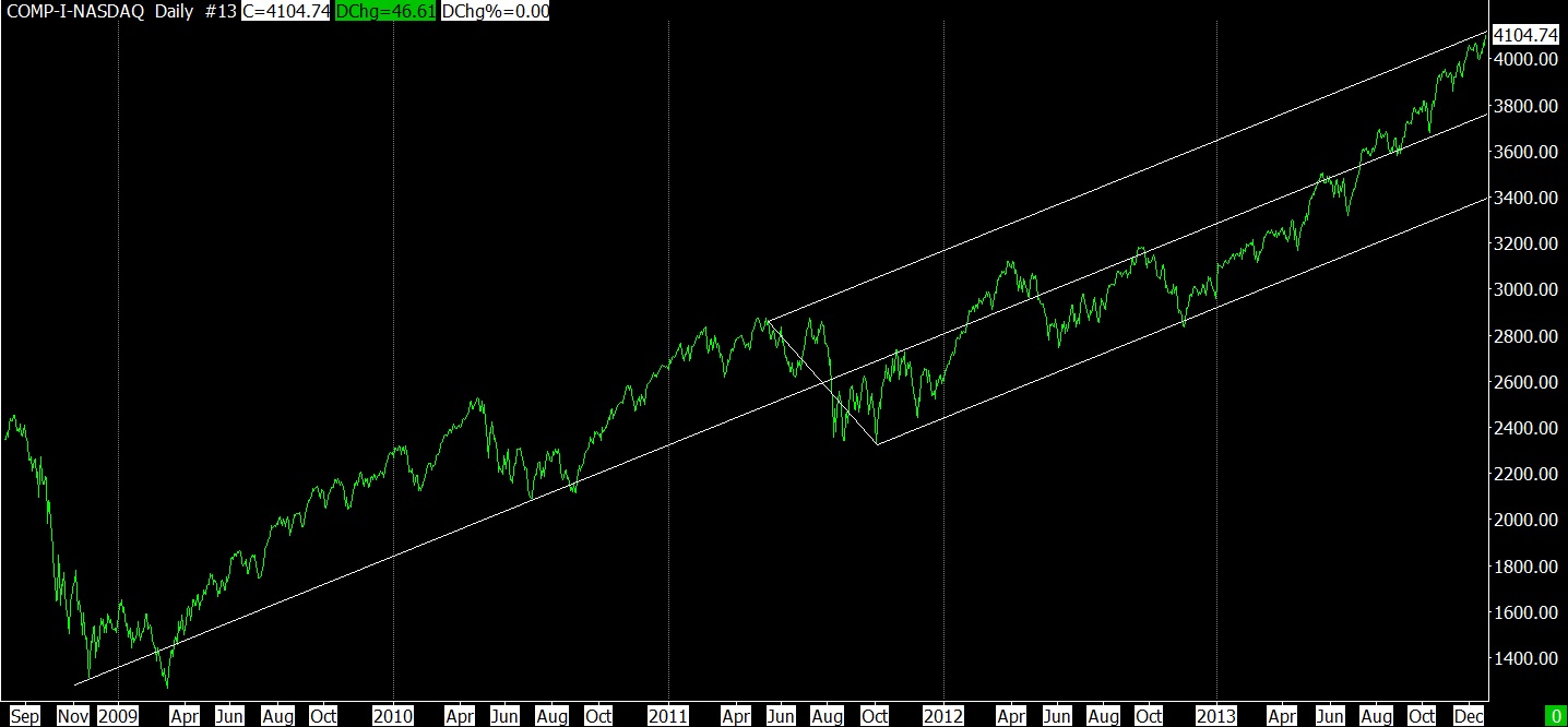
12-20-13 NASDAQ DAILY SINCE 2009 – ANDREWS PITCHFORK
12-20-13 DJ IND DAILY SINCE OCT 2011
12-20-13 SPX SINCE OCT 2011
12-20-13 DJ IND DAILY SINCE NOV 2012
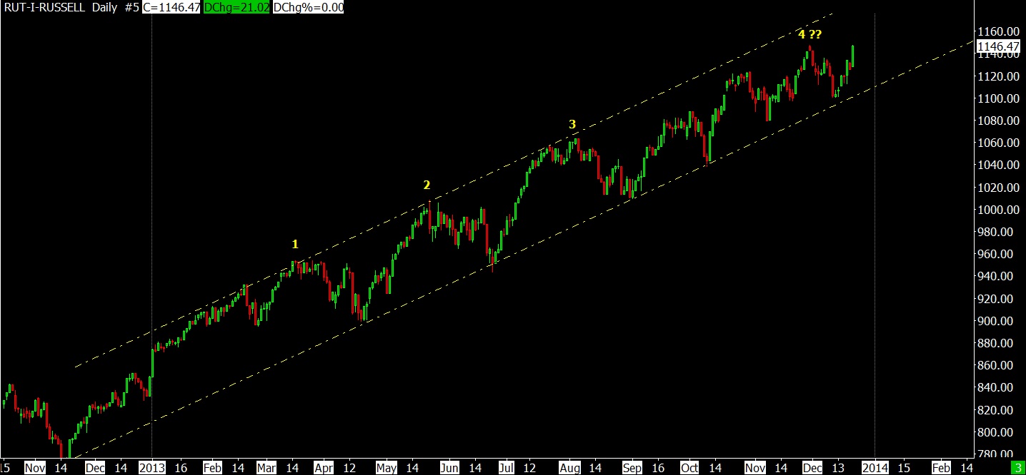
12-20-13 RUT DAILY SINCE NOV 2012
12-20-13 NASDAQ DAILY SINCE NOV 2012
——————————– SECTION FOUR ——————————–
- Click on any image to enlarge it
- ES is SP 500 futures
- YM is DJ Industrial futures
- NQ is NASDAQ Composite futures
- All Rights Reserved © ™
- Leave me a comment just a few inches below, look for:

Leave a reply
- If you only see the following:

Comments
- Click on “Be the first to comment” and magically you’ll see:
Leave a reply
- I will try to answer all questions.
