
MARKET MESSAGES
7/29/13 . . .
It will help you understand my wave counting method.
—————————————————————————————————————————————
For those that may have missed something, this is the 4th blog update in the last 6 days.
Before I get to the promised cycle stuff, here are couple of charts and comments about the current decline.
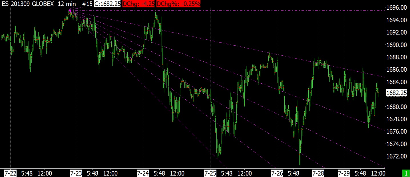
A downside fan that has shown some resistance to the lines.

7-29-13 SP FUTURES 12 MIN FIBONACCI DOWNSIDE FAN
An upside fan that has shown some resistance to the lines as the market declined.

7-29-13 SP FUTURES 14 MIN UPSIDE FIBONACCI FAN
Here is a possible wave count with upside projections. Naturally these projections are trash if all we are doing is tracing out a lateral upside move from the recent bottom.
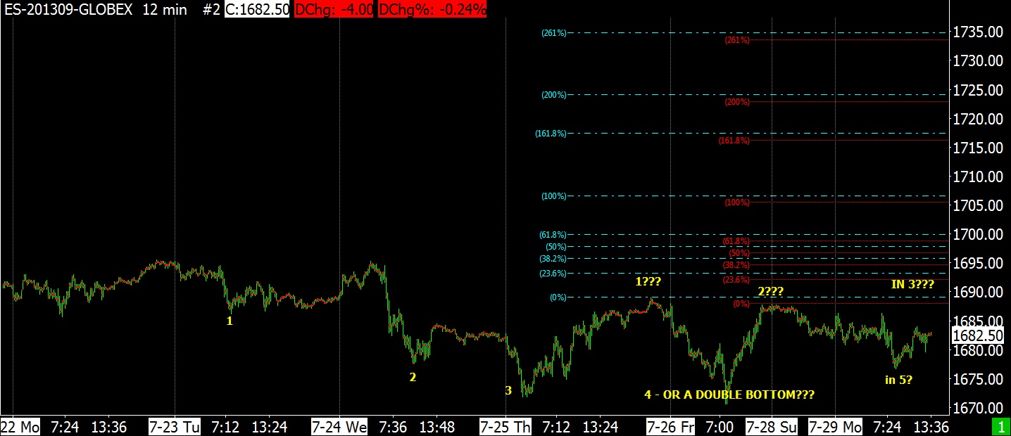
7-29-13 SP FUTURES 12 MIN PROJECTIONS & WAVE COUNTS POSSIBILITIES
A longer term upside fan, since the June 24th bottom, showing resistance at the lines.

7-29-13 SP FUTURES 85 MIN UPSIDE FIBONACCI FAN
Another downside fan with resistance to the lines.
7-30-13 SP FUTURES 12 MIN FIBONACCI DOWNSIDE FAN
The daily charts below indicate that since the June 24th low, we could have one more push to new highs in both the SPX and the Dow to complete a 3 count.
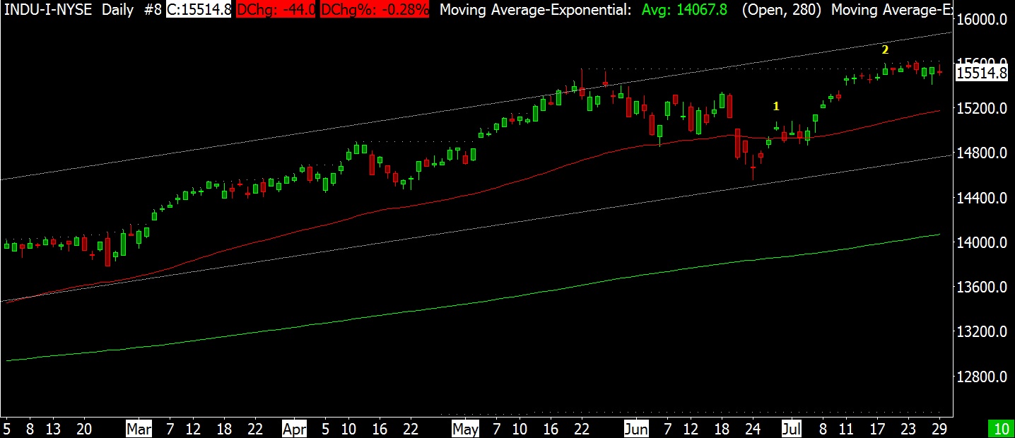
7-29-30 DJ IND DAILY

7-29-13 SPX DAILY
The next chart shows that we are in the area of the upper limits of the megaphone formation. This formation has been unfolding since the 2000 peak.
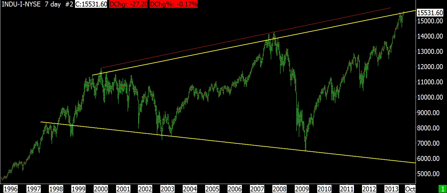
7-29-13 DJ INDUSTRIALS 7 DAY VERTICAL BAR – MEGAPHONE FORMATION
PRE-BLOG INFO
Before my blog, I emailed friends about my stock market thoughts.
The following email was dated March 5, 2009.
“We are in the late stages of the bear decline that began in Oct 2007. I am watching for any type of climactic action that will signal the end. When that happens we should have a good rally for 6-12 months. The rally could be explosive and during the rally we could start hearing some good news that will feed the rally. Something other than bad news would be nice.”
On August 2, 2010 I wrote the following email to friends:
“The below graph is the period 1961 to 1978 for the SP 500. Notice the three peaks and three bottoms on this chart. The chart looks like a horn with higher peaks and lower lows. If you lay a straight edge on the 3 bottoms, you’ll find they almost line up perfectly. The Dow Jones Industrials chart of the same period did line up exactly.
1st peak – early 1966, 1st decline – late 1966
2nd peak – late 1968, 2nd decline – mid 1970
3rd peak – early 1972, 3rd decline – late 1974
8 years from start to finish
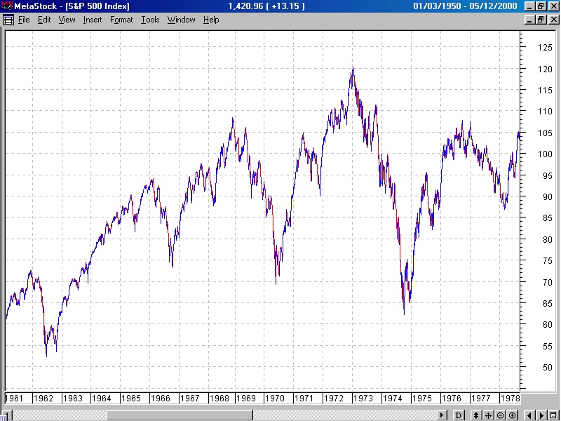
1966 to 1974 bear markets
I believe we could be in a similar situation presently with an identical chart formation.
1st peak – early 2000, 1st decline – early 2003
2nd peak – late 2007, 2nd decline – early 2009
3rd peak – anytime (now to 2 years from now), 3rd decline – 2016
16 years from start to finish”
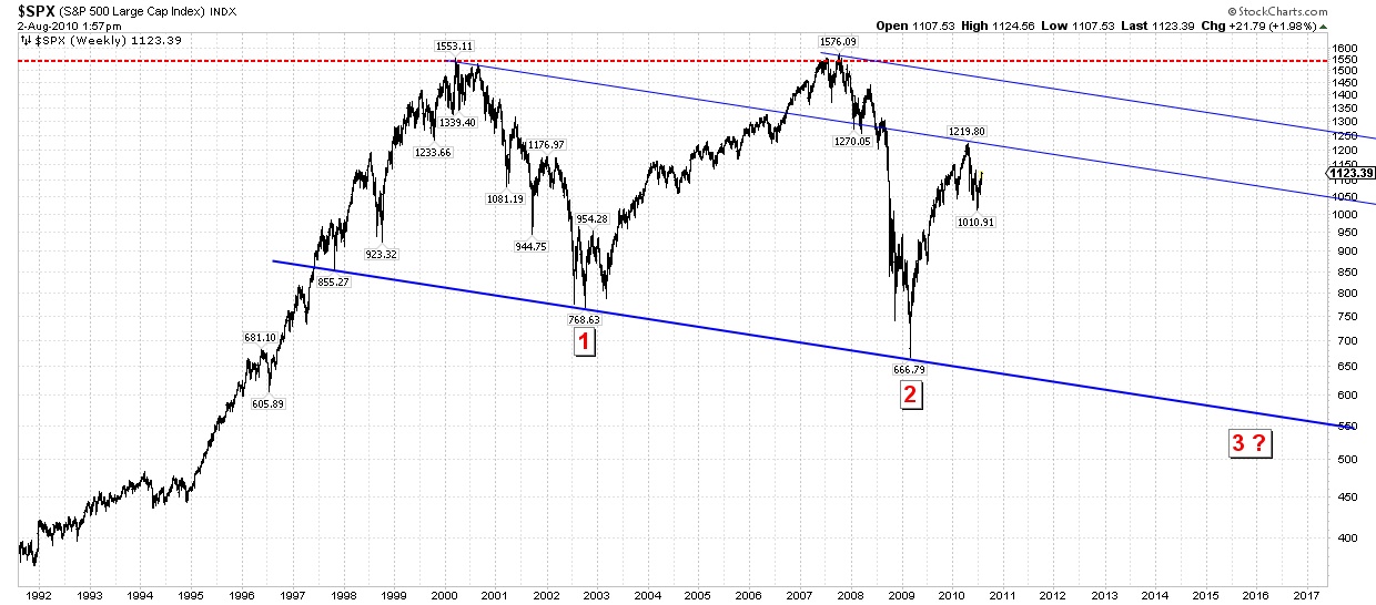
SPX Aug 2010
This supposition that we could test the upper limits of the megaphone formation if everything went right was kind of far out in 2010 with the SPX sitting at 1123. Since that time, SPX has risen to almost 1700, an increase of 51%.
MEGAPHONE FORMATION
In the above phrase, “The chart looks like a horn with higher peaks and lower lows“, I later began calling the horn a megaphone formation. Megaphone is what Magee and Edwards called this type of formation and I adopted that name after August 2010. I applied it to the present expanding formation, and also for the period 1966 to 1974.
Contrary to some beliefs, Edson Gould never called the period 1966 to 1974 a megaphone formation. I subscribed to his market letters during that period and he never used the term megaphone formation to describe this period.
This error arose from a misunderstanding from an email I wrote to a very good market analyst. I had written him about some of Edson Gould’s great market history. In the same email I called the present period as a possible megaphone formation similar to 1966 to 1974. He misunderstood that it was my use of the term, megaphone and not Goulds. And so began the fame of the Edson Gould Megaphone Formation. Funny how things can happen. I never corrected him because it wasn’t important. Sadly it matters even less today.
In my blog on 6/17/11, I wrote:
“We have entered a wide swinging market similar to that of 1966 to 1974. During that era we had three bear markets with 2 intervening rallies. Each bear market had a lower low than the prior bear. The intervening rallies saw new all time highs before the next bear market began.
Since 2000 we have had two bear markets, 2000 to 2003 and 2007 to 2009. Like 1966 to 1974, the recovery from the first bear market saw a new all time high (2007 peak). It is possible that we may experience another all time high during the present recovery period.“
Two years ago we were at 12,000 on the Dow and now we are knocking on the door of the upper limits of the megaphone formation and at all-time highs near 16,000.
JEFF SAUT
Jeff’s comments for today are summed in the following:
“The call for this week: On Friday, July 19th (D-Day) the SPX closed at 1692.09. The following Monday it closed at 1695.53 and then at 1692.39 on Tuesday. Subsequently, the SPX has not been able to recapture those highs. Anybody that follows my work knows that such D-Day “calls” have a tracking error of one to three days. Also worth remembering is that I have always thought the SPX could travel into the 1700 – 1730 level before any meaningful decline begins. Whether that happens remains to be seen, but so far the SPX has been merely “hanging on,” but I think its “hanging” remains on borrowed time. Whatever the near-term resolution, I know old traders, and I know bold traders, but I know no old and bold traders! Be cautious my friends …”
—————————————————————————————————————————————
CYCLES
Following is Chart # 70.2 from My Charts
The following is an inflexible cycle chart (unlike the Hurst cycle software) using StockChart tools, but it does appear interesting. You’ll see how it roughly matches the Hurst cycle update that follows, showing an peak soon and a bottom in late December or early January.
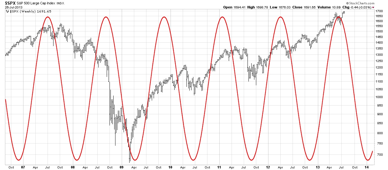
70.2 – PLAYING AROUND WITH CYCLES
Later this year (October to January) we have some important cycles bottoming. The bottom will include, the 55 month cycle, 14 month cycle, 39 week cycle, 24 week cycle, 80 day cycle, 44 day cycle, and 21 day cycle.
The last time the 55 month cycle bottomed was in March 2009. That was a biggie, but the largest cycle bottoming on that date was an 18 year cycle and that has continued to dominate this stock market. The 18 year cycle won’t peak until the next time the 55 month cycle bottoms (about 2018). After that the 18 year cycle will be on the down slope. In 2009, the 55 month cycle took a back seat to the longer cycles. But coming this October, the longest cycle bottoming will be the 55 month and it’s going to be the top dog on this occasion and exert its dominance (maybe).
BUT . . . Since the 55 month cycle crested about 2 years ago and has been falling, it has been unable to exert any downward pressure on the market until now (???). This means there is a longer term cycle that is still dominating the 55 month cycle. That’s very interesting and shows the “possibility” that the bull market isn’t going to die this year (3 cheers for that prospect). This late downward effect of the 55 month cycle low is called right side translation and is always present during a good bull market.
Note that all of the above cycles mentioned will be bottoming at the same time (Oct – Jan). This is dictated by Hurst’s Law of Synchronicity, which states that waves in price movement are phased so as to cause simultaneous troughs wherever possible. I don’t like the part about “wherever possible”. It seems to me they bottom simultaneously, it just takes some adjustment to figure it out. Sometimes it’s easy and other times, it isn’t obvious until much later.
The Principle of Proportionality states that, waves in price movement have an amplitude that is proportional to their wavelength. In other words, the longer the cycle, the wider prices will oscillate (lower or higher).
Cycles don’t have fixed time lengths. They vary over time and this can make understanding cycles a heard scratcher. The Hurst software calculates this for you automatically.
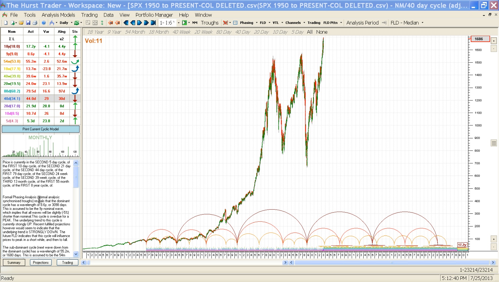
For instance, the 18.0 year cycle is actually running at 17.2 years currently.
Following is the nominal cycle length followed by its actual cycle length.
9.0 year = 8.6 years
53.8 month = 55.2 months
17.9 month = 13.7 months
39.0 week = 39.6 weeks
19.5 week = 24.0 weeks
68.2 day = 79.5 days
34.1 day = 44.0 days
HURST CYCLES
The most informative chart for the immediate future is the last chart. The others are history and long term predictions.
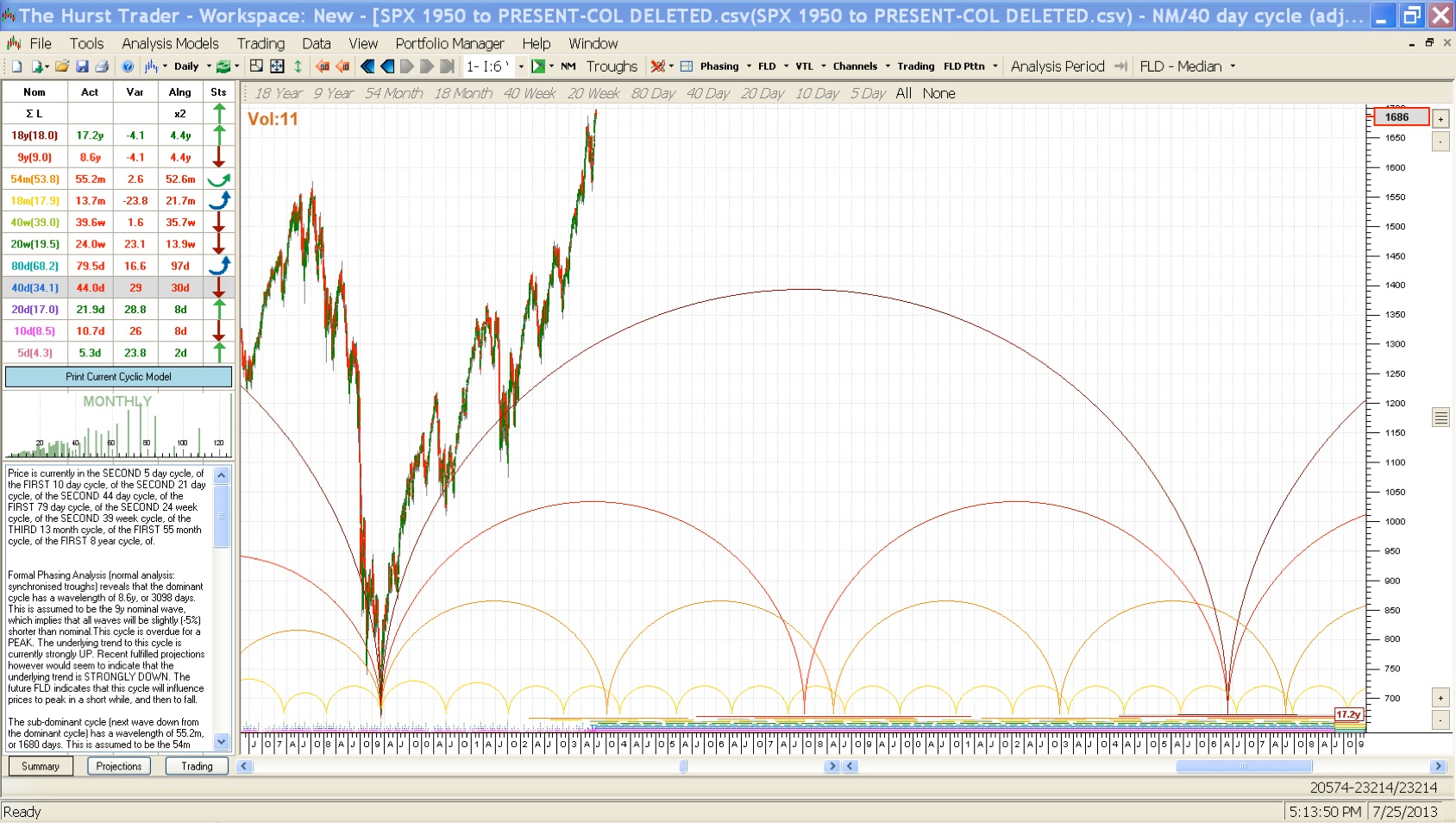
An overview of the cycles since 1950 to 2053. This is a “rough” outline of the future and past.
7-25-13 1950-2013
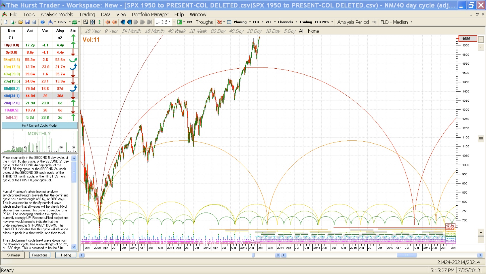
Projections for the market since 2007 to 2029. Notice the largest cycle crests in 2018. Maybe that will be an interesting observations in the years to come. We’ll see what happens.
7-25-13 2007-2029
Cycles from 2009 to 2018. Notice that there is always a bunch of cycles coming down at the same approximate time (2018). This is how Hurst’s Law of Synchronicity working. They will all be defined at one point when the cycles bottom.
7-25-13 2009-2018
The recent past beginning in 2011 and running to 2014
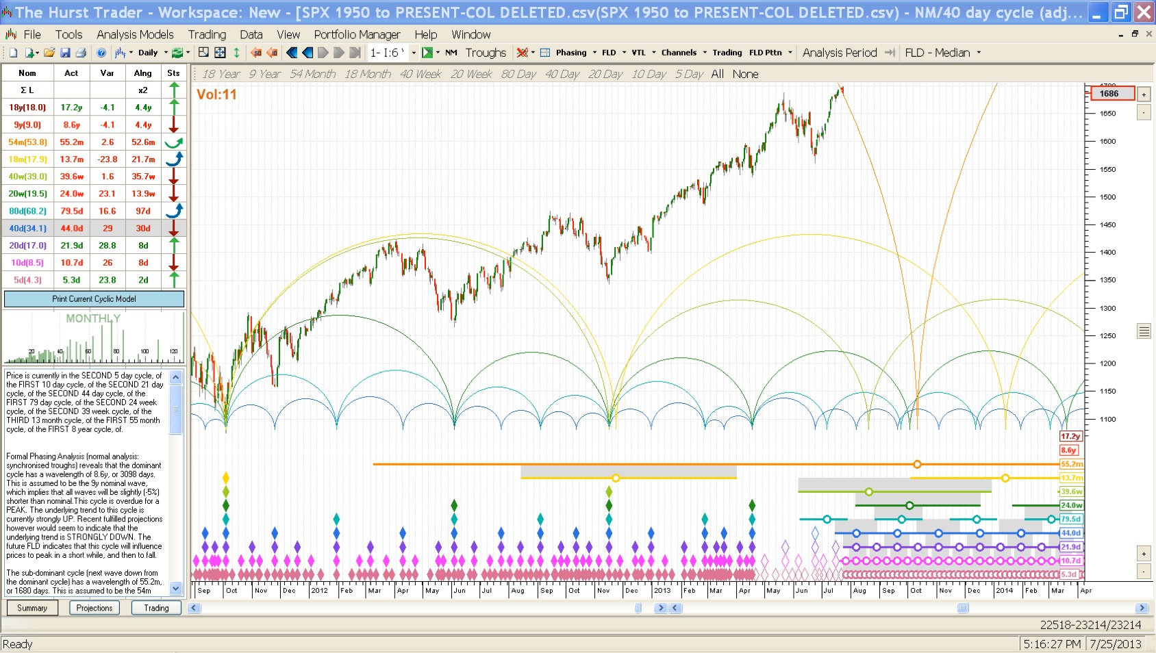
7-25-13 2011-2014
A closer view of the cycles from October 2012 to January 2014. Most of the cycles are indicating an October bottom, but the 14 month cycle is indicating January 2014. All of these cycles will line up on one date (after the bottom) and won’t be spread out as shown presently.
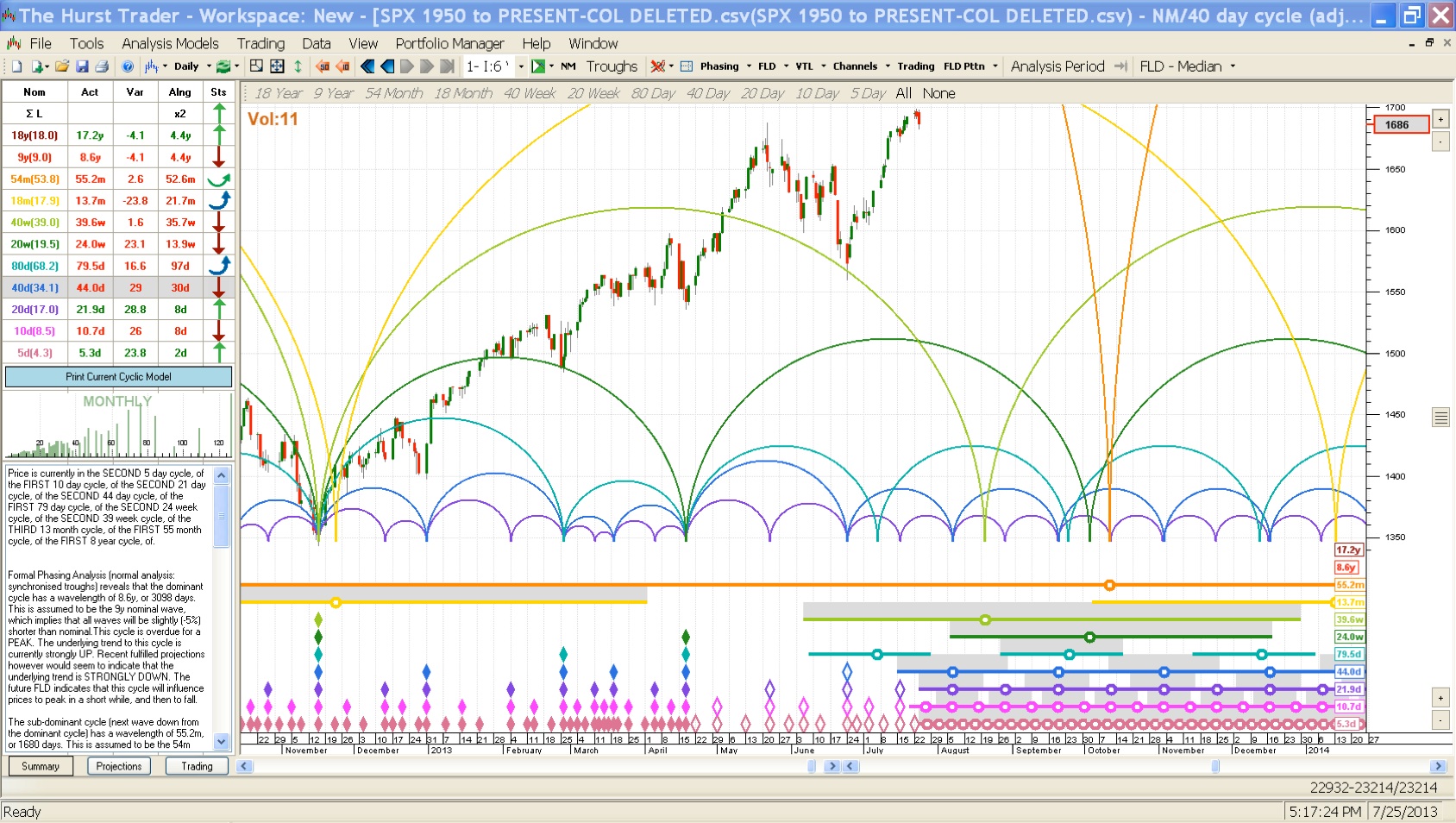
7-25-13 10-2012 TO 01-2014
This chart is the same as the one immediately above, but I turned on the 54 month projections in the software (I had mentioned there were more bells and whistles in the Hurst software and this is one of them). It’s indicating a bottom somewhere from SPX 1700 to 1370. We’ll see how all of this plays out in reality.
One nice thing about this software is that it keeps modifying its projection based on reality, meaning as we move forward towards the cycle bottom and things are not going according to the original projection, it will changes its predicted outcome. We are relatively close to the Oct-Jan time frame and there isn’t likely to be much in the way of adjustments.

7-25-13 54 MONTH PROJECTED BOTTOM
There have been past instances where the uptrend was so strong (due to a larger cycle’s influence) that a projected bottom of significance turned out to be a non-event. When this happens, the software will mark a tepid decline as the cycle bottom. In one recent occasion that this actually took place, the market took off even stronger than it had before. This seems reasonable because the cycle bottom was past and the current downward influence was over for the moment.
It’s the dominance of a larger cycle that comes into play and truncates a smaller cycle’s bottom. I’m not saying that is going to happen this time, it’s just a history lesson. In fact, I believe that we will have a significant cycle bottom in the 4th quarter. How significant will be the interesting part.
—————————————————————————————————————————————
PRINCIPLES OF HURST’S CYCLIC THEORY
The Principle of Commonality – All equity (or forex or commodity) price movements have many elements in common (in other words similar classes of tradable instruments have price movements with much in common)
The Principle of Cyclicality – Price movements consist of a combination of specific waves and therefore exhibit cyclic characteristics.
The Principle of Summation – Price waves which combine to produce the price movement do so by a process of simple addition.
The Principle of Harmonicity – The wavelengths of neighboring waves in the collection of cycles contributing to price movement are related by a small integer value.
The Principle of Synchronicity – Waves in price movement are phased so as to cause simultaneous troughs wherever possible
The Principle of Proportionality – Waves in price movement have an amplitude that is proportional to their wavelength.
The Principle of Nominality – A specific, nominal collection of harmonically related waves is common to all price movements.
The Principle of Variation – The previous four principles represent strong tendencies, from which variation is to be expected.
—————————————————————————————————————————————
HURST CYCLE SOFTWARE
(Click on the links in this section to learn more about Hurst cycles.)
You can find lots of information about Hurst’s Cyclic Principles here.
For anyone interested in charting Hurst Cycles by hand . . . it’s time consuming and a LOT of work, but when executed properly it will usually reward you with profitable transactions (if you do it right).
In order to chart by hand, you will need the “CycliTec Services Training Course”, which was reprinted by Traders Press Inc. as the “J. M. Hurst Cycles Course”. It’s a long course with approximately 1200 pages and includes audio lessons.
Charting the Hurst cycles by hand, I’ve been there, done that. I wound up not keeping the cycles up to date because of the work involved. When I fell behind, I missed some important market bottom dates. Those errors cost me money and that’s definitely not the path to success. So you must have the time to dedicate to charting the Hurst cycles. Without this time, don’t waste your money on the course. But there is an alternative to time consuming hand charting, Hurst Software.
Since I’m lazy, I love the software.
Incidentally, there is a LOT more to the Hurst cycles course and the software, than what I normally show in my blog charts. I keep things on a simplified basis by only concentrating on cycle bottoms.
Software:
The software to generate the cycles is a little bit expensive, excellent on projections, error free, and recommended. Since it ain’t cheap, you better be serious about making money in the market. But the return on your money should be worth the investment in the software.
The software is available through Sentient Trader.
There are different software packages, which are broken down into leasing or buying.
Lease Software:
EOD is “end of day”. Intraday software is really not needed and could be asking for tactical problems.
I have NOT taken the FLD workshop and can’t testify to how well it works and whether it’s worth the extra money. I do find FLD lines to be very interesting and they frequently work quite well in giving fairly accurate measurements for a projected bottom or top, plus they also provide insight to possible resistance levels. Apparently the FLD workshop provides some new insights into FLD that Hurst may have missed. Maybe they’ll offer it to me gratis and I can tell you first hand all about it. That would be nice but I’m not holding my breath.
The software automatically generates all of the bells and whistles that Hurst developed, plus a few more that the software author has added. The data file I use for analyzing the SP 500 cycles is downloaded from Yahoo Historical Quotes and saved in comma delimited format.
If you want the Cliff Notes version of the cycles, try Hurst Signals. It’s consists of a concise update of the different cycles and costs $89 per month for the Basic Bundle. This bundle includes EURUSD, S&P 500, and CRUDE OIL.
I find the Hurst cycle software to be valuable and it has become an integral part of my analysis. It helps me to accurately project times for bottoms and occasionally it can project peaks. I wouldn’t want to give it up now that I’ve been using it.
—————————————————————————————————————————————
- Click on any picture or chart to enlarge it
Leave me a comment or question just a few inches below here. If it says “Comment”, click on the comment and you’ll see “Leave A Reply”.
All Rights Reserved © ™
