February 2006 – T Theory® Update

Short Term Update February 9 2006
My next posting at this site is scheduled for Thursday February 23.
The chart below summarizes the status of the current T that projects a final rise to the right end date later this month or perhaps very early March. I have also sketched in the tentative arrival of the next T that will begin from a low after the current T’s projected peak (remember the center post of any new T must lie to the right of a completed older T ). Click on image for larger view or get PDF file below.
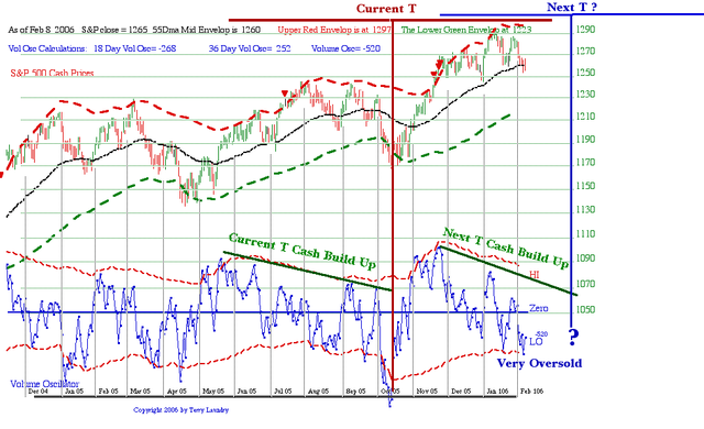
The important point is that these two Ts taken as a sequence are likely to provide the major profit phase for the rally that began from the October 2005 low and is likely to end in May or so. Beyond May 2006, at some point, the market will begin to deteriorate in stages as two Rate Ts begin a series of corrections that should culminate in a very oversold condition estimated to be in October of this year.
Early next week I will post my expectation for this corrective phase at my ttheoryfoundation.org site. This post May correction is expected to be severe like many of the so-called 4 year cycle lows, but it will provide a great buying opportunity for the final upswing to the Advance-Decline Ts projection of a March 2007 major peak for the bull market trend that started from the late 2002 early 2003 low.
The important point for most of us longer term investors is that for holdings that have been doing well, the current corrections and the future corrections as we transition into the next T, are only likely to be consolidations that cure the overbought conditions produced by the intial momentum of the current T. I think it is likely that most of the correction process was done this week so there is a fair chance that future corrections won’t do much more damage and the stage will be set in March for a new T to explode the market to the upside into what will eventually become a more serious top. I personally don’t plan to do much alteration to my positions during this transition.
However if one is inclined to do so, the channel limits in the chart below will provide some guidance. As you may remember the black 55 day Moving Average, currently at S&P 1260 is a key support level for bullish trends. Today the S&P turned up from this level after particularly nasty decline, and if it holds going forward, the outlook into late February is good. However the upper channel limit in red (currently 1297) is continuing to prove a ceiling for the market, so beware on another overbought condition in about seven days or just topping late in the month.
If the trend remains bullish it would be normal for the recent lows to hold any March correction into the center post of the new T. In my next update we can take another look. But be sure to check the foundation site next week for a different perspective on this year’s trend.
Terry Laundry
Feb 22 2006 Update
My next posting at this site is scheduled for Thursday March 7 2006.
Please read my major Rate T Study now posted at http://www.ttheoryfoundation. It provides my best estimate of the projected S&P lows for this year plus other interesting aspects of this important concept. I have also added important 1997 T Theory Introductory material that was originally published elsewhere. This will provide a nice introduction for my new projects.
Note all studies at http://www.ttheoryfoundation are listed in reverse chronological order to this site, with most recent post at the end of the list, but you can get to the lower new topics quickly by using the normal ordered links at the right under my picture. Eventually this site will consist only of multi-page studies in Adobe PDF format, so be sure you have the Acrobat Reader on your computer to open the various PDF links. You can read the studies electronically or print them out on paper as you wish. Data files will be included by March to enable independent research projects to move ahead.
In this report I take a look at the upcoming new Short Range T which should start a better recovery some time in March along with the Gold Stocks via the fund chart that follows. Both these subjects look at their respective trends from the rather basic ideas that I developed early in my T Theory discovery. I think these simple concepts get at the critical issues of potential bullish trends for the current situations.
Let’s first look at the Tocqueville Gold TGLDX plot below which is one of the better managed Gold equity funds. The fund is plotted in red vs an orange plot of the general category of Gold funds. The green plot shows the S&P 500 as the conventional equity benchmark. You can see many other fund examples at http://www.morningstar.com. As we have discussed before, T Theory sees the whole natural resource complex as ending a 1980 to 2000 20 year bear market, and then starting in 2001, entering the theory’s requirement for a matching 20 year bull market. The important point to keep in mind right now is that the current gold bull market environment of 2001 to 2020 can not be completely understood by referencing its behavior entirely in terms of gold’s trend characteristics back in the 20 bear market years of 1980 to 2000.
History shows the greatest, and often forgotten, lesson is that only bull markets provide the trend needed to make big money, and these great moves don’t work by old bear market rules. Thus many of the current analysis sees the recent sharp advance, particularly in the metal price, as a sure sign of a key technical peak because such condition have led to important peaks for so the last 25 years. But they forget that the nature of bull markets is usually quite different than this largely bear market environment. To truly view a gold bull market, one needs to go back to the mid 1960’s and watch the run up to the 1980 peak. Few have bothered to look at this “ancient” history.
So gaining the correct perspective in any new bull market is always difficult because one must first disregard the most recent bear market history. Even then, normal bull market corrections are often so sharp they initially feel like bear market trends getting underway. A solution to this general problem was made when I first discovered the big Ts in the Dow Jones Industrial average during the 1972-3 period. I was surprised to see that the big T that projected a great bull market from 1949 to 1968 could be refined by a series of shorter span Dow Jones Transport Ts. This was a key development step and such examples are shown for the period in my Introduction which has just been posted.
Turning back to the big 20 year projected Gold bull market, its forecast is really no different than the 1949 to 1968 Dow Industrials forecast of old. It simply claims that a steady stair stepping type of advance for Gold (and other natural resources) will take place in the 20 year period contained within the right side of the T. The rules for that bullish period are only that the inevitable corrections will be contained in price, and that after a usually relatively short period of time, the major advance will resume from a low that is above any prior low, and that new advance will carry to new highs.
The refinement of the very long Gold bull market that interested me most was the equivalent to the Transport Ts that I have sketched into the chart below courtesy of http://www.morningstar.com for TGLDX. I was initially drawn to this fund because its manager, John Hathaway, seemed to me to be the best at explaining the fundamentals of gold ownership from a logical, unemotional perspective. I put a good chunk of money in a long term position and it is becoming the initial funding for my charitable foundation. This fund was chosen mainly because Gold had the greatest length T making it a favorite for the very long term. As we can see, Tocqueville is outperforming the green S&P 500 trace in the chart which confirms it is the superior growth investment I wanted.
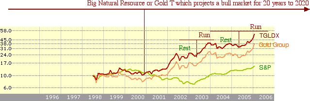
The two smaller Gold Ts that I have constructed in the chart are the equivalent to the old Transport Ts. They see the long bull market trend subdivided into smaller consolidations noted here as bull market “Rests” in green that define the left side of the Gold Fund Ts time-wise. The upside breakout that follows these “Rests” should produce a stronger bullish trend, labeled as the red “Runs” here, and it is expected each new T’s “Run” will last the same amount of time as the prior “Rest”. When viewed in this context the Gold stocks current surge, while perhaps too much too soon, is not seen as as the end of the projected Run. Surprisingly the equal time symmetry sees the latest “Run” as lasting into mid 2006 pretty much in line with the general market. So it is likely the short term correction will be brief and gold stocks will continue higher as soon as the next Short Range T gets underway in March. The end of the new Short Range T will likely be important since my Rate Ts will start pulling the S&P etc into new Fall projected lows as per the new study.
The next chart shows an old color plot of the short series of daily Ts taken from my Intro topic just posted at the foundation site. In this ideal period the S&P was able to hold all the corrections into the next T’s center post low. This was during the golden days of the 1995 period when the Short Range Ts flourished. The key point to take away from this history is that in an ideal bull trend most strong investments will hold their 55 day Moving Average during the corrections needed to set up the various short range Ts that necessarily govern all market trends. Conversely if the S&P 500 can hold its 55 day MA in the current daily chart below then we would find the best possible transition period between the ending of the old T (thin lines) and the beginning of the next T which traditionally must start from at least a low near the 55 day MA, if not lower.
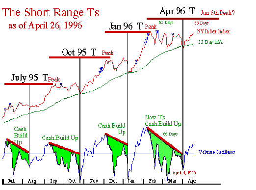
Of course we may not be so lucky to find the S&P can hold this minimum level because we are in a less than ideal environment. However it would be the first level to watch for some positive sign. It is also a level to watch for any investment that might be able to hold its own 55 day MA.
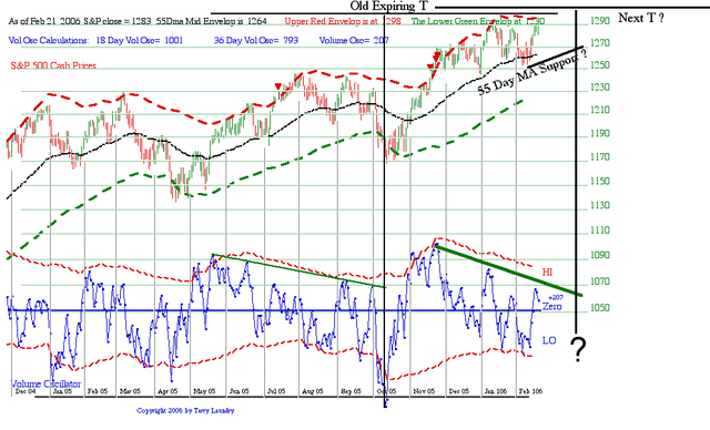
What is interesting about the current situation is that many, if not most of the time, when market weakness causes a break down below the 55 Day MA, the culprit has been a Rate T that is pulling the market down, usually to a lower 200 day MA.
As my Rate study shows, there are no Rate T projected lows near here, so we have a chance to see the 55 Day MA, currently at S&P 1264-ish, to hold corrections before the blue volume oscillator prepares to break above the green downward sloping Cash Build Up and kick off the next rally phase. Small 55 Day MA penetrations like the one earlier this month are OK.
We should soon see how the new low is shaping up as we move into March.
Terry Laundry
****************************************************************************************
All Rights Reserved By The T Theory® Foundation ©
Order the T Theory® Encyclopedia
For a complete understanding of the T Theory® and how to successfully use Terry’s unique methods, order the Encyclopedia from Paula at the above link. There is additional material in the encyclopedia not covered here. Paula will be more than happy to answer your questions too.
Many thanks to Paula Burke for her permission to re-post Terry’s old T Theory® explanations. The period re-blogged on these pages are some of Terry Laundry’s best work and was published here from public domain.
****************************************************************************************
I claim no credit for the material found under T Theory® on this blog. All of this material is the creation of Terry Laundry and was downloaded from Terry’s free blog site (TypePad). I have created a mirror of Terry’s original material and now there is a second site containing Terry’s T Theory®. One or both of these websites hopefully will survive through time as Terry’s material is too important to be lost to the ravages of time. This site is simply a memorial to his lifetime work.
The page content re-blogged here is exactly as Terry created on his original webpages (saved on my computer with ScrapBook)). Nothing has been left out from the period Dec 2003 to June 2011. From Terry’s site, I made a lot of formatting changes, creating a more easily readable webpage appearance. The PDF chart duplicates of the JPEGs have been omitted for ease and speed of recreating Terry’s pages. References to PDF charts should be ignored (but no chart was left out).
After June 2011, Terry created a paid subscription website. None of that material is found here.
There were many many, many hours spent on this project; downloading Terry’s individual charts & audio files, followed by the uploading of Terry’s charts and audio to my WordPress blog library, after which I had to insert the uploaded material into my new T Theory® webpages (hopefully in the correct places). This was a dull and arduous project and I hope you enjoy it. I don’t believe there remains any more of Terry’s material in free domain, so my T Theory® project is probably finished. If I’ve missed something, you can leave me a comment.
If you find an uploaded reference error (chart or audio in the wrong place), please note the month and year of the webpage, plus the exact name of the referenced error file. Include any other info that will help me locate the problem file and where it occurs on the webpage. Leave a comment for me with the info and I’ll fix it.
Terry’s material is very long and will take many weeks for you to finish. Don’t hurry, it’s not a marathon and you will absorb more if you go through it at a reasonable rate. This is especially true for those who don’t invest in the T Theory® reference encyclopedia. The encyclopedia is a written reference for T Theory® and includes everything of importance for Terry’s T Theory®. Without the reference encyclopedia you must depend on your memory and Terry’s method carries some rules that you could easily violate. The encyclopedia also includes new information never seen on his website.
You are welcome to save any or all of my blog material to your computer. You also have my permission to re-blog my information, but you must (1) credit me and my blog in an obvious manner and (2) don’t change my material.
FYI – I find the best way to save a webpage is using “ScrapBook” (it’s an add-on for the FireFox browser). ScrapBook saves a webpage to your computer EXACTLY as it appears on the day you saved it. You can’t tell the difference between the internet webpage and your ScrapBook saved webpage. The saved pages are not pictures. Instead the pages consist of HTML and page functionality remains identical on your computer. There is also a second method for using ScrapBook, where you can save all of the webpages down to a defined link depth. This optional method means all links will function on your computer to the link depth specified (meaning you can click on links on your saved webpages and tunnel down into pages within pages). Saving the normal way will only save the top webpage but the links that exist could continue to function by taking you to the website on the internet instead of on your computer. But sometimes the linked website doesn’t exist anymore. I’ve had this happen on some very good webpages with unique information (they just disappear into the internet void). That’s a bummer when you lost some really good info and thus rose my need for ScrapBook. You can also filter the pages saved using the optional ScrapBook method, which can exclude all pages not coming directly from the specified website (filtering is recommended using this method otherwise you wind up with a LOT of useless stuff).
.
Explore posts in the same categories: . . . T Theory®
Leave A Reply