December 2005 – T Theory® Update

Gold Ts December 1 2005
My next T Theory Observations is scheduled for Thursday December 15 2005
Some weeks ago I expressed the opinion that Gold and Gold related stocks or funds might replace Oil as the favorite in the Natural Resource group since we are locked within a very long Mega-T bullish environment. Since then the interest in Oil and Real Estate has waned and a new surge in Gold Interest has taken its place. In this report I will show how to analyze this going forward using the daily Gold chart courtesy of StockCharts.com that follows.
This same analysis can be used to track or update my big 3 T configuration for the QQQQ index as per my last posting. In fact you can use the techniques I describe in this posting to update any T Theory interpretation including gold funds or stocks provided you recognize the inherent limitations of the technique and watch the evolving cash build up pattern in the small Ts that are defined by the RSI oscillator’s descending tops at the top of these graphs. If you are interested in a gold stock or a gold fund simply find its symbol and insert it. $GOLD is their symbol for the gold metal price. But for any Gold related investments keep to a 65-week(=325 trading days,=65*5) exponential moving average as one of the key charting options.
When analyzing whole gold complex picture it is important to understand that the big Gold T starting from the 2000 low, following a 20 year bear market from the all time high in 1980, must have a T Theory projection of a matching 20 year advance to the year 2020. The Archives contain my original Chart construction if you need to see it. But beyond that distant projection, it would be normal to see ebbs and flows within the projected 20 year up trend. The question right now is whether we might be seeing an important breakout in Gold considering it has consolidated for a couple of years, and may be ready to resume the longer term uptrend with more enthusiasm.
The best I can do in this regard is to study the short-range T constructions that periodically (around every 6 weeks) show up in this chart. These Ts provide some idea of the surges that must occur in their right side, but of course one needs to estimate the arrival of each new low that might be the center post of each new T in the series.
Referring to the daily chart below, note I have made use of the 325 day (equivalent to 65 weeks) exponential moving average as the normal definition of a bull market support zone when prices have fallen about as low as they should in a long term bullish trend. During successful tests of this support level (June and July) gold at least suggested the longer-term bull market was in tact, even if the uptrend was not particularly exciting at that time. However prices were low at that time and so might have attracted a value oriented investor.
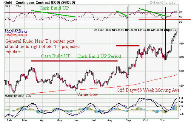
For shorter-term moves, the Ts I have constructed provide more insight. As usual the left side of each T is defined by the period of descending RSI Oscillator peaks down to a price low called the cash buildup phase. The gold price up trend that results once the RSI oscillator down trend line is broken, lasts about the same amount of time as the green cash build up, so one arrives at a new peak time estimate in Gold Prices at the T’s right end date. This time symmetrical pattern then reproduces itself with variations via the successive Ts through the history and we are left with the chart as noted here.
The bigger question that interests me the most is what might happen after the current T expires in later December and a new pullback sets up a new cash build up for a new series of Ts. This I will address in my mid December topic as it seems the current T will carry gold into the third week of December anyway.
I would also note you can also work with this chart in weekly format for a longer term perspective. Just change the period option to weeks and in the overlays use 65 for the exponential MA, then update the chart. Now note how clever the 65 week Moving Average identifies all the key support levels. So if one wanted to accumulate gold say as exchange traded GLD shares, then concentrating purchases at these lows over time should result in building a position at higher lows over a long period. This bigger perspective will also suggest other strategies that might interest you as well.
A 5% to 10% position traded by these techniques would help to diversify ones portfolio, should provide an easy trading vehicle using the GLD shares and makes a good introduction to T Theory. See PDF below.
Terry Laundry
Price T Observations December 15 2005
I have quite a bit to cover in this T Theory Observation post but I first want to take note of some internet additions made over the last two weeks in preparation for the new year. I am committed to maintaining high quality content for three websites once the new year starts so I am stretched a bit for time.
The three sites are:
This Observation site has now been placed under the name of my own domain which I have owned for many years. Basically if you bookmark my general domain http://www.ttheory.com you will end up at this T Theory Observations site. T Theory Observations exists primarily to show how T Theory can be applied to what I see as the current interesting situation in which some useful insight is possible. It will not serve to explain basic principles as that will move to my second site which features my “perpetual” charitable trust. The Observations will likely be published twice monthly on the Thursdays about one week into the new month and one week before the end of the month. I will always specify the publication date in advance. January 5 is likely to be my next Observation posting.
TTheoryFoundation.org
is a non for profit charitable organization which is being set up for educational purposes to fund scholarship aid for local students as well as funds for continuing research into T Theory. I will be working on key projects that deal exclusively with the theory basics and a more scientific analysis of the nature of the symmetry. This won’t occur right away as I still am dealing with the lawyers but projects are underway.
Presently the Foundation is not terribly active only showing a cover page, but I am working on two key projects. The most current is a complete analysis of the rate Ts so as to understand the sources of the errors on projected bottom dates and ways to correct rate Ts projections. Also I need to verify the rate T’s historical completeness for the period of 1994 to the present and anything else that looks important or interesting. This is time consuming to set up so I need some time away from the Observations. Expect twice monthly postings here.
The second task is the scanning of my old March 1973 study titled Principle of the Magic T in which I first summarized what I thought was the fundamental time symmetry which no one else had seen or suspected. It is somewhat outdated because I didn’t know much about oscillators back then. However within its 100 pages it introduces the big simple price Ts like the one for Gold/Natural Resources below. It serves to get one started from a historical perspective. Because the two original copies are deteriorating I need to move to along on the scanning to preserve it. Don’t ask about the foundations projects for a while. I need time to set up legal stuff as well as do the projects. I will make mention of its progress here when it is appropriate.
AmericanShareholders.biz
is my company site. Most of the specifics will be in a password protected area for client use only. However in thinking over the Gold T in my last posting it occurred to me that a better way to understand how investment growth ties into T theory is to go back to an old idea from a much simpler 1970’s age when some postulated that all growth situations take place within a concepts which was called at the time the “S” shaped growth curve. The idea got its name from the observation that great growth stories as viewed on very long term charts invariably began from long quiet bases that ended with a modest upside breakout that at first didn’t attract much attention, but later accelerated into a high growth trajectory that lasted for some time, at least until the fundamentals started ran out, then the growth curve flattened out and real profits faded.
It was postulated by some (Ted Warren, for example) that recognition of this pattern and its starting characteristics could lead one to eventually discover major new growth in equities if one was patient over the very long term to find suitable emerging patterns. I was receptive to this argument because in my 1973 study I could see that the biggest gains nearly always occurred in Ts that had the greatest size, in other words within the biggest T as measured by time span of the cash build up period. Also, by then I knew that the growth phase could only occur in the right side of a T. So it was logical to assume the greatest profit potential of a new developing situation would potentially come from the longest cash build up phase that was easily seen from the charts prior to the initial upside break out. Assuming this was generally true, I concluded that the best investment strategy would favor the biggest identifiable T that one could construct in the various investment possibilities.
In general I found this key rule (i.e. that the biggest T= greatest investment return) held true, so I want to emphasize this principle now so you might understand why T Theory observations needs to focus on the higher projected return Ts, not necessarily the most technically interesting situations. To start we will first consider the big Gold T which is actually the big Natural Resource T, then move on to Japan, and finally “the China T” which is an abstract concept because we don’t have China data going back 1000 years, but which is the current basis for the boom in emerging markets. Finally I will update the smallest S&P Short Range T chart to round out the picture.
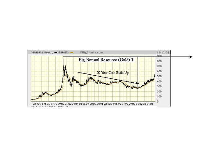
The Gold/Natural Resources T below was the first large T I was able to identify after the major year 2000 peak that effectively ended the Dow Jones and S&P Mega-Ts that had dominated the US market since the 1940’s. The cash build up lasts from 1980 to 2000, some 20 years, making it the longest T in my work to date. If one accepts the rule that long T contain the greatest growth potential, then this T points to natural resources as the major gainers until 2020, when it expires. The same T exists in the general commodities world so it applies to gold, oil, copper, water resources, land, etc, and by extension, to any hard physical assets that lie outside the domain of financial assets. A fundamental basis for gains over this long period came from the work of Dr Hubbert who in his later years at the M.I.T. Energy Laboratories where he made the fundamentally important statement that put the hard asset investment potential into perspective relative to the financial world which we are more familiar with. He essentially concluded that the nature of financial assets was that they could grow exponentially over the very long term because money, the critical factor, could be created in our modern financial system. However in the world of natural resources, growth could only proceed at a more restricted linear rate due to the scarcity of most natural resources and the ever increasing expenses in digging deeper to get more of the limited resource that nature had created. Thus Hubbert’s vision of the world was one in which the higher growth financial world would on certain occasions run into sudden shortages, not expected or understood by the financial community. This process continues today with the financial community generally clueless about the very long range value of hard natural assets.
When viewed from a T Theory perspective, the long decline in Oil prices, Gold or commodities into a 2000 low, once reversed to the upside lays out a giant upside potential that essentially defines the price potential due to developing shortages. But as with Gold the companion Oil up-trend needs to be tracked to gain short term perspective and opportunities. The chart below of the $XOI Oil Index is currently making a triangle type of consolidation which in my 1973 study was the most common way for a cash build phase to be identified.
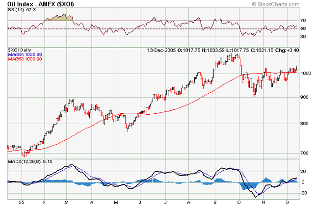
You can watch this chart in the days ahead to see if OIL is planning the breakout needed to confirm a new T near term. Generally speaking these triangles are very promising before and after the breakout. The QQQQ triangle in the Nov 3 2005 posting was attractive to me when I first introduced it because I hadn’t seen such a long triangle pattern since the days back in 1973 when they were the only way to identify the left side of potential new Ts.
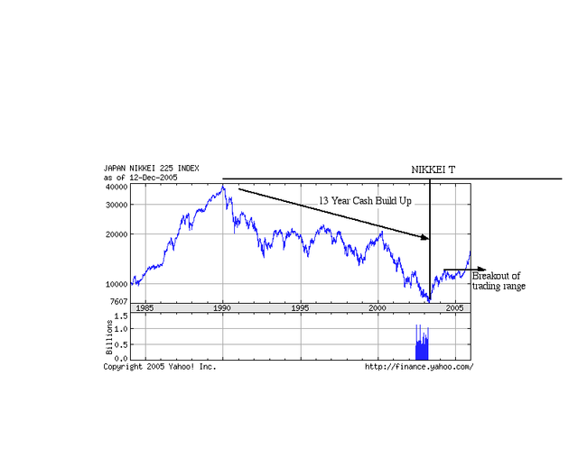
Another example of a Big T is the one constructed for the NIKKEI 225 below. Its a simple straightforward Price T with a 13 year cash build up (decline in price) which projects the normal 13 year advance for Japan investments. What is interesting is the sideways consolidation under the arrowed line at the right side of this chart. After the initial rally that kicked of the new up trend, the sideways consolidation could have been interpreted as a top, rather than a resting consolidation within the right side of an ongoing T. My basic message for this report is that the first priority for applying basic T Theory isn’t to study the short term picture. Rather it is to search out the biggest time spanning cash build up that is likely to be the source for a very long term and very fundamentally important time matching advance in price and then find a sideways consolidation which likely represents a temporary rest phase. The break out of the resting phase represents the most favorable entry point since the bigger more powerful T should then start the catch up process.
The more interesting question to me is whether my general sense that the longer T always has the greater capital appreciation potential or not. I am sure it isn’t always true, but my research has always shown that very long Ts (13 years to 18 years, termed Mega-Ts), have always held the key to superior performance. So I am biased towards finding very long Ts. Potentially the longest T has to be the China T, with a Russia T not as long, but both much longer in time than the Natural Resource T. So if the “bigger is better” argument is actually true in T Theory, then the China T concept has to be the main provider of long term investment profits and the main source of long term economic growth in this century. This is especially important because no long Ts exist for the US markets. This raises to prospects that investment returns in the Asia region will become superior over the long term while US returns will fade as the US increasingly becomes a low growth, high debtor region that is increasingly shunned by all investors.
The credentials for the start of a proposed major China Ts are overwhelming. Since China abandoned communism about 20 years ago it has sustained average an annual economic growth rate of some 9%, probably making this period the strongest example of economic growth period in history. This is key in verifying that a new T did in fact occur. All large (Price) Ts exhibit extra ordinary early growth and this record growth suggests the China T must be huge in its time span. Of course the size of the T can only be gauged by its cash build up, which practically speaking, represents the decline phase from the prior bull market peak, which is currently unknown, to the center post low known to be about 20 years ago. Estimating the left end of this T requires a deeper historical review than I have time for right now. The most I know is the 12 Th. century traveler Marco Polo found ancient China to be a very advanced leader in technology the arts and culture. Clearly some time after 1300 but well before the 1980-ish low point for China, some sort of very long decline must have generated a very long T Theory Cash Build Up phase for a new China T. I will research it further but I think it is safe to assume the cash build up phase lasts some centuries, making it the largest T in recorded history.
You might ask what is the practical meaning of such a long T, since it is likely most of us will be dead and gone before the China T has realistically reached its full potential. This is probably true, but if one is setting up a charitable trust that needs to be funded in “perpetuity” and one believes that the bigger T would make the better investment to sustain the trusts investments activity, then the China T is the one that has to be the focal point of the trusts investment portfolio. The problem with this approach right now is that direct investment in China is not prudent due to the lack of a modern stable banking system and transparent equity markets. But China has time to develop, and over time direct investment will become safer.
A counter argument to the idea of a big China T is to play it safer with the Natural Resource T which is doing well with Oil Copper and any other resources in demand but having a limited natural supply. However a key point to T Theory is that one needs to know what the dominant T is. The dominant T is of course likely to be the longest and it is important because it is likely to be “pulling the strings” which motivate or perhaps actually drive the smaller Ts.
In this case China can be seen as a huge growing economic system that is reaching out to gather all sorts of materials to construct a modern China. It is analogous to the galactic black hole that is growing ever larger as is sucks in ever increasing amounts of matter to feed its ferocious appetite, yet may be invisible to the outsider who is not yet fallen into its influence. From the natural resource point of view, if we accept the idea that China is driving the resource boom, it obviously is a good idea to keep an eye on China’s development. If one is looking for an entry point, the $XOI looks to be the only one I have found so far but I am sure there are others. A good general starting point is to search out a sideways trading pattern that is taking the shape of a triangle, somewhat like the QQQQ plot I did in November.
However their are other, even more interesting growth opportunities around the outskirts of China. Going back to the black hole analogy, the more interesting place to observe the spectacle is just outside the point where gravity is collecting new matter. From an economic standpoint the better investments are also in the small countries ringing China that get a growth boost from this nearby huge rapidly growing economic power. Generally these will be the emerging or developing countries and there are many ways to invest. Look for the triangle sideways consolidation for an entry point.
Moving on I want to touch on the T as a projector of various stages of growth. It clear that the 20 year Natural resource T is probably identifying the time limit of China’s infrastructure growth, that is into 2020 the resource T’s projected peak. By then China will probably be finished with its major building program and Natural resources will be passe from an investment stand point. But since the China T runs much longer, a new growth phase should follow not based on its building boom. It could be a financial growth period and if so direct investment is then likely to be attractive. It will be making more comments of this subject next year as I unravel the big T picture in more detail but I think it is good to start thinking about the big Price Ts. Ts can be constructed out of web resources because it gets on moving towards the day when investment in the US is likely to prove a lower return sector for investment.
In my QQQQ analysis I pointed to 3 concentric Ts that could also identify various stages of a trend that might reach out to mid 2006. At least this is consistent with the next Rate T projection of a November 6 2006 low since a peak in the market would be expected some two months before this low date. This gives me plenty of time to refine the Rate T analysis which when complete will be published at the TTheoryFoundation.org/ site.
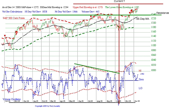
In the meantime the stage analysis can be better estimated via the Short Range T chart above. As you can see the S&P is rising in a choppy manner while the oscillator has slowly moved down to a neutral level. There are a number of important observations here that I can summarize for you as we move into the new year.
First, the important correction that provides the ideal buy point for a “dip’ has always come on a pullback to the 55 Day exponential moving average currently rising on the general upside of the bigger T’s momentum. You can get up-to-date numbers for the 55 day MA at any of charting site to monitor the correction low. I will post a short update when it occurs. The date is unknown, but probably it is in January. Second, the normal long term picture would see a pullback that holds the break out above the old tops as indicated by the green line. Thus ideally the correction should not occur until the 55 day MA gets up to or above the old tops resistance level. But in any event the 55 day MA would be the best buying juncture whenever it occurs.
The third factor is the possibility that the $XOI triangle pattern is ready to break out, thereby potentially triggering a disruptive rise in the price of Oil. If so, there are negative consequences for the general market and specific industries as well as for most Asian country that lack internal oil resources. So it would be a good idea to keep an eye on the $XOI chart for clues that might help in making any near term decisions.
My next scheduled up will come January 5th 2006 unless I see a 55 day MA test. This will give me time to write my year end reports, make program changes and wait for additional data in the early part of the new year. I will also be revising the text layout of this site before year end. Nothing changes it just looks different and might be read easier. Until then enjoy the Holidays.
Terry Laundry
****************************************************************************************
All Rights Reserved By The T Theory® Foundation ©
Order the T Theory® Encyclopedia
For a complete understanding of the T Theory® and how to successfully use Terry’s unique methods, order the Encyclopedia from Paula at the above link. There is additional material in the encyclopedia not covered here. Paula will be more than happy to answer your questions too.
Many thanks to Paula Burke for her permission to re-post Terry’s old T Theory® explanations. The period re-blogged on these pages are some of Terry Laundry’s best work and was published here from public domain.
****************************************************************************************
I claim no credit for the material found under T Theory® on this blog. All of this material is the creation of Terry Laundry and was downloaded from Terry’s free blog site (TypePad). I have created a mirror of Terry’s original material and now there is a second site containing Terry’s T Theory®. One or both of these websites hopefully will survive through time as Terry’s material is too important to be lost to the ravages of time. This site is simply a memorial to his lifetime work.
The page content re-blogged here is exactly as Terry created on his original webpages (saved on my computer with ScrapBook)). Nothing has been left out from the period Dec 2003 to June 2011. From Terry’s site, I made a lot of formatting changes, creating a more easily readable webpage appearance. The PDF chart duplicates of the JPEGs have been omitted for ease and speed of recreating Terry’s pages. References to PDF charts should be ignored (but no chart was left out).
After June 2011, Terry created a paid subscription website. None of that material is found here.
There were many many, many hours spent on this project; downloading Terry’s individual charts & audio files, followed by the uploading of Terry’s charts and audio to my WordPress blog library, after which I had to insert the uploaded material into my new T Theory® webpages (hopefully in the correct places). This was a dull and arduous project and I hope you enjoy it. I don’t believe there remains any more of Terry’s material in free domain, so my T Theory® project is probably finished. If I’ve missed something, you can leave me a comment.
If you find an uploaded reference error (chart or audio in the wrong place), please note the month and year of the webpage, plus the exact name of the referenced error file. Include any other info that will help me locate the problem file and where it occurs on the webpage. Leave a comment for me with the info and I’ll fix it.
Terry’s material is very long and will take many weeks for you to finish. Don’t hurry, it’s not a marathon and you will absorb more if you go through it at a reasonable rate. This is especially true for those who don’t invest in the T Theory® reference encyclopedia. The encyclopedia is a written reference for T Theory® and includes everything of importance for Terry’s T Theory®. Without the reference encyclopedia you must depend on your memory and Terry’s method carries some rules that you could easily violate. The encyclopedia also includes new information never seen on his website.
You are welcome to save any or all of my blog material to your computer. You also have my permission to re-blog my information, but you must (1) credit me and my blog in an obvious manner and (2) don’t change my material.
FYI – I find the best way to save a webpage is using “ScrapBook” (it’s an add-on for the FireFox browser). ScrapBook saves a webpage to your computer EXACTLY as it appears on the day you saved it. You can’t tell the difference between the internet webpage and your ScrapBook saved webpage. The saved pages are not pictures. Instead the pages consist of HTML and page functionality remains identical on your computer. There is also a second method for using ScrapBook, where you can save all of the webpages down to a defined link depth. This optional method means all links will function on your computer to the link depth specified (meaning you can click on links on your saved webpages and tunnel down into pages within pages). Saving the normal way will only save the top webpage but the links that exist could continue to function by taking you to the website on the internet instead of on your computer. But sometimes the linked website doesn’t exist anymore. I’ve had this happen on some very good webpages with unique information (they just disappear into the internet void). That’s a bummer when you lost some really good info and thus rose my need for ScrapBook. You can also filter the pages saved using the optional ScrapBook method, which can exclude all pages not coming directly from the specified website (filtering is recommended using this method otherwise you wind up with a LOT of useless stuff).
.
Explore posts in the same categories: . . . T Theory®
Leave A Reply