“My Charts” – Indicator Explanation – Page 1

09/02/14 . . . by Bob Karrow
- If you aren’t familiar with my unorthodox wave counting method, there is a simple explanation at the beginning of the glossary. The glossary also contains lots of other details (explanations) that don’t appear in the blog.
- My charts consist of various indicators and index charts (short to long term), but the theme is concentrated on the items that Paul Desmond warned about in his paper, “The Warning Signs Of Major Market Tops”, which you can find at the link below.
- Please follow MY CHARTS so I’m not relegated to the dung heap of nobody is interested in this crap. You only have to follow once. You click the blue icon seen in the upper right of each page that says “Follow”. After you’ve clicked once, the blue icon should change to “Unfollow”. Leave it so it says “Unfollow”.
- If you want to know what I’m currently thinking (rantings on occasion too)
- A lot of visitors to my blog are looking for information on T-Theory ®. The below link will take you to the index of all of Terry Laundry’s comments during the period Dec 2003 to June 2011. There is a considerable amount of charts and audio material from Terry Laundry in this section.
- If you are looking for the ability to make your own predictions using T-THEORY ®, I would highly recommend Terry’s Encyclopedia on T-THEORY ®
- Order the T Theory® Encyclopedia from Paula
EDSON GOULD
—————————————————
There will be a test later on the material in this edition of the blog and everyone not achieving 100% will be kicked out of the blog. True . . . would I lie???
If I’ve screwed up something, just send me an email through the comment section and I’ll fix it. But I don’t make mistakes, only senile old farts make mistakes . . . oh wait, that’s what I am . . . never mind. Just send an email and since I’m now 105, I’ll try to fix it (literary license).
—————————————————
MY CHARTS – can be a mystery to some, so I decided I would explain what I’m trying to show in each chart. I will keep MY descriptions short and concise. But I’ll also use the more loquacious StockCharts definition of the indicator when available.
I will depend upon feedback questions from you if I need to create a better definition of a SPECIFIC CHART. Feedback can be found on my charts in the upper right corner of each chart page where it says in blue “send feedback”.
The location of the chart is indicated by page number and chart number and they are in sequential order. Chart numbers are in numerical order beginning with a zero instead of one. The charts on each page range from 0 to 9 (10 charts per page). There are 10 pages, which begin on page 1 and not page 0 (huh . . . kinda inconsistent). I do on occasion move charts into different locations and this might cause you to look around to find its new location.
If you familiarize yourself with Paul Desmond’s paper, “The Warning Signs Of Major Market Tops”, you’ll find that I do try to illustrate his theme. I also have charts that are not part of Desmond’s warning regarding Market Tops. These charts are hopefully trying to show a relationship to future market direction, but sometimes the connection can be tenuous.
I’m always looking for a cause and effect in the charts. The indicator is the cause and I’m looking to see if it has an effect on the market. I will chart the indicators back to major market turns to see if there was an early indication of the impending turn in the market. Some indexes (or stocks) have historically shown a tendency to turn before the major indexes like SP 500 or Dow Jones Industrials. Due to space limitations of ten pages, I can’t show historical charts for all the indicators.
In all of my charts, I’m always looking for the bullish or bearish divergence. This is probably the most important concept to watch for in charts and indicators.
“One of the most important technical signals to watch for on any chart is a divergence. Simply stated, a divergence occurs when prices move in one direction (up or down) and an indicator based on those prices moves in the opposite direction.”
—————————————————
PAGE 1 CHART 0 – – PERCENTAGE ABOVE 200 DAY MOVING AVERAGE
As for all of my charts, I’m always looking for a bullish or bearish divergence.
StockCharts Definitions
“Moving averages smooth the price data to form a trend following indicator. They do not predict price direction, but rather define the current direction with a lag. Moving averages lag because they are based on past prices. Despite this lag, moving averages help smooth price action and filter out the noise. The two most popular types of moving averages are the Simple Moving Average (SMA) and the Exponential Moving Average (EMA). These moving averages can be used to identify the direction of the trend or define potential support and resistance levels.
A simple moving average is formed by computing the average price of a security over a specific number of time periods. Most moving averages are based on closing prices. A 5-day simple moving average is the five day sum of closing prices divided by five. As its name implies, a moving average is an average that moves. Old data is dropped as new data comes available.
Exponential moving averages reduce the lag by applying more weight to recent prices. The weighting applied to the most recent price depends on the number of periods in the moving average.
The longer the moving average, the more the lag. A 10-day exponential moving average will hug prices quite closely and turn shortly after prices turn. Short moving averages are like speed boats – nimble and quick to change. In contrast, a 100-day moving average contains lots of past data that slows it down. Longer moving averages are like ocean tankers – lethargic and slow to change. It takes a larger and longer price movement for a 100-day moving average to change course.”
“The percentage of stocks trading above a specific moving average is a breadth indicator that measures internal strength or weakness in the underlying index. The 50-day moving average is used for the short-medium term timeframe, while the 150-day and 200-day moving averages are used for the medium-long term timeframe. Signals can be derived from overbought/oversold levels, crosses above/below 50% and bullish/bearish divergences.”
“This indicator measures the degree of participation. Breadth is strong when the majority of stocks in an index are trading above a specific moving average. Conversely, breadth is weak when the minority of stocks are trading above a specific moving average. There are at least three ways to use these indicators. First, chartists can obtain a general bias with the overall levels. A bullish bias is present when the indicator is above 50%. This means more than half the stocks in the index are above a particular moving average. A bearish bias is present when below 50%. Second, chartists can look for overbought or oversold levels. These indicators are oscillators that fluctuate between zero and one hundred. With a defined range, chartists can look for overbought levels near the top of the range and oversold levels near the bottom of the range. Third, bullish and bearish divergences can foreshadow a trend change. A bullish divergence occurs when the underlying index moves to a new low and the indicator remains above its prior low. Relative strength in the indicator can sometimes foreshadow a bullish reversal in the index. Conversely, a bearish divergence forms when the underlying index records a higher high and the indicator remains below its prior high. This shows relative weakness in the indicator that can sometimes foreshadow a bearish reversal in the index.”
“The 50% threshold works best with the percent of stocks above their longer moving averages, such as the 150-day and 200-day. The percent of stocks above their 50-day moving average is more volatile and crosses the 50% threshold more often. This volatility makes it more prone to whipsaws.”
“The percent of stocks above their 50-day SMA is best suited for overbought and oversold levels. Because of its volatility, this indicator will move to overbought and oversold levels more often than the indicators based on longer moving averages (150-day and 200-day). Just like momentum oscillators, this indicator can become overbought numerous times in a strong uptrend or oversold many times during a strong downtrend. Therefore, it is important to identify the direction of the bigger trend to establish a bias and trade in harmony with the big trend. Short-term oversold conditions are preferred when the long-term trend is up and short-term overbought conditions are preferred when the long-term trend is down. Basic trend analysis can be used to determine the trend of the underlying index.”
“Bullish and bearish divergences can produce great signals, but they are also prone to many false signals. The key, as always, is to separate robust signals from ineffective signals. Small divergences can be suspect. These typically form over a relatively short time period with little difference between the peaks or troughs. Small bearish divergences in a strong uptrend are unlikely to foreshadow significant weakness. This is especially true when the divergent peaks exceed 70%. Think about it. Breadth still favors the bulls if more than 70% of stocks are trading above a designated moving average. Similarly, small bullish divergences in strong downtrends are unlikely to foreshadow a major bullish reversal. This is especially true when the divergent troughs form below 30%. Breadth still favors the bears when less than 30% of stocks are trading above a specified moving average. Larger divergences have a greater chance of success. Larger refers to the elapsed time and the difference between the two peaks or troughs. A sharp divergence covering two months or longer is more likely to work than a shallow divergence covering 1-2 weeks.”
“The percentage of stocks above a specific moving average is a breadth indicator that measures the degree of participation. Participation would be deemed relatively weak if the S&P 500 moved above its 50-day moving average and only 40% of stocks were above their 50-day moving average. Conversely, participation would be deemed strong if the S&P 500 moved above its 50-day moving average and 60% or more of its components were also above their 50-day moving average. In addition to absolute levels, chartists can analyze the directional movement of the indicator. Breadth is weakening when the indicator falls and strengthening when the indicator rises. A rising market and falling indicator would raise suspicions on underlying weakness. Similarly, a falling market and rising indicator would suggest underlying strength that could foreshadow a bullish reversal. As with all indicators, it is important to confirm or refute findings with other indicators and analysis.”
Analysis – What I’m Looking For
When you see indexes moving to new highs and the percentage of stocks above their 200 day average is declining (bearish divergence), this shows that fewer stocks are participating in making new highs. This is bearish behavior. The opposite of this concept is also true, index rally highs with a rising percentage of stocks over their 200 day moving average shows expanding participation. This is bullish behavior.
Gotta remember that smaller capitalization indexes are more sensitive to future market moves. Why? Since these stocks are more thinly traded (poor liquidity) than larger capitalization stocks, investors move in or out of these stocks earlier than the large capitalization stocks. Consequently, the large capitalization indexes will often be the last participants in a bull market, while other indexes have been trending downward for awhile. Therefore, the micro-capitalization indexes will have turned down long ago, while the large cap indexes kept forging ahead.
How can an index move to new highs if fewer stocks are participating in the move? This is possible because most of the index averages are weighted towards capitalization. A stock that has 1 million shares in capitalization moving up 1 point has a smaller influence than a stock that has 10 million shares capitalization that moves up 1 point.
StockCharts Definitions
“In a cap-weighted index, large price moves in the largest components can have a dramatic effect on the value of the index. Some investors feel that this overweighting toward the larger companies gives a distorted view of the market, but the fact that the largest companies also have the largest shareholder bases makes the case for having the higher relevancy in the index.”
Chart 1 is the percentage of stocks on the NASDAQ exchange above their 200 day average
Chart 2 is is the percentage of stocks in the small cap index above their 200 day average
Chart 3 is the percentage of stocks in the mid cap index above their 200 day average
Chart 4 is the percentage of stocks in the SP 500 index above their 200 day average
Chart 5 is the percentage of stocks in the DJ Industrials index above their 200 day average
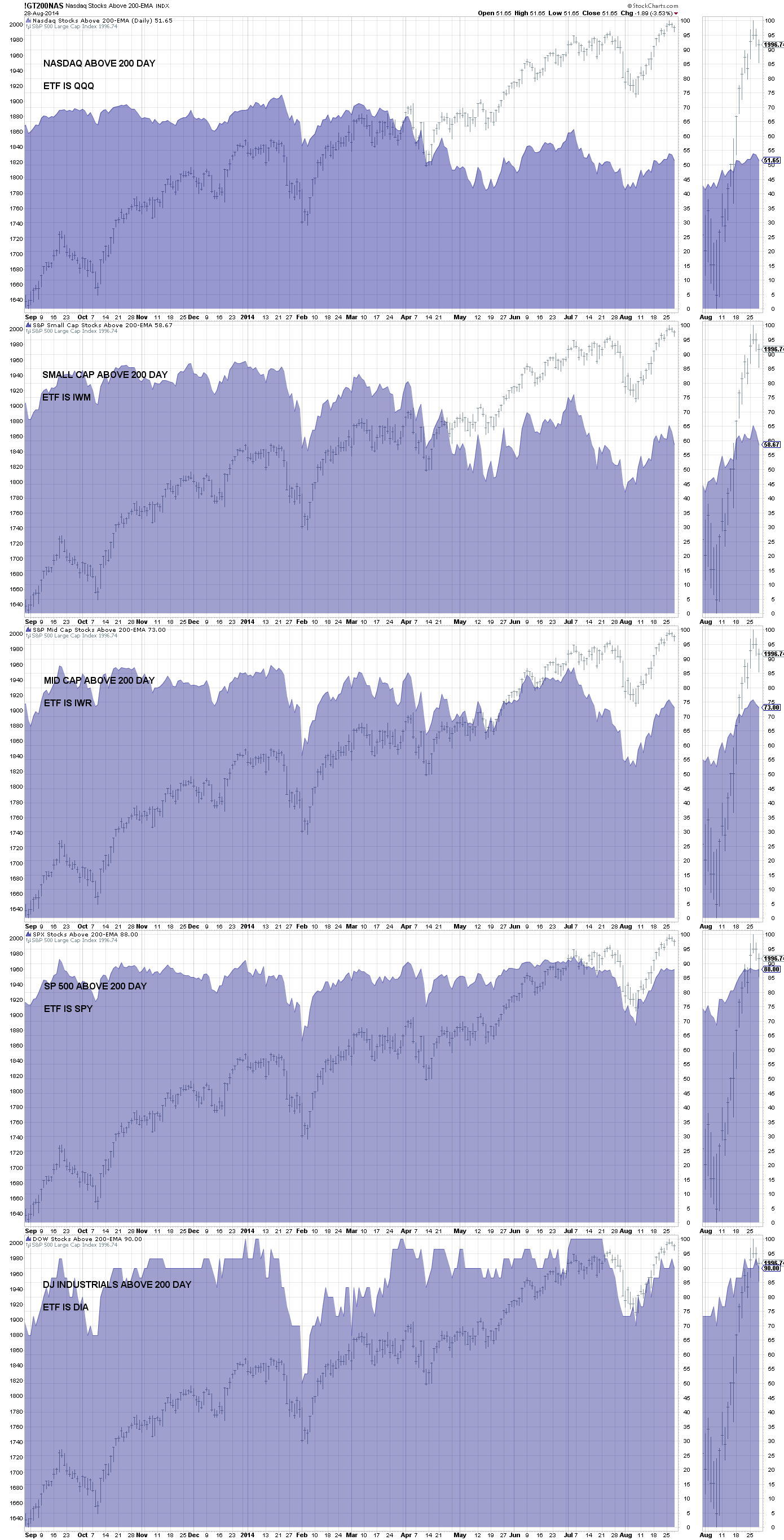
PAGE 1 CHART 0 – – PERCENTAGE ABOVE 200 DAY MOVING AVERAGE
PAGE 1 CHART 1 – – PERCENTAGE ABOVE 50 DAY MOVING AVERAGE
I’m always looking for a bullish or bearish divergence.
This is the exact same chart as PAGE 1 CHART 2 except we are looking at 50 moving averages. Everything stated above regarding the 200 day average is true for the 50 day moving average chart. The shorter time span (50 days) makes this chart more responsive to market direction and also more prone to whiplash.
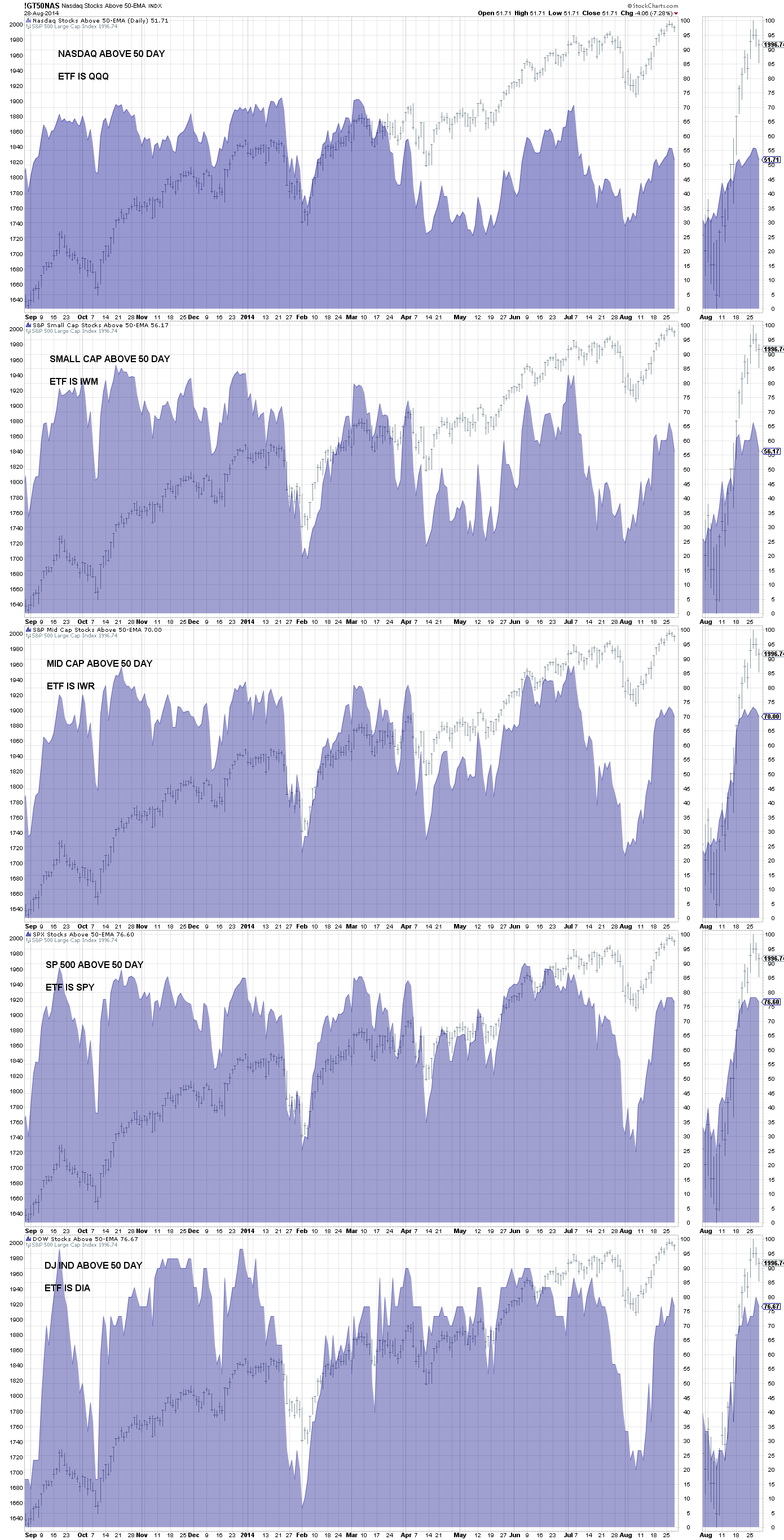
PAGE 1 CHART 1 – – PERCENTAGE ABOVE 50 DAY MOVING AVERAGE
PAGE 1 CHART 2 – – AVERAGE PRICE RELATIVE TO 52-WEEK HIGH
I’m always looking for a bullish or bearish divergence.
StockCharts provides no information regarding this indicator and it’s a muddy one to leave out the explanation.
This indicator is showing a stock’s current price compared to its price scale of its 52 week high to its 52 week low. The result must be expressed in a percentage of where the current price is located on the span of points from its 52 week high to its low. If the price was currently at the 52 week high, this would result in an answer of 100%, at the 52 week low results in an answer of 0%, and right in the middle of the high low price span would result in 50%.
This is probably clear as mud and I’m not good in mud. But here is an illustration of how one component would be computed in an index of stocks. 500 stocks in the index would mean this would be calculated 500 times and then create an average for all 500 components. This is not something you ever need to do (computers do our thinking for us), but hopefully an example will show you what the chart is telling you.
Stock XYZ is currently priced at 58
52 week high = 82 and 52 week low = 27
Calculate the “high low point span”
high minus low = high low point span
82 – 27 = 55 point span
How much does one point represent in percentage terms?
each point of the high low point span = 100 / “high low point span”
100 / 55 = 1.8% and this is the amount one point represents in percentage terms, call the result “percentage point”.
In percentage terms, where is the current price on the high low point span
(“current price” – “52 week low”) times “percentage point” = current placement on the high low span in percentage terms
(58 – 27) * 1.8 = 31 * 1.8 = 55.8% (answer)
Analysis – What I’m Looking For
As an index is moving higher and more stocks are not making new 52 week highs, this indicates weakness and a bearish divergence. This has great similarity in concept to what was illustrated in PAGE 1 CHART 0 – – PERCENTAGE ABOVE 200 DAY MOVING AVERAGE. Any chart that has a similar concept to “PAGE 1 CHART 0 – – PERCENTAGE ABOVE 200 DAY MOVING AVERAGE” can use the same deductions found in PAGE 1 CHART 0. The reverse concept is obviously true (bullish divergence).
Chart 1 is the NASDAQ exchange’s current price of the index’s components versus the index’s average 52 week high for all stocks in the index
Chart 2 is the SP 500 current price of the index’s components versus the index’s average 52 week high for all stocks in the index
Chart 3 is the SP 100 current price of the index’s components versus the index’s average 52 week high for all stocks in the index
Chart 4 is the SP 500 current price of the index’s components versus the index’s average 52 week high for all stocks in the index
Chart 5 is the DJ Industrials’s current price of the index’s components versus the index’s average 52 week high for all stocks in the index
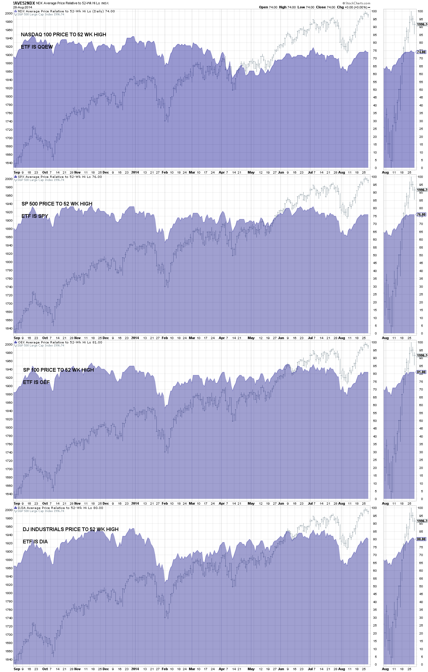
PAGE 1 CHART 2 – – AVERAGE PRICE RELATIVE TO 52-WEEK HIGH
PAGE 1 CHART 3 – – NYSE HIGH LOW
I’m always looking for a bullish or bearish divergence.
This chart is showing the daily movements of new highs and new lows on the New York Stock Exchange.
StockCharts Definitions
“A new high is recorded when a security’s price reaches its highest level in 52-weeks. Similarly, a new low occurs when the price records a 52-week low. From this high and low data, StockCharts also calculates Net New Highs, which is new highs minus new lows, and the High-Low Ratio, which is new highs divided by new lows.”
Chart #1 is the SP 500, commonly referred to as SPX
Chart #2 is the ratio of (daily new highs divided by new lows). A rising ratio indicates a rising plurality of new highs (bullish). The daily ratio is shown by the blue histogram and the red line is a moving average of the blue histogram. In the background is the SP 500. As always I’m watching for a trend that is divergent from prices.
Chart #3 is new highs minus the new lows. This is shown in the gray histogram (or red histogram when negative) and in the background is the SP 500. This indicator can on occasion be more useful for trend than the ratio.
Chart #4 is the number of daily new highs in green with the SP 500.
Chart #5 is the number of daily new lows in red
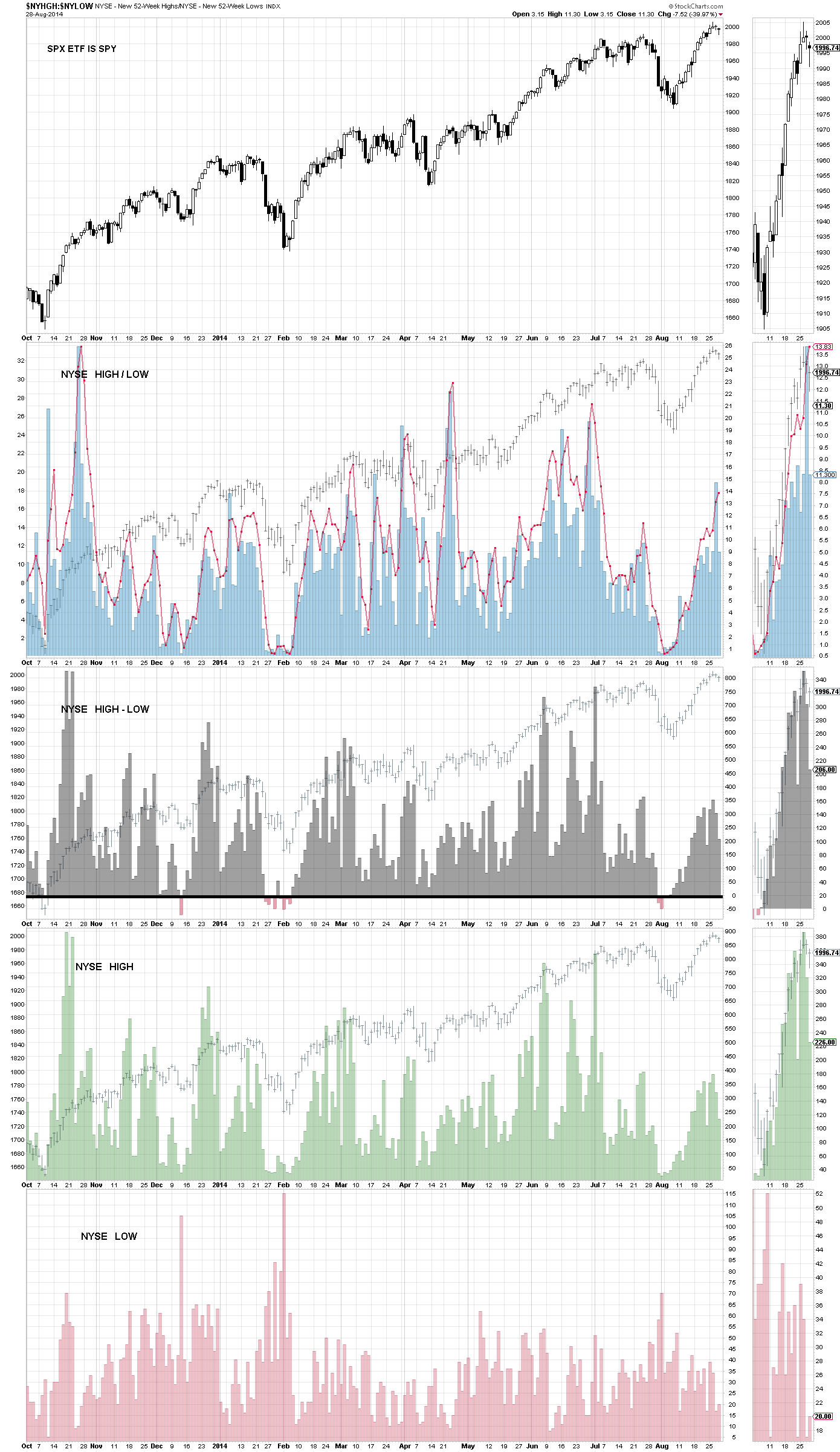
PAGE 1 CHART 3 – – NYSE HIGH LOW
PAGE 1 CHART 4 – – NASDAQ HIGH LOW
This is an exact copy of chart 5 only it’s showing the NASDAQ exchange.
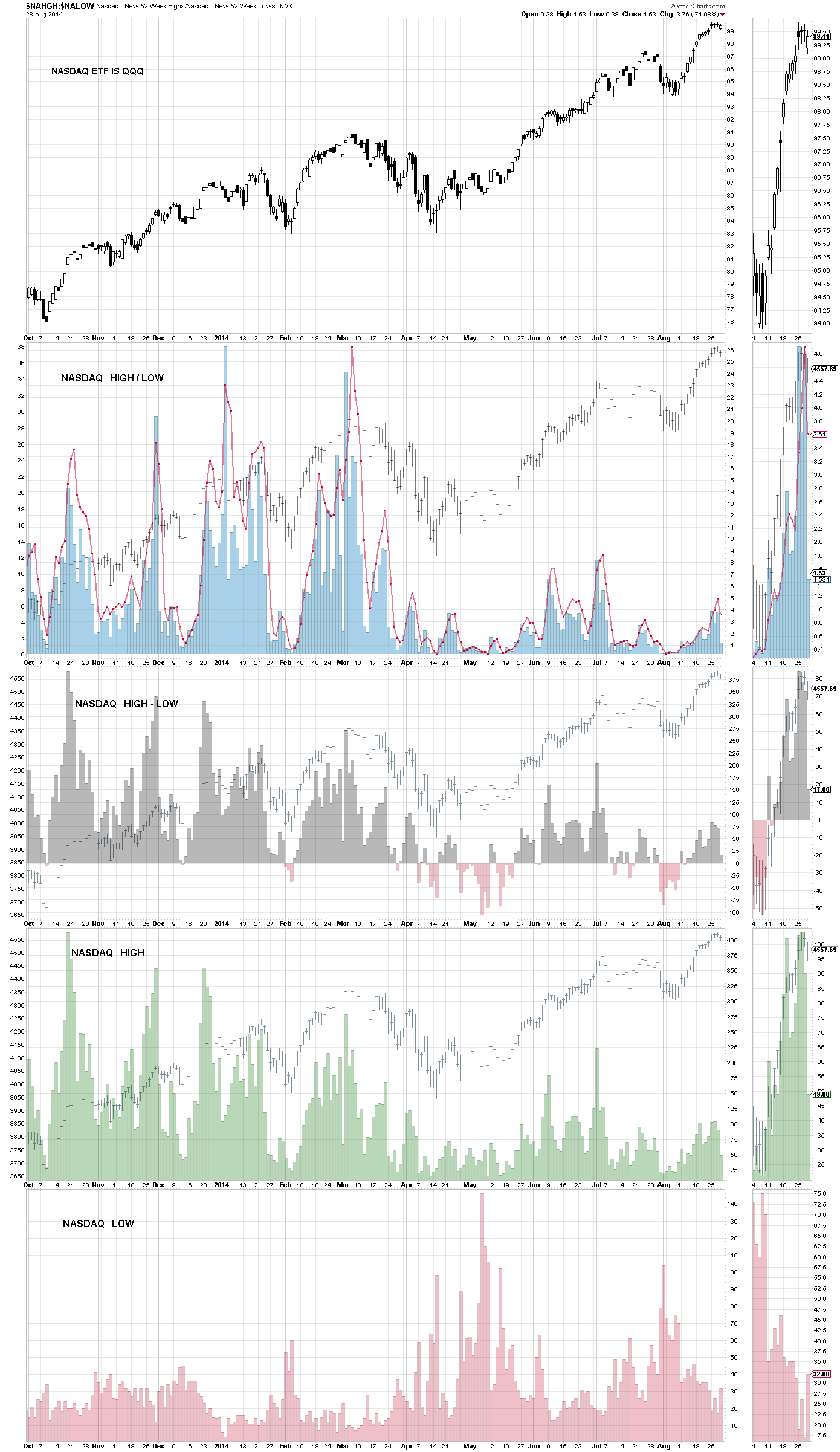
PAGE 1 CHART 4 – – NASDAQ HIGH LOW
PAGE 1 CHART 5 – – NEW HIGHS
I’m always looking for a bullish or bearish divergence.
This is the daily new highs for various indexes and is illustrated by a gray histogram, SP 500 is in the background. No lows are used in the calculation of these charts.
Chart 1 is the NASDAQ exchange’s new highs
Chart 2 is the SP small cap index’s new highs
Chart 3 is the SP mid cap index’s new highs
Chart 4 is the New York Stock Exchange’s (NYSE) new highs
Chart 5 is the SP 500 index’s new highs
Chart 1 is
Chart 2 is
Chart 3 is
Chart 4 is
Chart 5 is
Chart 6 is
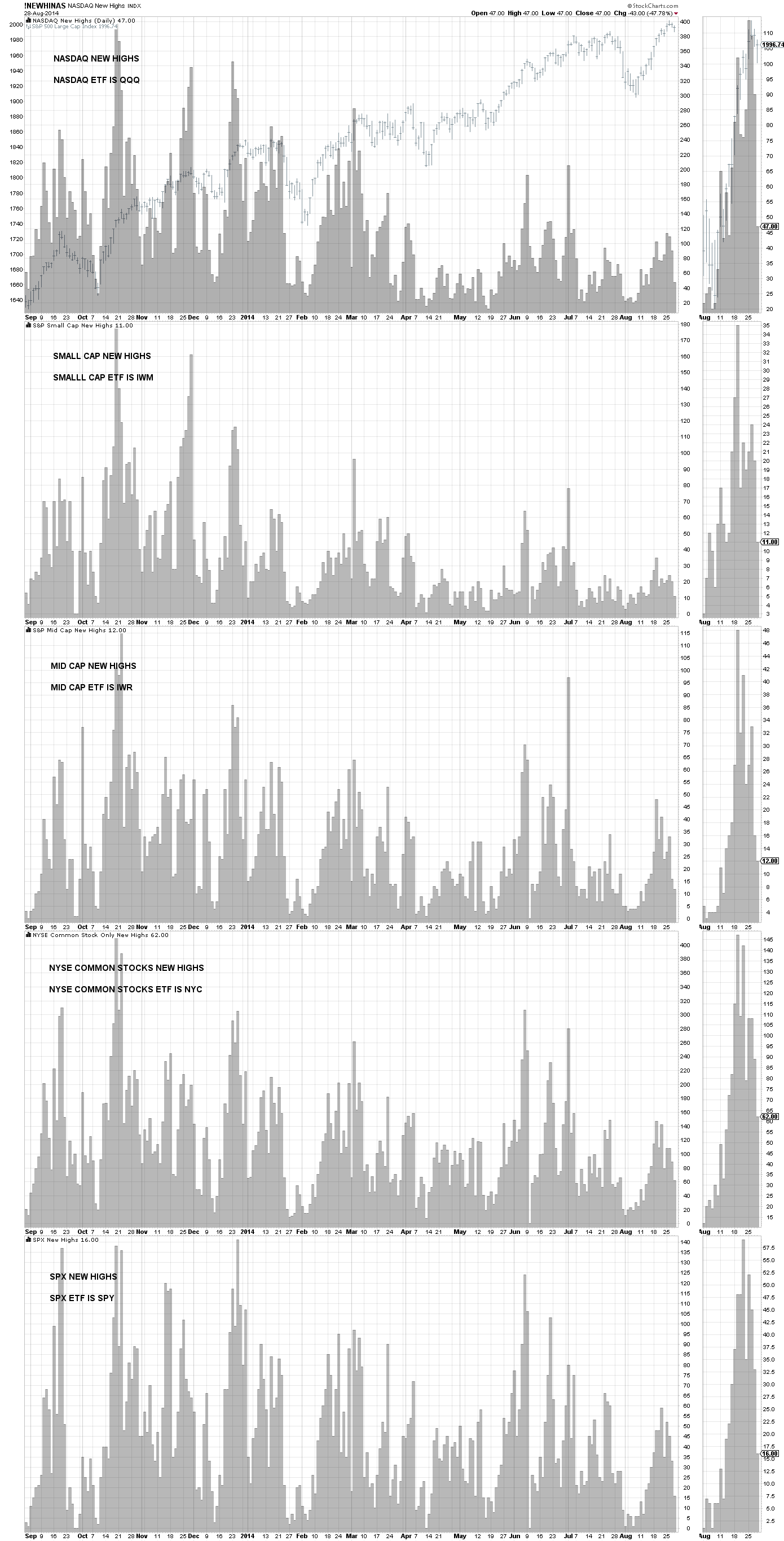
PAGE 1 CHART 5 – – NEW HIGHS
PAGE 1 CHART 6 – – NEW HIGHS MINUS NEW LOWS
I’m always looking for a bullish or bearish divergence.
StockCharts Definitions
“A new high is recorded when a security’s price reaches its highest level in 52-weeks. Similarly, a new low occurs when the price records a 52-week low. From this high and low data, StockCharts also calculates Net New Highs, which is new highs minus new lows, and the High-Low Ratio, which is new highs divided by new lows.”
This is the daily NET new highs for various indexes and is illustrated by a gray histogram, SP 500 is in the background.
Chart 1 is the SP small cap new highs minus new lows
Chart 2 is the SP mid cap new highs minus new lows
Chart 3 is the SP 1500 new highs minus new lows
Chart 4 is the SP 500 new highs minus new lows
Chart 5 is the DJ Industrials new highs minus new lows
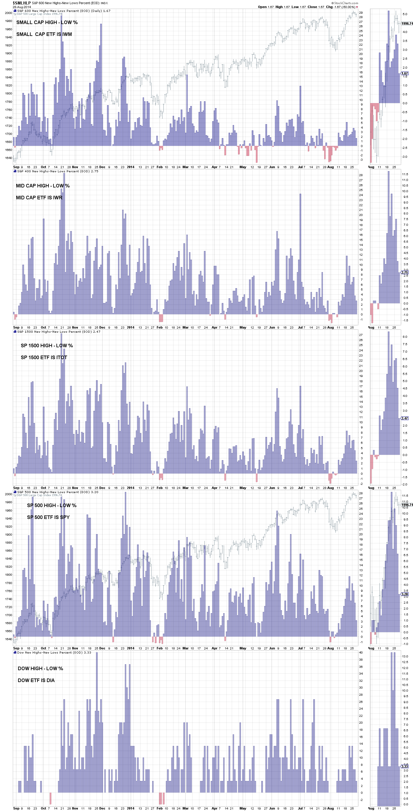
PAGE 1 CHART 6 – – NEW HIGHS MINUS NEW LOWS
PAGE 1 CHART 7 – – PUT / CALL RATIO – COOK CUMULATIVE TICK INDICATOR FOR NYSE & NASDAQ
I’m always looking for a bullish or bearish divergence.
StockCharts Definitions
“The Put/Call Ratio is an indicator that shows put volume relative to call volume. Put options are used to hedge against market weakness or bet on a decline. Call options are used to hedge against market strength or bet on advance. The Put/Call Ratio is above 1 when put volume exceeds call volume and below 1 when call volume exceeds put volume. Typically, this indicator is used to gauge market sentiment. Sentiment is deemed excessively bearish when the Put/Call Ratio is trading at relatively high levels, and excessively bullish when at relatively low levels. Chartist can apply moving averages and other indicators to smooth the data and derive signals.”
Trader’s Narrative
“If you’ve somehow managed to not learn about Mark D. Cook by now: he is a ‘Trading Wizard’ featured in Schwager’s series of books, a legendary futures trader and the winner of the 1992 U.S. Investment Championship (with a 563.8% return). His most famous contribution to trading and technical analysis is his self named, Cook Cumulative Tick Indicator.
This indicator is, as the name suggests, simply a cumulative count of tick throughout the trading day. The exact recipe is only known to Mark D. Cook but from what he has publicly divulged, we can try and estimate the Cumulative Tick Indicator to a pretty good degree.
First, separate the noise from the signal by ignoring any tick readings within the +/-400 range. We then record and aggregate those readings outside this range at a fixed time interval. We don’t know exactly what interval Mark uses so just pick a time interval: minute, hour, day, etc. The important thing is to be consistent. That’s it! Now you have the super secret Mark D. Cook, Cook Cumulative Tick Indicator. So what do you do with it? Watch the 95th and 5th percentile. If the Cumulative Tick Indicator is above the 95th percentile, sell; if below 5th percentile, buy.
Remember, this is a counter trend strategy so the more extreme the tick, the more vicious the snapback. As with all counter trend strategies, mind your protective stop loss!
I have notes below PAGE 1 CHART 7, which state:
I disagree with one point on what is stated below. When an uptrend begins after a long and significant decline, you will get a reading over +400 and that is not a sell point. It’s an initial overbought point that occurs early in the takeoff on a bull move.
I seems that you are more likely to get a tick reading outside of the +/-400 range on the NASDAQ than the NYSE.
‘First, separate the noise from the signal by ignoring any tick readings within the +/-400 range. We then record and aggregate those readings outside this range at a fixed time interval. We don’t know exactly what interval Mark uses so just pick a time interval: minute, hour, day, etc. The important thing is to be consistent. That’s it! Now you have the super secret Mark D. Cook, Cook Cumulative Tick Indicator. So what do you do with it? Watch the 95th and 5th percentile. If the Cumulative Tick Indicator is above the 95th percentile, sell; if below 5th percentile, buy.
Remember, this is a counter trend strategy so the more extreme the tick, the more vicious the snapback. As with all counter trend strategies, mind your protective stop loss! A trend can persist much longer than you can remain solvent. Never try and be a hero by playing chicken with the market.’
Chart 1 is the put / call ratio surrounded by trading bands illustrating when the indicator is outside of normal expected behavior.
Chart 2 is the NASDAQ Cook cumulative short term tick indicator with the SP 500 in the background
Chart 3 is the NASDAQ Cook cumulative long term tick indicator with the SP 500 in the background
Chart 4 is the NYSE Cook cumulative short term tick indicator with the SP 500 in the background
Chart 5 is the NYSE Cook cumulative long term tick indicator with the SP 500 in the background
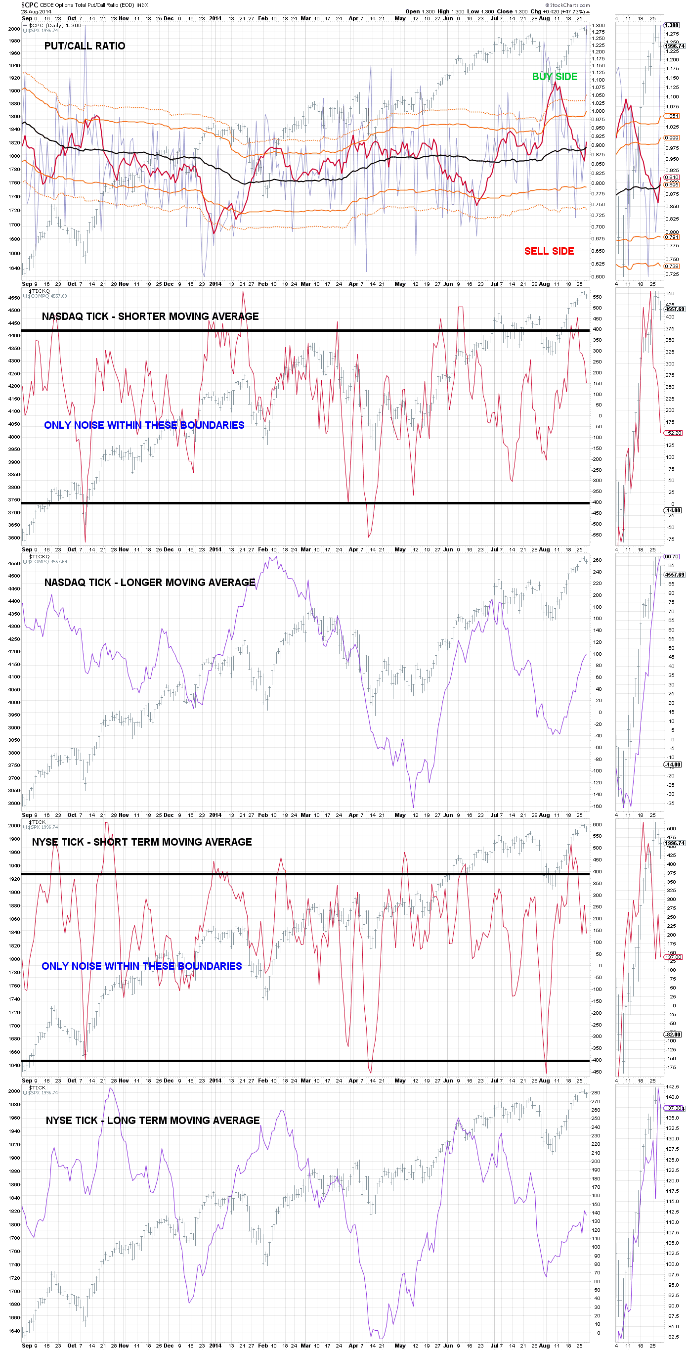
PAGE 1 CHART 7 – – PUT:CALL RATIO – COOK CUMULATIVE TICK INDICATOR FOR NYSE & NASDAQ
PAGE 1 CHART 8 – – CUMULATIVE ADVANCE DECLINE
I’m always looking for a bullish or bearish divergence.
StockCharts Definitions
“The Advance-Decline Line (AD Line) is a breadth indicator based on Net Advances, which is the number of advancing stocks less the number of declining stocks. Net Advances is positive when advances exceed declines and negative when declines exceed advances. The AD Line is a cumulative measure of Net Advances. It rises when Net Advances is positive and falls when Net Advances is negative. Typically, the advance-decline statistics come from the NYSE or Nasdaq on a daily basis. Chartists can plot the AD Line for the index and compare it to the performance of the actual index. The AD Line should confirm an advance or a decline with similar movements. Bullish or bearish divergences in the AD Line signal a change in participation that could foreshadow a reversal.”
“The AD Line measures the degree of participation in an advance or a decline. An AD Line that rises and records new highs along with the underlying index shows strong participation that is bullish. An AD Line that fails to keep pace with the underlying index and confirm new highs shows narrowing participation. Market strength is undermined when fewer stock participate in an advance. Narrowing participation is often identified with a bearish divergence between the AD Line and the underlying index. On the downside, the market is considered weak when the AD Line moves to new lows along with the underlying index. This reflects broad participation in the decline. A bullish divergence forms when the AD Line fails to record a lower low along with the index. This means fewer stocks are declining and the decline in the index may be nearing an end.”
“The advance-decline statistics have a few quirks that chartists should know. First, there is a long-term downward bias in the Nasdaq AD Line. This is because Nasdaq listing requirements are not as strict as NYSE listing requirements. The Nasdaq is full of upstarts in industries ranging from biotech to technology to alternative energy. There may be huge upside potential, but there is also risk of absolute failure. More Nasdaq stocks are prone to delisting. Companies that fail are removed from the index and replaced, but their negative affect on Net Advances remains”
“The AD Line is a breadth indicator that reflects participation. A broad advance means the vast majority of stocks are participating and this will cause the AD Line to move sharply higher. A narrow advance shows limited participation that will cause the AD Line to move slightly higher. Declines can also be broad or narrow. A broad-based advance shows underlying strength that lifts most boats. This is bullish. A narrow advance shows a relatively mixed market that is selective. Narrowness in an advance or decline sets up the divergence signals. An advance with narrow participation is unlikely to keep up with the underlying index and a bearish divergence will form. Similarly, a decline with narrow participation is unlikely to keep up with the index and a bullish divergence will form. These divergences can help chartists identify important reversals in the market.”
Analysis – What I’m Looking For
This indicator has a very good record of forecasting major peaks in advance as indicated by the historical chart below. As always you are looking for divergent action from prices.
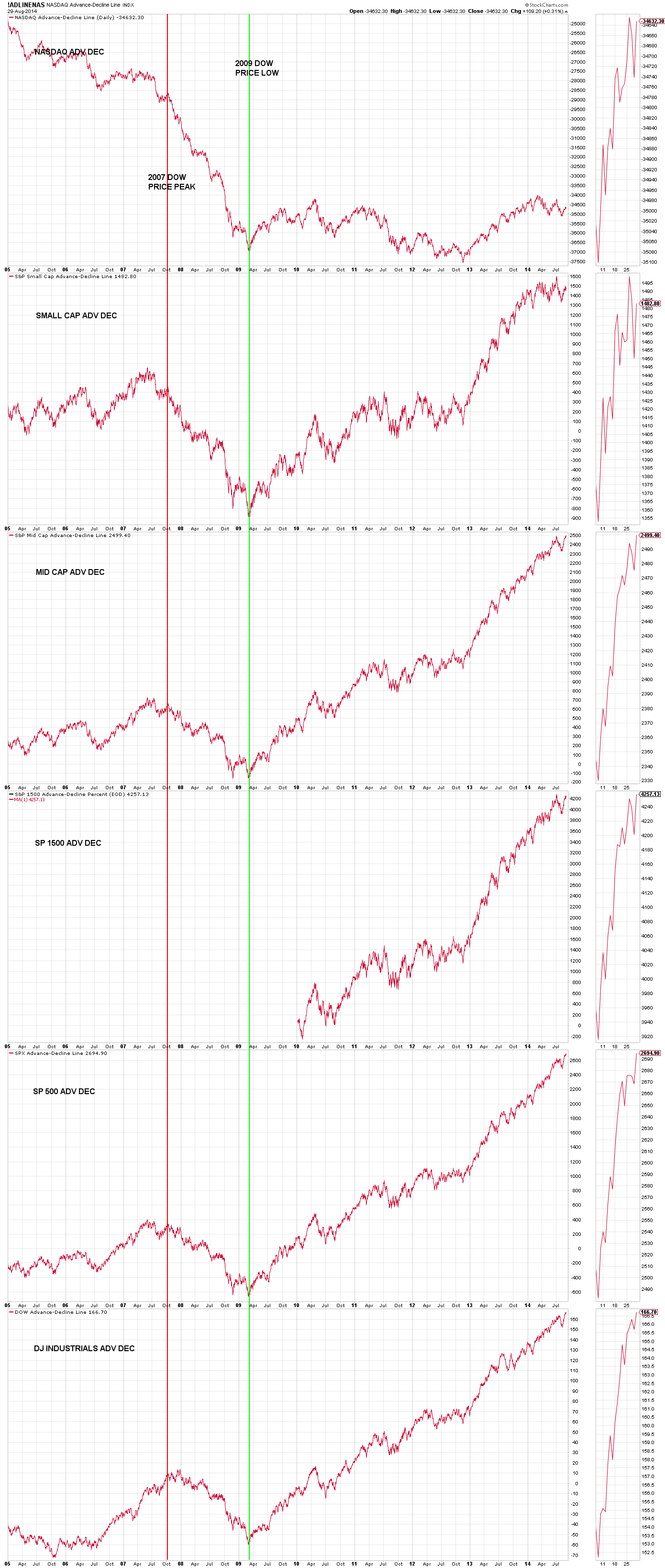
PAGE 7 CHART 3 – – CUMULATIVE ADVANCE DECLINE – SINCE 2005
The current chart for cumulative advance decline follows.
Chart 1 is the cumulative advance decline line for the NASDAQ (always going down with major exceptions)
Chart 2 is the cumulative advance decline line for the SP small cap index
Chart 3 is the cumulative advance decline line for the SP mid cap index
Chart 4 is the cumulative advance decline line for the SP 1500 index
Chart 5 is the cumulative advance decline line for the SP 500 index
Chart 6 is the cumulative advance decline line for the DJ Industrials index
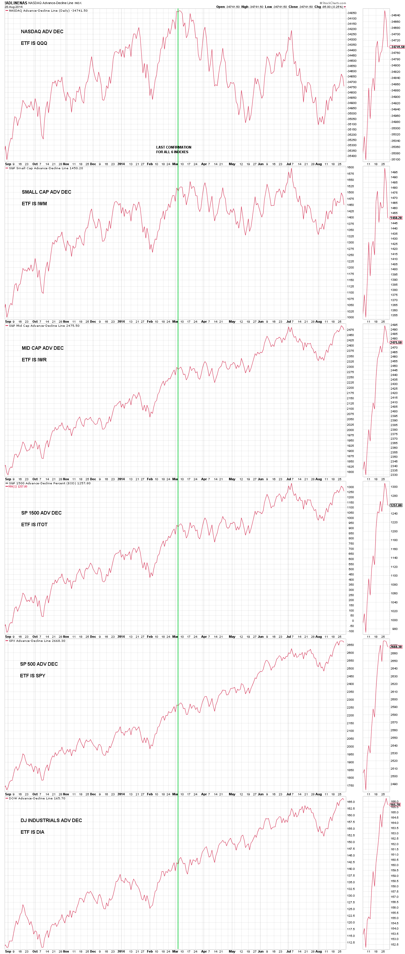
PAGE 1 CHART 8 – – CUMULATIVE ADVANCE DECLINE
PAGE 1 CHART 9 – – CUMULATIVE UP DOWN VOLUME
I’m always looking for a bullish or bearish divergence.
StockCharts Definitions
“The AD Volume Line is a breadth indicator based on Net Advancing Volume, which is the volume of advancing stocks less the volume of declining stocks. Net Advancing Volume is positive when advancing volume exceeds declining volume and negative when declining volume exceeds advancing volume. The AD Volume Line is a cumulative measure of Net Advancing Volume. It rises when Net Advancing Volume is positive and falls when Net Advancing Volume is negative. Typically, the volume statistics come from the NYSE or Nasdaq on a daily basis. Therefore, we can plot the AD Volume Line for a specific index and compare it to the performance of that index. The AD Volume Line should confirm an advance or a decline with similar movements. Bullish or bearish divergences in the AD Volume Line signal a change in buying or selling pressure that could foreshadow a reversal in the market.”
“Because it is based on volume, the AD Volume Line measures the buying and selling pressure behind an advance or a decline. The volume behind advancing stocks represents buying pressure, while the volume behind declining stocks represents selling pressure. An AD Volume Line that rises and records new highs along with the underlying index shows strong buying pressure. This is bullish. An AD Volume Line that fails to keep up with the underlying index and fails to confirm new highs reflects weakness in buying pressure. Market strength is undermined when buying pressure fails to confirm an advance. Weakness in buying pressure can be identified with a bearish divergence between the AD Volume Line and the underlying index. On the downside, the market is considered weak when the AD Volume Line moves to new lows along with the underlying index. This shows strong selling pressure. A bullish divergence forms when the AD Volume Line fails to record a lower low along with the index. This means selling pressure is waning and the decline may be nearing an end.”
“The advance-decline volume statistics favor large cap stocks over small-cap and mid-cap stocks. The Nasdaq trades some 2700 stocks every day – give or take a couple hundred. The NYSE trades over 3000 stocks per day. The vast majority of these stocks are small and mid size companies. Even though relatively few are large-caps, the largest companies account for the most volume. Large-caps such as Microsoft, Intel, Cisco, Comcast, Dell, Oracle, News Corp, Apple, Research in Motion, Ebay, Applied Materials, Adobe and Qualcom regularly appear on the most active list. Small stocks occasionally make it on the most active list, but volume is still dominated by large-caps. Microsoft averages over 70 million shares in volume per day. Imperial Sugar (IPSU), on the other hand, averages just over 100,000 shares in volume per day. An advance in Microsoft adds some 70 million shares to Net Advancing Volume. An advance in Imperial Sugar adds just 100,000 shares to Net Advancing Volume. It takes a lot of Imperial Sugars to make up for one Microsoft. The same logic is true for the NYSE. ExxonMobil (XOM) averages over 20 million shares volume per day, but Vector Group (VGR) averages around 300,000 shares volume per day.
While the Nasdaq AD Line has a downward bias over the longer term, the AD Volume Line does not share this characteristic. Nasdaq listing requirements are not as strict as NYSE listing requirements. As a result, the Nasdaq is full of upstarts in industries ranging from biotech to technology to alternative energy. Even though more Nasdaq stocks are prone to failure, these failures are usually small-caps. The negative impact on the AD Volume Line is minimal because large-caps drive the AD Volume Line. In contrast to small-caps and mid-caps, large-caps are much less likely to go out of business or fail to meet listing requirements on the Nasdaq. There will, however, be a few exceptions along the way (such as WorldCom).
The Nasdaq, NY Composite and many other indices are usually weighted according to market capitalization. The stocks with the bigger market caps are also the volume leaders. With large-caps driving the Nasdaq and NY Composite, it is little surprise their respective AD Volume Lines correlate to the underlying index. While divergences will form, they are usually the exception rather than the norm. The chart below shows the Nasdaq with the Nasdaq AD Volume Line from July 2004 to July 2010. They pretty much rise and fall together.”
Analysis – What I’m Looking For
This indicator has a good record of forecasting major peaks as indicated by the historical chart below. As always you are looking for divergent action from prices.
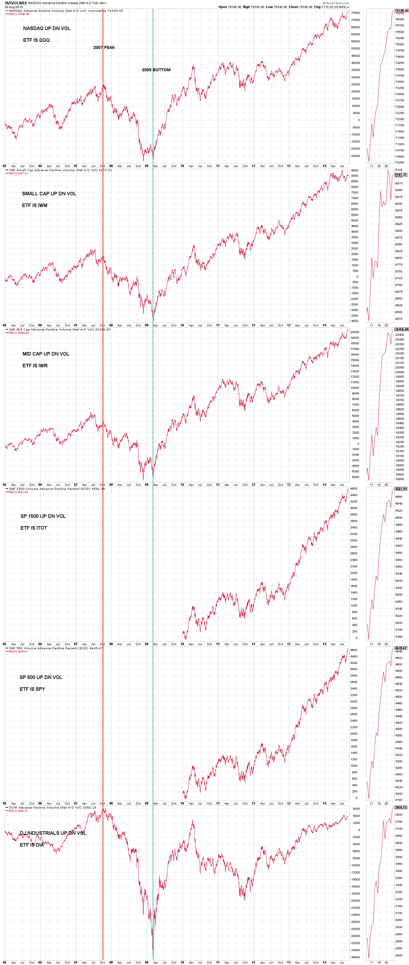
PAGE 7 CHART 2 – – CUMULATIVE UP DOWN VOLUME – SINCE 2005
The current chart for cumulative up down volume follows.
Chart 1 is the cumulative up down volume line for the NASDAQ
Chart 2 is the cumulative up down volume line for the SP small cap index
Chart 3 is the cumulative up down volume line for the SP mid cap index
Chart 4 is the cumulative up down volume line for the SP 1500 index
Chart 5 is the cumulative up down volume line for the SP 500 index
Chart 6 is the cumulative up down volume line for the DJ Industrials index
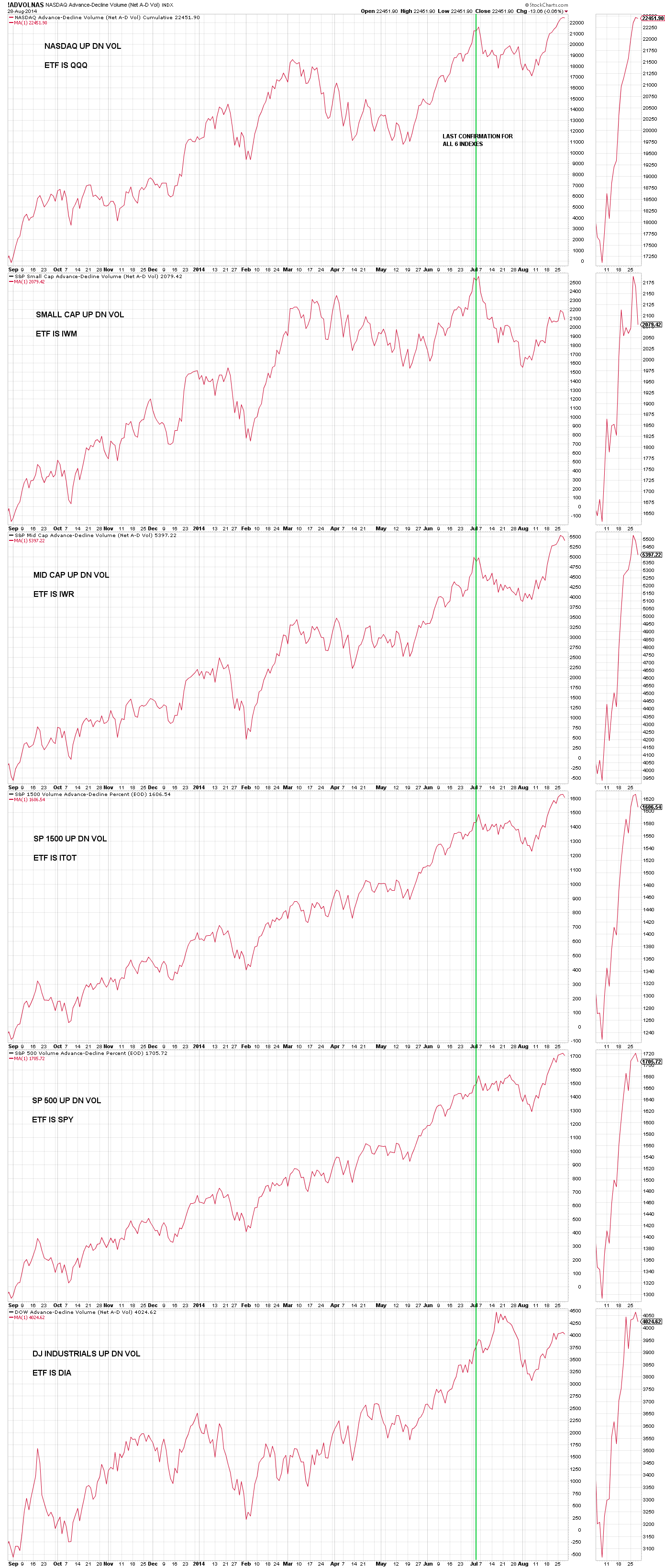
PAGE 1 CHART 9 – – CUMULATIVE UP DOWN VOLUME
—————————————————
- Please follow MY CHARTS so I’m not relegated to the dung heap of nobody is interested in this crap. You only have to follow once. Click the blue icon seen in the upper right of each page that says “Follow”. After you’ve clicked once, the blue icon should change to “Unfollow”. Leave it so it says “Unfollow”.
—————————————————
- Click on any chart to enlarge it
- All Rights Reserved © ™
- Leave me a comment just a few inches below, look for:

- If you only see the following:

- Click on “Be the first to comment” and you’ll see:

Leave A Reply