March 2004 – T Theory® Update

The March 26 2004 39 Week Adaptive Channels Perspective
Thursday Mar 25 saw a 170 Dow Point rally from an oversold condition which no doubt was justified technically by the oversold condition. However the more significant question to investors is whether this might not signal the resumption of the bull market. In T Theory there is also the more technical question as to whether very short term this might not be the beginning of a new Short Range T that in the week ahead could extend the recent uptrend. This is a standard question that is better answered by reference to the 39 Week Moving Average (MA) Adaptive Channels presented in the chart below. Please click on the image for a larger view.

The unique and most useful characteristic of these proprietary Adaptive Channel Envelopes are that the S&P 500 weekly fluctuations, for the most part of history, and even more generally in overvalued markets, trends can be seen to follow standard configurations. Only two patterns need to be considered and they can make the establishment of turning points vastly simpler than the other common techniques such as Elliot Wave, repetitive cycles, Oscillators, Contrary Opinion, etc. The patterns of Tops and Bottoms that I have add the three channel envelopes are the key to establishing targets for new turning points and trend confirmations.
Also the rules are quite simple to follow. But you must first make a judgment as to whether the trend is longer term Bullish (up) or Bearish (down). Since one can never be sure as to which trend is in effect, it’s simpler to start out initially assuming the direction of the 39-week MA (same as the 200 day MA) is a rough approximation of the longer trend, at least for the near term. Having made that judgment it is usually correct to anticipate that with in an uptrend, Tops will occur at the level denoted by the red dashed line. Bottoms will then occur at levels denoted by the black central 39 week MA. In Bear Trends the target levels just shift down to the lower half of the channels.
Since Channel Price levels being calculated by my computer program, it is relatively easy to anticipate specific turning point target levels. One need only let the short-term trends or Ts to move the S&P to the next Top or Bottom as these recurring patterns unfold over time. For the present case we see the 39 Week MA has been rising, so the standard top at the upper red dashed line would have been an extreme and this is confirmed by the current decline. Moving on to answering the basic questions, we can see standard channel logic would now call for a new Bottom around the 39Week MA currently at S&P 1056 but rising slightly over time.
So the simple Adaptive Channel answer to the questions posed above is based on history, particularly in an over-valued a true correction low has not been seen and thus the recent rally can be expected to fail, with somewhat lower lows to follow.
However, if the S&P 500 should fall to the Bottoms target level or even slightly below, then a potential key price low would have been seen if the longer term is indeed up as initially assumed. Once a 39 -Week Bottom is reached, we will want to look at the Short Range T picture in order to ascertain whether its independent analysis will support a rally back up to the red Tops channel.
If the new Short Range T, which I am now assuming will get its initial rally started from the vicinity of the 39 Week MA, can not sustain an uptrend in its right side, or worse collapses, then the initial assumption of an ongoing bull market will found to be false.
On the other hand if the new trend can sustain itself beyond the initial rally of the new Short Range Ts start, then a gradual uptrend to new highs is the likely outcome and a continuing Bullish outlook would be justified.
So the Short Range Ts role in T Theory at this juncture is really limited to what it can do after the S&P target low at the 39 Week is achieved. That is the important point to keep in mind for this week.
Terry Laundry
Short Range T Update for March 19 2004
The Short Range Picture below shows a declining S&P 500 trend is in progress with no real indications of an up -turn as of the present time. The rallies from the over sold condition are likely to fail as the blue volume oscillator gets up to the neutral, zero level. Please click on the chart for a larger image.
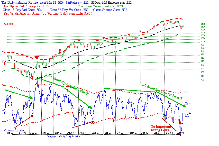
Terry Laundry
Short Range T Posting March 12 2004
The S&P has fallen to its 55-Day exponential MA as expected , then gone lower to penetrate it, suggesting a serious decline is underway. The bigger questions are whether any new Short Range T might be developing soon. As of this March 11 close there is no rising bottoms pattern in the blue volume oscillator in the chart so there is no reason to anticipate a nearby turn, at least right away. Click on the image for a larger more detailed view.
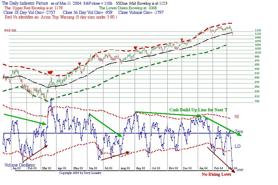
One of the possibilities suggest by the Michael Belkin analysis note in my March 10th Dow Jones Mega-T introduction was the potential for a serious correction given that the NASDAQ had completed a bounce off its 200 month MA one year ago and recently risen to its 200 week MA. The deep and steep drop in the daily blue Volume Oscillator is suggesting a radical negative change is occurring and the smart way to deal with this it to hold off on looking for any low until the normal bottoming signs surface.
Whether the Belkin analysis is valid remains to be seen, but there are signs of a downward acceleration of a magnitude that many produce longer-term problems for the bullish case so there is no need to jump into the current oversold condition in hopes of a rapid turn around. In general the greater the downside momentum, the longer it takes for the market to make a turning pattern in the oscillator. This gives us time to watch for a rising bottoms pattern in the Volume Oscillator.
Price-wise the S&P may be headed to the next lower channel objective at the green dashed line. Currently this is at 1068 but may be rising slowly. Terry Laundry
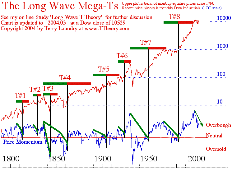
Dow Jones Industrial Mega-T March 10 2004 Posting
Earlier on Mar 5 2004 , I Posted the Gold Mega-T that projects a bright future for the precious metal into 2020. As a follow up I am introducing the companion Dow Jones Industrial Average Equity Mega-Ts that illustrate the comparable equity time symmetry. This chart forms the greatest demonstration for T Theory over 200 years. The updated chart below which can be expanded by clicking on the image brings up the 200 year history of T Theory as applied to conservative blue chip equities.

- DJMegaT0403
This very long-term equity perspective plots a multitude of very interesting data that can be applied to a much wider variety of investment concepts beyond T Theory. I would point out however the logarithmic rates of return for the Dow Industrials plotted here do not include dividends as part of total return to the longer-term investor.
Nevertheless I am working on the expansion of this basic price appreciation data towards the key valuation concepts expressed by of Yale Professor Dr. Robert Shiller, which led to his conclusion of a year 2000 bubble. Also I am introducing some of the innovative very long-term Moving Average ideas presented by Mr. Michael Belkin who also defined the year 2000 bubble peak and recent recovery low in term of moving averages. This work will be published in a month or so using more detailed data.
In this initial presentation I want to list some of the important T Theory Observations for the equity market and their relationship to gold. Also, I want to note for reference Dr. Robert Shiller’s key conclusion that the year 2000 saw a monumental peak in speculative P/E Ratios as a fundamental over-valuation is historically coincidental and perhaps roughly equivalent with a peaking of the blue momentum oscillator at historically very high levels, in fact higher than the momentum peak seen at the 1929 peak. From a purely technical standpoint, I want to note Michael Belkin’s technical observation that “bubbles” and “lows” from a trading standpoint might eventually be indicated by very long term moving averages such as those contained in this chart.
The first and most basic conclusion of this chart, which was developed in the 1980’s, was that very long term equity trends did indeed satisfy the basic T Theory time symmetry; namely, each rally in the DJIA (right side of the T) lasted as many months as the prior momentum Oscillator decline (left side of T). The last completed T, #8 in this chart, was successfully used to project the great 1982 to 1998 bull market for the Industrial Blue Chip sector. A new year 2000 to present Oscillator Decline is presumably starting the next T’s Cash Build Up Phase.
If one compares the price trend of Gold, within its separate long-term chart, with this Industrial trend, then the 1966 to present period illustrates a clear inverse relationship which is a key reason supporting gold investment for the current time period, in my judgment. From 1966, with the Industrial Average peaking in Oscillator Momentum, Gold Bullion shook off its historic low valuation (under $40/oz for the prior century due to historically controlled price) and began one of the great advances in percentage terms into its 1980 speculative peak ending above $800/oz.
The next important turning point, that once again illustrated the contrary nature of equity trends vs. Gold trends, occurred in the very early 1980’s. With the Gold price speaking above $800/oz in 1980, the Dow Industrial Oscillator completed a 16 year decline in 1982 thereby putting a 16 year Cash Build Up Period in place to define the next 16 year advance for blue chip stocks via my T concept. This T projected a matching 16-year advance from the equity turning point of 1982 to an eventual 1998 peak
Two years after successful completion of a 1998 peak for blue chips, the later speculative NASDAQ phase was completed its major year 2000 bubble peak and Gold was once again turning opposite by starting a strong rally coming out of a 20 year bear trend. If this new Gold uptrend is in fact the product of a new T, as I have contended, then the implications are that the equity momentum oscillator shown here in blue will be spending many years making a declining tops trend. This declining momentum trend would suggest Blue Chip stocks are losing their decades long upside momentum. Such a steady loss in price momentum would also imply Price to Earnings Ratios are steadily reverting back to their normal levels or perhaps to the very low valuations that are usually need to start a new Mega-T.
While we are watch these trends unfold in the months ahead, it is important to understand that the declining trend in momentum is the important criteria for any new Industrial T that might shift the gold preference back to equities via a new Industrial T. Note I have added the green down-arrow which will provide upside resistance during rallies. Historically it is possible for the Dow to reach token new highs without having the momentum oscillator break out of its decline. As long as this momentum measure is generally falling, as it is has been for 3 years, my conclusion is that Gold investments will outperform the blue chip equities plotted here.
Another very interesting project that will be coming out of this very long data presentation is a study of over-valuation vs. under-valuations using technical trend concepts as a companion to the standard fundamental valuations as proposed by Shiller and Hussman. The 200-year history shown here can be manipulated to show many key reversal points based on implied new technical valuation concepts as well as T Theory time symmetry, and I have been spending time on this approach as a way to research “bubble” turning points, etc.
Recently Belkin has proposed an interesting moving average approach as per his Oct 2003 comments that follow. I can reproduce most of his concepts and verify their application to this history without any great difficulty because his conclusions are based on very long term moving averages, which are already a part of my chart program, and can be included in this chart without much trouble.
Belkin defines major bubbles as excessive upside deviations from a stock or index’s 200-week (46-month) trend, while major crashes entail a fall to their 200-month trend. That’s not information you can use to short term trade, but it helps with the big picture investment implications of my T Theory conclusions for the long-term investment trends.
The big picture, in his view, amounted to these conclusions:
In March 2000, his prediction for a 65% decline for the NASDAQ was predicated on a belief that it would sink to its 200-month (or 16.5-year) average from a bubble peak. In October 2002, the NASDAQ rebounded off that level, around 1,180. In November 2002, his belief in a NASDAQ rally to 2,280 was predicated on a belief that it would rise to its 200-week ( 46-month) moving average at that level amid a business-cycle bounce. He speculated the index would fall short of his predicted move because private-sector credit growth is declining sharply in spite of the Federal Reserve’s neutral-to-slightly-simulative stance.
He claims the number 200 for the monthly and weekly MA’s has worked to define levels of support and resistance in every major bubble and crash he has studied over the last 100 years. A bear-market bounce in a stock index or commodity from its 200-month average to its 200-week average, he says, is relentless, takes about a year and ends with low volatility — all characteristic of the recent U.S. rally. I want to verify this conclusion in my 200-year chart because, if true, many new investment tools will become available for the future.
His success with these long term moving averages suggest I should follow suit with a new study which will be published here over the next few months. I already have the Dow Industrial or equivalent data back for two centuries, so his 200 months moving average conclusions aren’t a problem. The 200 week Moving Average can be approximated in terms of months so I can research his concept and perhaps find another set of tools to refine this big picture.
The main area of interest is to check his contention that a post bubble decline will bottom at a 200 month MA, then peak at a higher 200 week Moving Average. Keep in mind we are not talking about a commonly watched 200-Day moving average. These are very long term trend criteria that could prove interesting because no one is watching them. The critical conclusion however will be whether the historical record of post bubble recovery peaks has in fact peaked at the 200 week MA. If so we are nearing a potentially important peak.
I can check these criteria through this long history very easily and will post the results in a week or two. …Terry Laundry
Dow Jones Industrial Mega-T March 10 2004 Posting
Earlier on Mar 5 2004 , I Posted the Gold Mega-T that projects a bright future for the precious metal into 2020. As a follow up I am introducing the companion Dow Jones Industrial Average Equity Mega-Ts that illustrate the comparable equity time symmetry. This chart forms the greatest demonstration for T Theory over 200 years. The updated chart below which can be expanded by clicking on the image brings up the 200 year history of T Theory as applied to conservative blue chip equities.
This very long-term equity perspective plots a multitude of very interesting data that can be applied to a much wider variety of investment concepts beyond T Theory. I would point out however the logarithmic rates of return for the Dow Industrials plotted here do not include dividends as part of total return to the longer-term investor.
Nevertheless I am working on the expansion of this basic price appreciation data towards the key valuation concepts expressed by of Yale Professor Dr. Robert Shiller, which led to his conclusion of a year 2000 bubble. Also I am introducing some of the innovative very long-term Moving Average ideas presented by Mr. Michael Belkin who also defined the year 2000 bubble peak and recent recovery low in term of moving averages. This work will be published in a month or so using more detailed data.
In this initial presentation I want to list some of the important T Theory Observations for the equity market and their relationship to gold. Also, I want to note for reference Dr. Robert Shiller’s key conclusion that the year 2000 saw a monumental peak in speculative P/E Ratios as a fundamental over-valuation is historically coincidental and perhaps roughly equivalent with a peaking of the blue momentum oscillator at historically very high levels, in fact higher than the momentum peak seen at the 1929 peak. From a purely technical standpoint, I want to note Michael Belkin’s technical observation that “bubbles” and “lows” from a trading standpoint might eventually be indicated by very long term moving averages such as those contained in this chart.
The first and most basic conclusion of this chart, which was developed in the 1980’s, was that very long term equity trends did indeed satisfy the basic T Theory time symmetry; namely, each rally in the DJIA (right side of the T) lasted as many months as the prior momentum Oscillator decline (left side of T). The last completed T, #8 in this chart, was successfully used to project the great 1982 to 1998 bull market for the Industrial Blue Chip sector. A new year 2000 to present Oscillator Decline is presumably starting the next T’s Cash Build Up Phase.
If one compares the price trend of Gold, within its separate long-term chart, with this Industrial trend, then the 1966 to present period illustrates a clear inverse relationship which is a key reason supporting gold investment for the current time period, in my judgment. From 1966, with the Industrial Average peaking in Oscillator Momentum, Gold Bullion shook off its historic low valuation (under $40/oz for the prior century due to historically controlled price) and began one of the great advances in percentage terms into its 1980 speculative peak ending above $800/oz.
The next important turning point, that once again illustrated the contrary nature of equity trends vs. Gold trends, occurred in the very early 1980’s. With the Gold price speaking above $800/oz in 1980, the Dow Industrial Oscillator completed a 16 year decline in 1982 thereby putting a 16 year Cash Build Up Period in place to define the next 16 year advance for blue chip stocks via my T concept. This T projected a matching 16-year advance from the equity turning point of 1982 to an eventual 1998 peak
Two years after successful completion of a 1998 peak for blue chips, the later speculative NASDAQ phase was completed its major year 2000 bubble peak and Gold was once again turning opposite by starting a strong rally coming out of a 20 year bear trend. If this new Gold uptrend is in fact the product of a new T, as I have contended, then the implications are that the equity momentum oscillator shown here in blue will be spending many years making a declining tops trend. This declining momentum trend would suggest Blue Chip stocks are losing their decades long upside momentum. Such a steady loss in price momentum would also imply Price to Earnings Ratios are steadily reverting back to their normal levels or perhaps to the very low valuations that are usually need to start a new Mega-T.
While we are watch these trends unfold in the months ahead, it is important to understand that the declining trend in momentum is the important criteria for any new Industrial T that might shift the gold preference back to equities via a new Industrial T. Note I have added the green down-arrow which will provide upside resistance during rallies. Historically it is possible for the Dow to reach token new highs without having the momentum oscillator break out of its decline. As long as this momentum measure is generally falling, as it is has been for 3 years, my conclusion is that Gold investments will outperform the blue chip equities plotted here.
Another very interesting project that will be coming out of this very long data presentation is a study of over-valuation vs. under-valuations using technical trend concepts as a companion to the standard fundamental valuations as proposed by Shiller and Hussman. The 200-year history shown here can be manipulated to show many key reversal points based on implied new technical valuation concepts as well as T Theory time symmetry, and I have been spending time on this approach as a way to research “bubble” turning points, etc.
Recently Belkin has proposed an interesting moving average approach as per his Oct 2003 comments that follow. I can reproduce most of his concepts and verify their application to this history without any great difficulty because his conclusions are based on very long term moving averages, which are already a part of my chart program, and can be included in this chart without much trouble.
Belkin defines major bubbles as excessive upside deviations from a stock or index’s 200-week (46-month) trend, while major crashes entail a fall to their 200-month trend. That’s not information you can use to short term trade, but it helps with the big picture investment implications of my T Theory conclusions for the long-term investment trends.
The big picture, in his view, amounted to these conclusions:
In March 2000, his prediction for a 65% decline for the NASDAQ was predicated on a belief that it would sink to its 200-month (or 16.5-year) average from a bubble peak. In October 2002, the NASDAQ rebounded off that level, around 1,180. In November 2002, his belief in a NASDAQ rally to 2,280 was predicated on a belief that it would rise to its 200-week ( 46-month) moving average at that level amid a business-cycle bounce. He speculated the index would fall short of his predicted move because private-sector credit growth is declining sharply in spite of the Federal Reserve’s neutral-to-slightly-simulative stance.
He claims the number 200 for the monthly and weekly MA’s has worked to define levels of support and resistance in every major bubble and crash he has studied over the last 100 years. A bear-market bounce in a stock index or commodity from its 200-month average to its 200-week average, he says, is relentless, takes about a year and ends with low volatility — all characteristic of the recent U.S. rally. I want to verify this conclusion in my 200-year chart because, if true, many new investment tools will become available for the future.
His success with these long term moving averages suggest I should follow suit with a new study which will be published here over the next few months. I already have the Dow Industrial or equivalent data back for two centuries, so his 200 months moving average conclusions aren’t a problem. The 200 week Moving Average can be approximated in terms of months so I can research his concept and perhaps find another set of tools to refine this big picture.
The main area of interest is to check his contention that a post bubble decline will bottom at a 200 month MA, then peak at a higher 200 week Moving Average. Keep in mind we are not talking about a commonly watched 200-Day moving average. These are very long term trend criteria that could prove interesting because no one is watching them. The critical conclusion however will be whether the historical record of post bubble recovery peaks has in fact peaked at the 200 week MA. If so we are nearing a potentially important peak.
I can check these criteria through this long history very easily and will post the results in a week or two. …Terry Laundry
Short Range T Update March 5 2004
Not much has happened since my last week’s update. There is no sign of a rising bottoms pattern currently existing in the blue volume oscillator, which normally precedes any new T’s initial rally. So it is best to wait for further information and lower S&P prices until the pattern become clear. Click on image for more details.

Relative to recent questions on the Moving Average calculation (by Dario) and the implications on the big Gold T (by Keith) let me summarize briefly here as time permits. I will address these questions in more detail later as a separate category postings.
I have provided the detailed MA and Oscillator calculations details at my old site and I will provide them again when I next publish a Major Update to T Theory. However I have found that supporting these calculations is a waste of time. The essential points are covered in these weekly updates and detailed calculations are not needed.
Turning to the implications of the big Gold T that projects a rise to 2020, the basic conclusion is probably bad for US equity holders, etc. Additionally the current trader mentality that gold movements are simply the inverted result of USD changes fails to put the big picture in proper perspective.
For example, I can remember back at the 1982 market low how T Theory seemed on the verge of producing a Mega-T that projected 16 years of upside equity gains into a 1998 peak. When the new advance got under way, the typical brokerage/trade talk of the time was that the rebound in depressed stock prices was largely the result of the decline in the high interest rates of that period.
This conclusion might have been expected because Gold had peaked at $800 in 1980, possibly marking an end to inflationary concerns.
However this overly simplistic, mechanical interpretation that the new bull market coming out of the August 1982 low was primarily due to a recognition that inflation and high rates were falling from very high, and very oppressive levels, completely disguised the prospects for great economic growth in new industries (computers, finance, etc).
In retrospect, believing in the potential 16-year boom for equities was more important to overall investment success than any short-term mechanical explanation that is usually favored by Wall Street. The same is true for the new Gold T.
The implications for a projected long term advance for Gold over some two decades tells me to look at key long term fundamental arguments that might show some insight to the general problem this Gold Projection probably implies. I will detail these in longer-term perspectives next week.
Terry
Long Range Gold Ts Update Mar 2 2004
The 30-year weekly Gold Bullion chart below updates my Price T analysis for the largest and potentially most important projection in all T Theory. This chart is compliments of BigCharts.com and can be reproduced at their website under the title “38099902” as noted at the upper level. Click on the image for a full sized plot.

This posting updates my December 26 posting. It can be reviewed within the Gold T Theory Category. Also note the fine yellow 39-week exponential moving average (MA) added to help confirm primary trends for the metal. The main purpose of this topic is to introduce the double bottom chart configuration that requires the special T construction noted in the chart.
The special property of the double bottom construction was discovered in my original 1973 research and at that time called a “well bottom” because of its rectangular price characteristic. Unlike the “V” bottom, the Cash Build Up period was over stated if the green arrows here were extended from the prior peak to the final “B” low. This could be corrected by deleting the time span between A and B from both the cash build up period (that defines the left side of the T) and deleting it as well from the projected rise time in the right side of the T. Graphically this can be accomplished by placing the center of the T midway between A and B as shown here.
The only modification to the biggest Mega-T construction is to place the center of the big T half way between the 1999 and late 2000 A and B lows. This amounts to saying the Cash Build Up period that defines this T starts at the speculative 1980 peak and lasts for 20 years into the 1999 low, not the second low. The new bull market which according to T Theory’s most basic principle will last a matching 20 years is then assumed to start from the second low, not the first low. It is still projecting an advance to the year 2020 but the construction technique described here is more accurate and additionally can be used to project the shorter Ts, which are helpful in tracking the progress over a shorter number of years. In particular the third T is calling for a peak in the third Quarter, perhaps late in that quarter. So we need to keep track of progress to that general point in time.
To help monitor the trend some use 65 week MAs and claim the trend is bullish as long as the price holds above it. I rather use the more general 39-week MA and assume good buy points are near its slow moving trend. I may be broken very short term, but as long as Gold does not stay under it for any appreciable time, and more importantly the MA itself doesn’t turn down, the trend is progressing normally.
Of course the 39-week is nearly equivalent to the 200 day MA so you can simple call up a daily chart with 200 day exponential MA at BigCharts.com to determine this approximate support level.
****************************************************************************************
All Rights Reserved By The T Theory® Foundation ©
Order the T Theory® Encyclopedia
For a complete understanding of the T Theory® and how to successfully use Terry’s unique methods, order the Encyclopedia from Paula at the above link. There is additional material in the encyclopedia not covered here. Paula will be more than happy to answer your questions too.
Many thanks to Paula Burke for her permission to re-post Terry’s old T Theory® explanations. The period re-blogged on these pages are some of Terry Laundry’s best work and was published here from public domain.
****************************************************************************************
I claim no credit for the material found under T Theory® on this blog. All of this material is the creation of Terry Laundry and was downloaded from Terry’s free blog site (TypePad). I have created a mirror of Terry’s original material and now there is a second site containing Terry’s T Theory®. One or both of these websites hopefully will survive through time as Terry’s material is too important to be lost to the ravages of time. This site is simply a memorial to his lifetime work.
The page content re-blogged here is exactly as Terry created on his original webpages (saved on my computer with ScrapBook)). Nothing has been left out from the period Dec 2003 to June 2011. From Terry’s site, I made a lot of formatting changes, creating a more easily readable webpage appearance. The PDF chart duplicates of the JPEGs have been omitted for ease and speed of recreating Terry’s pages. References to PDF charts should be ignored (but no chart was left out).
After June 2011, Terry created a paid subscription website. None of that material is found here.
There were many many, many hours spent on this project; downloading Terry’s individual charts & audio files, followed by the uploading of Terry’s charts and audio to my WordPress blog library, after which I had to insert the uploaded material into my new T Theory® webpages (hopefully in the correct places). This was a dull and arduous project and I hope you enjoy it. I don’t believe there remains any more of Terry’s material in free domain, so my T Theory® project is probably finished. If I’ve missed something, you can leave me a comment.
If you find an uploaded reference error (chart or audio in the wrong place), please note the month and year of the webpage, plus the exact name of the referenced error file. Include any other info that will help me locate the problem file and where it occurs on the webpage. Leave a comment for me with the info and I’ll fix it.
Terry’s material is very long and will take many weeks for you to finish. Don’t hurry, it’s not a marathon and you will absorb more if you go through it at a reasonable rate. This is especially true for those who don’t invest in the T Theory® reference encyclopedia. The encyclopedia is a written reference for T Theory® and includes everything of importance for Terry’s T Theory®. Without the reference encyclopedia you must depend on your memory and Terry’s method carries some rules that you could easily violate. The encyclopedia also includes new information never seen on his website.
You are welcome to save any or all of my blog material to your computer. You also have my permission to re-blog my information, but you must (1) credit me and my blog in an obvious manner and (2) don’t change my material.
FYI – I find the best way to save a webpage is using “ScrapBook” (it’s an add-on for the FireFox browser). ScrapBook saves a webpage to your computer EXACTLY as it appears on the day you saved it. You can’t tell the difference between the internet webpage and your ScrapBook saved webpage. The saved pages are not pictures. Instead the pages consist of HTML and page functionality remains identical on your computer. There is also a second method for using ScrapBook, where you can save all of the webpages down to a defined link depth. This optional method means all links will function on your computer to the link depth specified (meaning you can click on links on your saved webpages and tunnel down into pages within pages). Saving the normal way will only save the top webpage but the links that exist could continue to function by taking you to the website on the internet instead of on your computer. But sometimes the linked website doesn’t exist anymore. I’ve had this happen on some very good webpages with unique information (they just disappear into the internet void). That’s a bummer when you lost some really good info and thus rose my need for ScrapBook. You can also filter the pages saved using the optional ScrapBook method, which can exclude all pages not coming directly from the specified website (filtering is recommended using this method otherwise you wind up with a LOT of useless stuff).
.
Explore posts in the same categories: . . . T Theory®
Leave A Reply