4/26/14 – Predictive Indicators

4/26/14 . . . by Bob Karrow
WAVE COUNTS
- If you aren’t familiar with my unorthodox wave counting method, there is a simple explanation at the beginning of the glossary. The glossary also contains other details that don’t appear in the blog.
TWEETS
- My tweets are like a frequent two line blog accompanied by charts.
BLOG
- My blog is published irregularly. The best way to keep updated on what I’m thinking is through my tweets.
—————————————————————————————
MY CHARTS
NEW CHARTS JUST POSTED – MUST SEE !!!
—————————————————————————————
I have been so busy creating these new charts that I haven’t had time to study them. I’ll try to find time this weekend to spend time studying them. My first glance impression was only to reinforce my present outlook on the market. Perhaps that will change upon further review.
—————————————————————————————
I’ve been busy changing the layout of my public charts this week and I think you’re going to like it. I personally find the new charts to be instructional on how long term tops were formed in the past and their relationship to the present. The new charts are very interesting and shouldn’t be glossed over quickly.
I went through all of my charts and created the same chart backdated to the period from Jan 2005 to Jan 2008. This time zone would show a long term peak developing with its final peak on October 8, 2007. I’m sure you are all well aware of the carnage that took place after that date. After creating the new charts, I found many of the backdated indicators had no long term significance. These indicators were discarded as useless and I kept only those with a predictive value.
In some of these chart if you see a section of the chart that is empty (an absent indicator), it means that there is no historical price data for that indicator in the period Jan 2005 to Jan 2008. A few indicators have no historical charts because the price data doesn’t exist. Some of the indicators with no past data were left in the predictive group due to the fact that I believe they will provide valid data on the next major peak. When you see those charts, I think you will understand why I kept them.
You will find that some of my valid indicators are related to new highs and new lows. This data is provided in different ways by StockCharts and I hope I have charted all of the available data on the new high and new low data. One of the significant features of a major peak is that only a few stocks will be making new highs, while the average stock will be lagging badly and will be well off it prior high. Some stocks will have become so sick that they will be actually making new lows and this category will be slowly growing in number until the market break takes place. At the market break, the new lows will swell in number quicker than on prior corrections. It’s the speed of the buildup of the new lows that will be different.
I created some charts that had historical price data back to the period from Jan 1998 to Jan 2001. These indicators showed almost the identical predictive topping patterns that you will find on the charts showing the 2007 peak. In other words, the patterns you will see in Oct 2007 was also present in the charts in the 2000 peak. Where possible, I hope to go back through the charts and create a third chart that shows the 2000 peak. A lot of indicators don’t have price data back to that period so only a few indicators will be able to produce a third chart covering Jan 1998 to Jan 2001.
A relationship that had been observed by me many years ago is that a bull market will usually be interrupted by a significant market correction late in the bull cycle. For the 2000 peak, it was the 1998 correction. For the 2007 peak, it was the summer of 2007 correction. Each of these corrections marked the true ending of the bull market but was not recognized for some time. Each of these early corrections was followed by new all-time highs in the index averages. I was aware of this fact in 1998 and became a “Chicken Little” crying that the sky was falling, but no one believed me and they all paid a dear price. No one wants to hear that the party is ending and you gotta pick up all of your toys and go home. It’s no fun leaving the party early, everyone wants to continue to party on.
My new charts (My Charts) are made up of 3 sections and the 1st section is the most important.
- the predictive indicator charts (pages 1 through page 7)
- the short term oscillators (page 8 and page 9) – used only for short term trading purposes
- the index charts (page 10) – used for wave counting and verifying the overall trend
The following are a few examples of the predictive charts. Each indicator has two charts, a current chart followed by a backdated chart. You can recognize the backdated chart at a glance because they all have a dull gray background and the current charts have a bright white backgrounds.
On my computer after clicking on one of the charts below, they show up as small charts that are too small to be unreadable. I have to click on each chart again to enlarge it to its normal size. If you should have more problems just go to “VIEW” on the menu at the top of your browser or picture viewer and click on 100% or actual size or Zoom In. One of these methods should work for you.
#1 is named “10.0 – JUNK BOND SENTIMENT – CURRENT” and it is exactly what you would gather from the name, junk bond sentiment for the present. Junk bond sentiment is the relationship between junk bonds and treasury bonds. A rising trend means that junk bonds are preferred (junk prices rising faster than treasury bonds), while a declining line shows that treasury bonds are preferred.
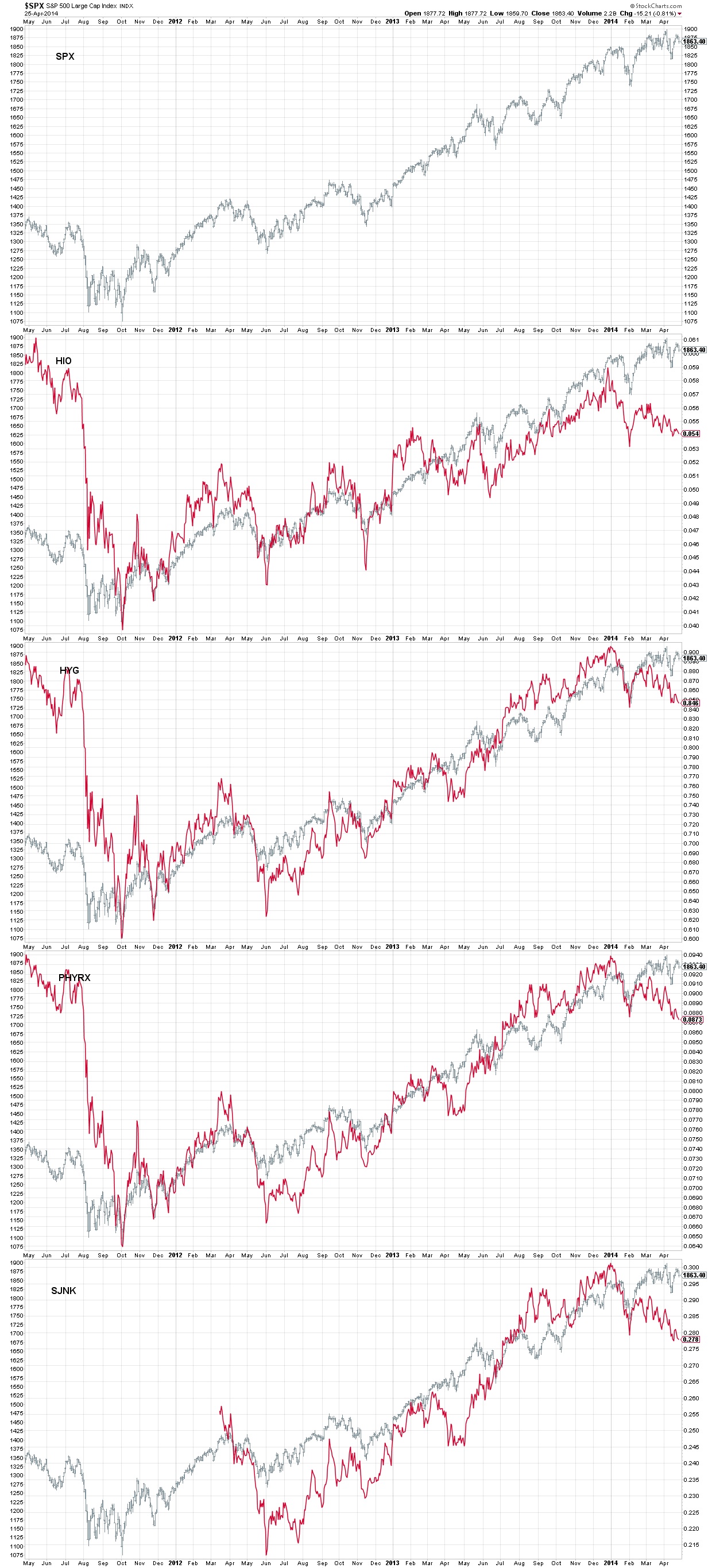
10.0 – JUNK BOND SENTIMENT – CURRENT
#2 is named “10.1 – HISTORICAL – JUNK BOND SENTIMENT – 2007 PEAK” and is the backdated junk bond sentiment chart from Jan 2005 to Jan 2008.
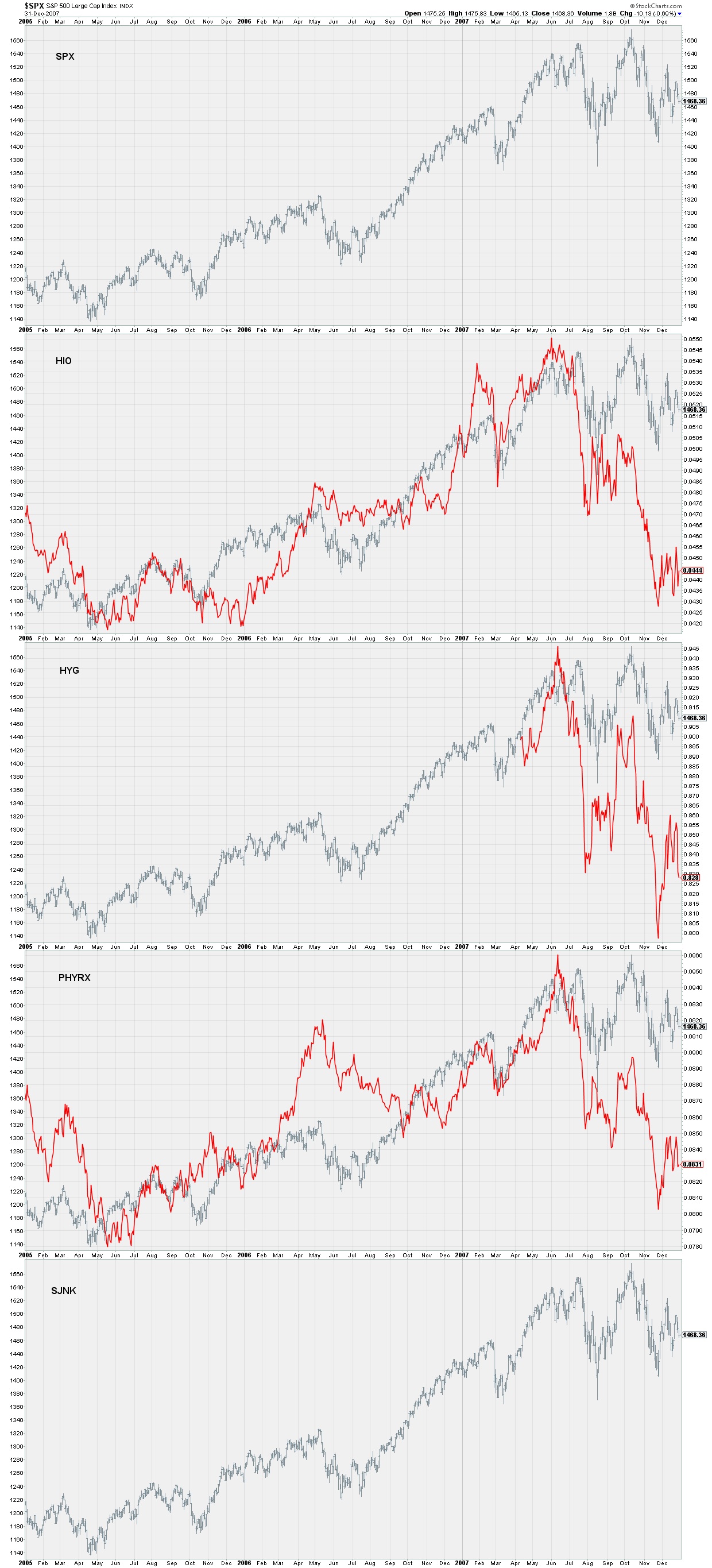
10.1 – HISTORICAL – JUNK BOND SENTIMENT – 2007 PEAK
In the 5th window of the above chart, you see that an indicator is missing, that means the indicator has no historical prices for that period.
In the backdated junk bond sentiment you can see that you got a good warning that something was very wrong with the Oct 2007 peak. This warning was pervasive throughout all of the predictive indicators that are in my public chart list now.
#3 is named “10.2 – INDEX RATIOS – CURRENT” and is the current charts for a few common indexes that have been manipulated to form a ratio.
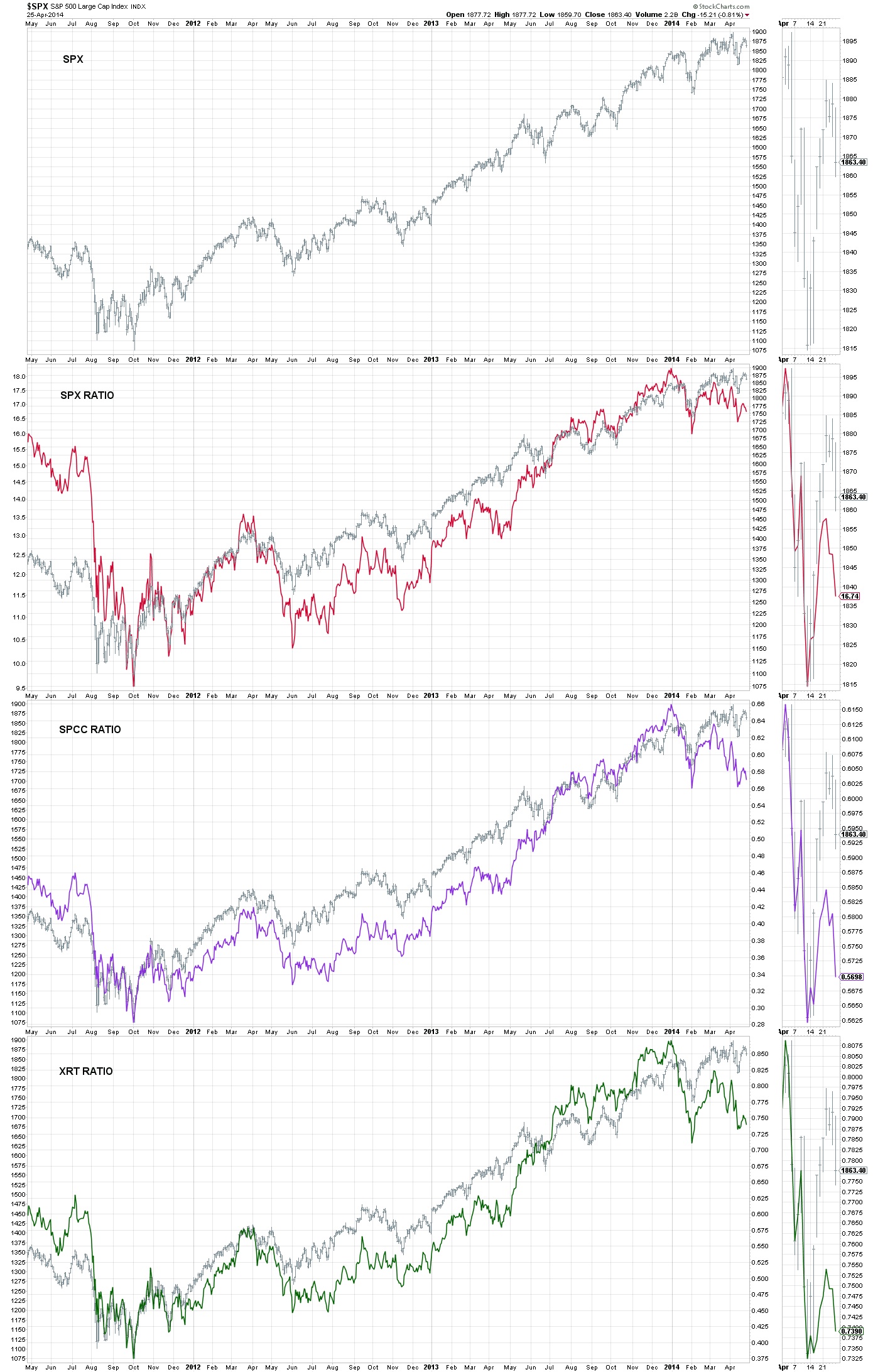
10.2 – INDEX RATIOS – CURRENT
#4 is named “10.3 – HISTORICAL – INDEX RATIOS – 2007 PEAK” and is the same chart as above except it is backdated to Jan 2005 to Jan 2008
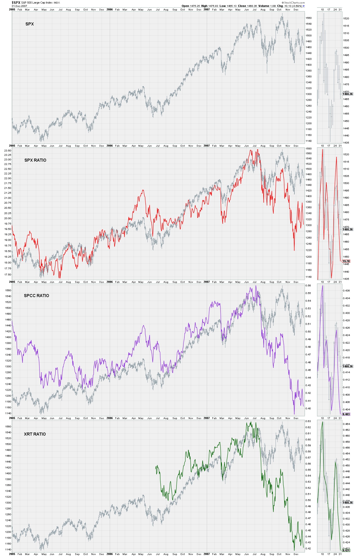
10.3 – HISTORICAL – INDEX RATIOS – 2007 PEAK
I will only show a few more examples as there are 7 pages of these type of charts on my public charts (My Charts). You need to check out the new charts and then start following them daily looking for signs of a the reversal patterns (reversal upward or reversal downward). Perhaps those downward patterns are beginning to show up presently. Only if you keep close tabs will you be warned in time.
#5 is a theme which you will find in various forms throughout these indicators and that is new highs and new lows and their relationships to prices. This chart is called, “10.4 – DJ INDUSTRIALS – HIGH LOW INDICATOR – CURRENT”
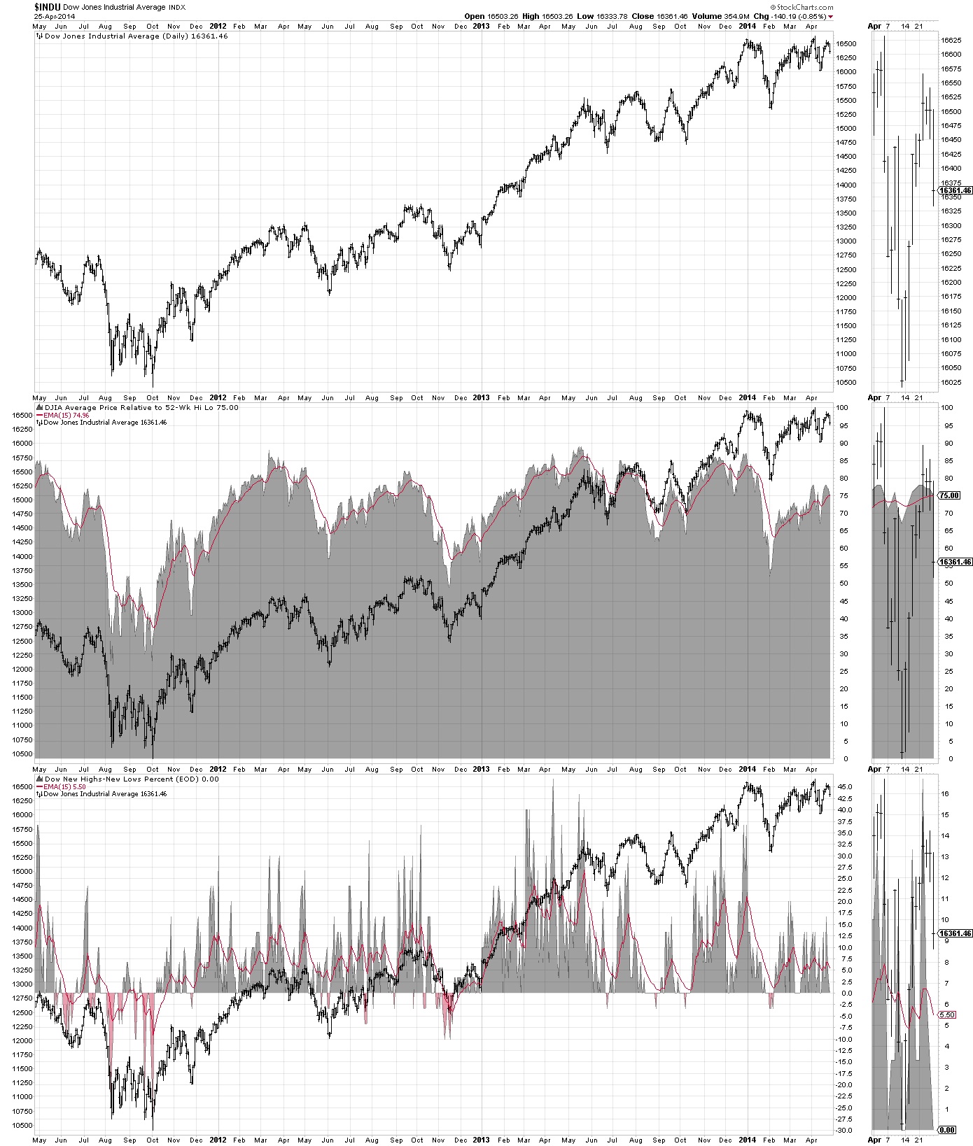
10.4 – DJ INDUSTRIALS – HIGH LOW INDICATOR – CURRENT
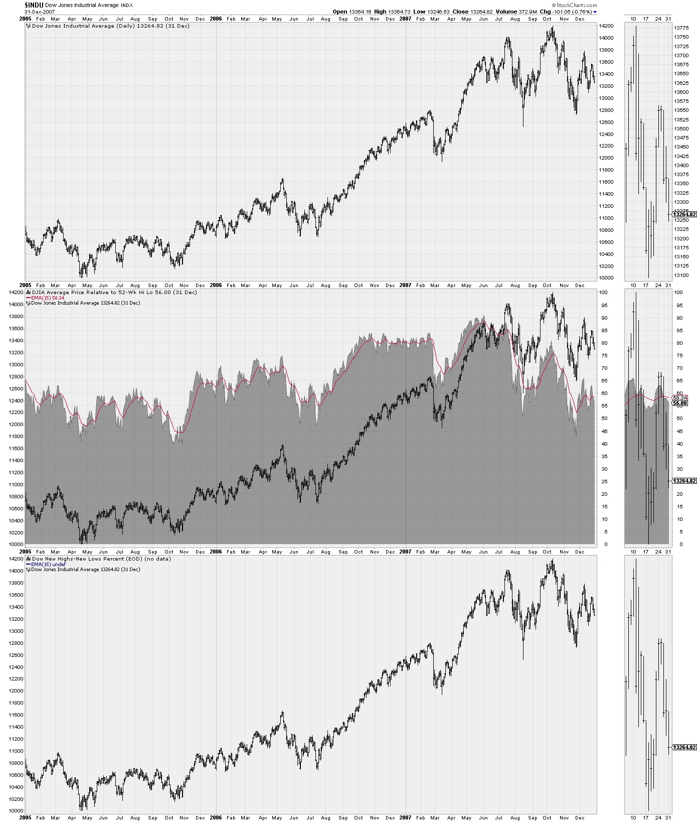
#6 is the backdated version of #5 and is called, “10.5 – HISTORICAL – DJ INDUSTRIALS – HIGH LOW INDICATOR – 2007 PEAK”
10.5 – HISTORICAL – DJ INDUSTRIALS – HIGH LOW INDICATOR – 2007 PEAK
In the second frame of chart #6, you can see how the high low relationship to prices began running into trouble in June 2007 and was well off of its highs by the time the DJIA made its all-time high in Oct 2007.
You can see how this relationship was even more obvious in the SP 500 charts. #7 is called, “10.8 – SP 500 – HIGH LOW INDICATOR – CURRENT”
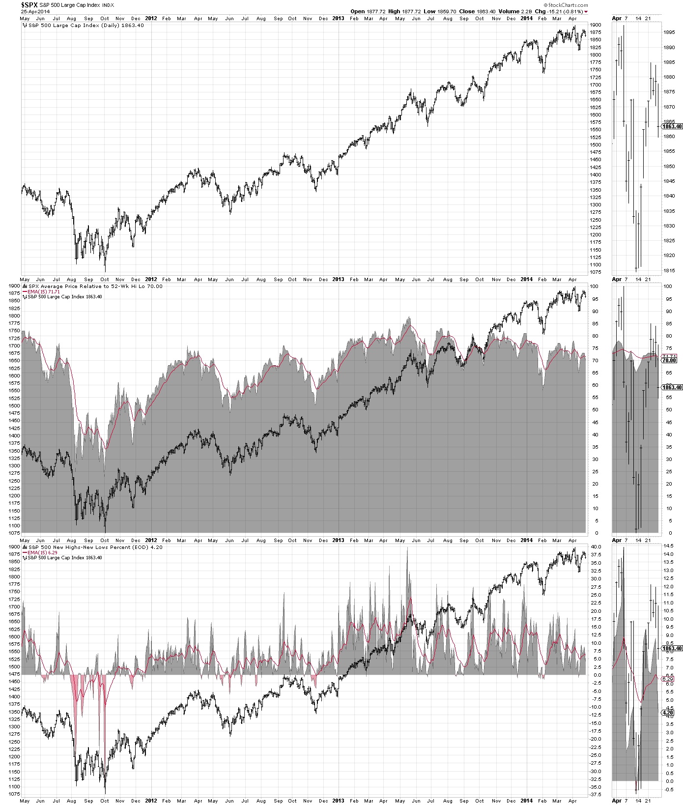
10.8 – SP 500 – HIGH LOW INDICATOR – CURRENT
#8 is called, “10.9 – HISTORICAL – SP 500 – HIGH LOW INDICATOR – 2007 PEAK”
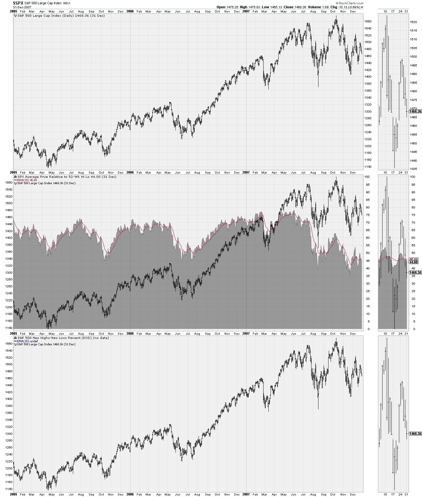
10.9 – HISTORICAL – SP 500 – HIGH LOW INDICATOR – 2007 PEAK
And here is the last example, #9 is called, “20.4 – CUMULATIVE UP DN VOLUME – CURRENT”
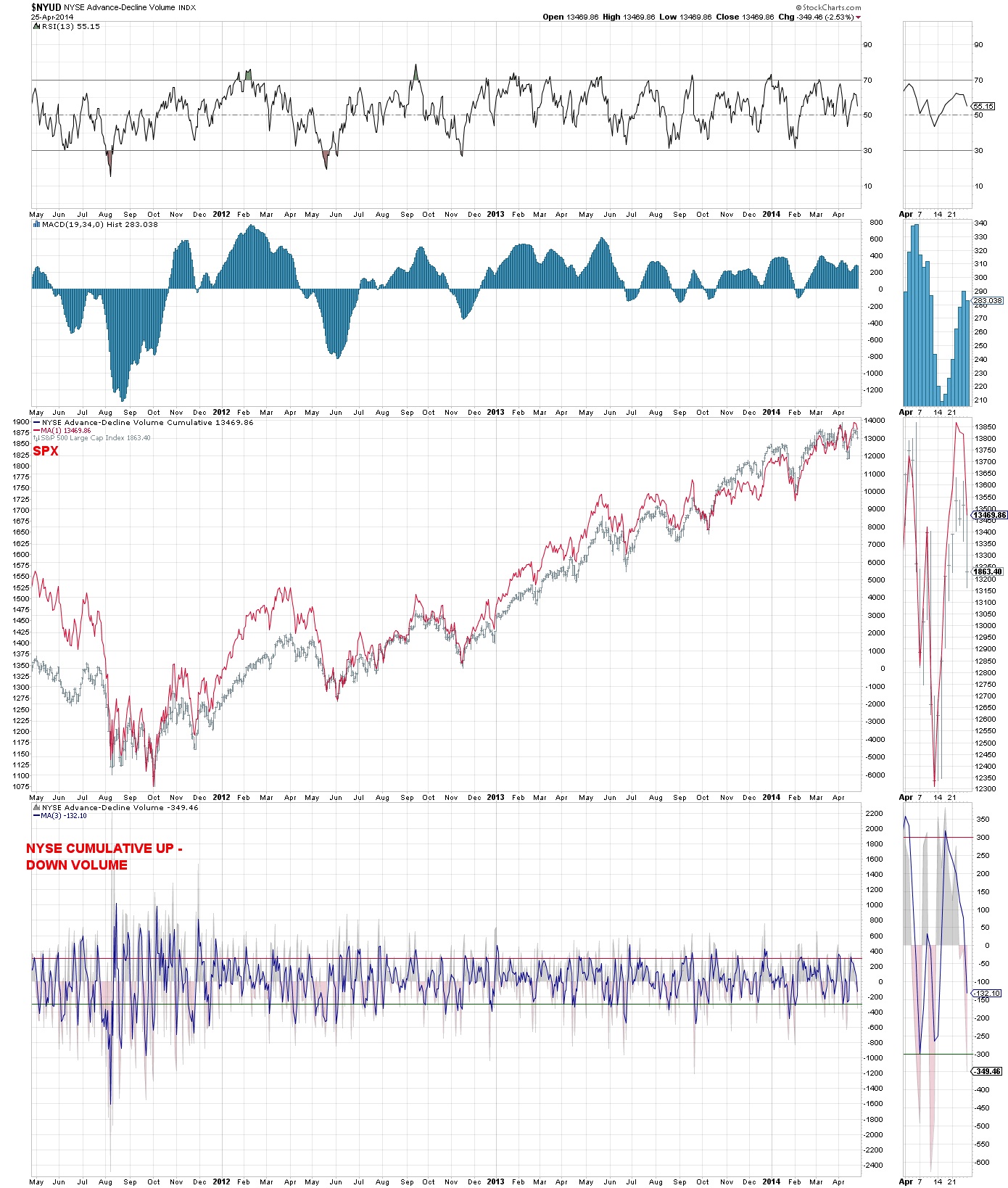
20.4 – CUMULATIVE UP DN VOLUME – CURRENT
#10 is called, “20.5 – HISTORICAL – CUMULATIVE UP DN VOLUME – 2007 PEAK”
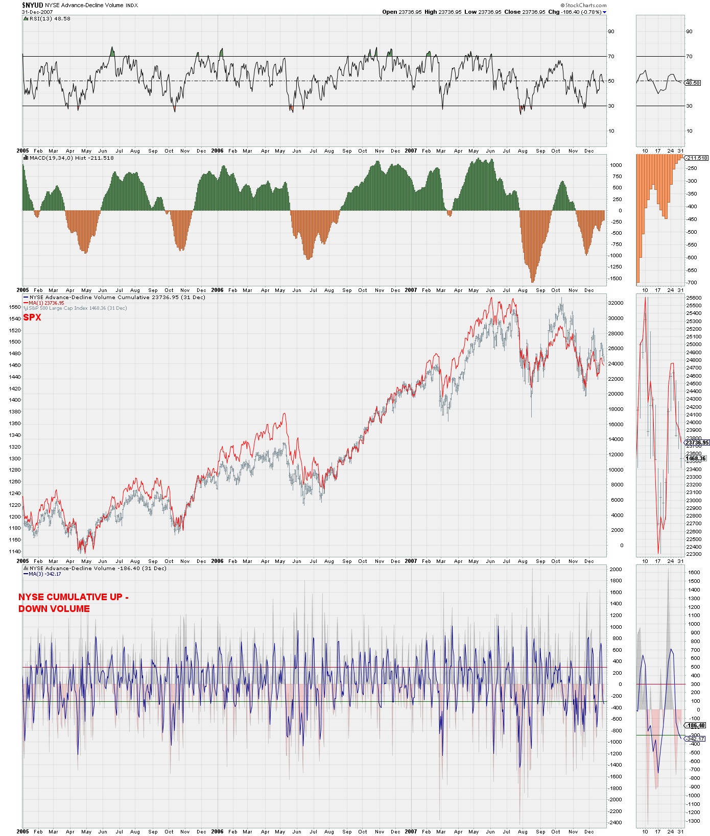
20.5 – HISTORICAL – CUMULATIVE UP DN VOLUME – 2007 PEAK
Only some of the indicators presently show an early warning of an impending significant correction. Chart #9 does not show a problem at the moment other than a loss of momentum.
As I said there are 7 pages of present and past charts of predictive indicators. I’ll try to post the same indicators for the period of Jan 1998 to Jan 2001 in the not too distant future. Remember only some of the indicators will have price data for that period.
So make sure and check out the new charts today and keep checking back because things change and they will probably change when you are least of the possibility of an impending peak.
COMPLACENCY ALWAYS RULES SUPREME AT MARKET PEAKS.
- My Charts – NEW CHARTS IN THIS LINK – MUST SEE
—————————————————————————————
I noted in a couple of tweets last week that we did not have a new closing high in the DJIA as was stated in one of the columns by Arthur Hill this week. The closing high for the DJIA is Dec 2013. The closing high in April was 3 points short of the December high. New intraday highs were achieved but intraday highs are not used in the Dow Theory.
Another fallacy was also stated in one of last week StockCharts columns. The statement was that the NASDAQ composite is a leader up and down in the market. This is true during the intermediate term moves in the market. But on major tops, the NASDAQ will continue rising past the time when other averages have broken down. In 2007, the NASDAQ continued rising for another month before peaking. In 2000, the NASDAQ peaked 3 months after the DJIA average. The late turn down in the NASDAQ is probably caused by the euphoria of the public at major peaks. On intermediate peaks, the euphoria is not present to the degree that it will be later in the bull market.
Gregg Schnell stated this week at StockCharts, “CONSUMER STAPLES MADE NEW HIGHS 5 OF THE LAST 6 DAYS… There is still a bid going towards consumer staples as they have made higher highs almost every day. Chart 4 shows the steady progression of the consumer staples sector.”
Consumer staples are a poor indicator of the overall stock market and should be disregarded. This is a defensive sector and will rise when most everything else is declining. I suppose you could use it as a contrary indicator when the rest of the market is falling and this sector is rising. That would probably mean something is rotten on Wall Street. At the Oct 2008 peak, consumer staples never had a hiccup and continued rising as the rest of the market began falling. In the 2007 to 2009 bear market, consumer staples made a price peak in early September 2008, just before the Lehman fiasco. At that point it did fall rapidly in sympathy with the rest of the market.
Consumer Discretionary spending is a different matter. This group represents spending by the public for things that are not needed, but are a luxury, such as cameras, TVs, vacations trips, new cars, motorhomes, new boats, jewelry, and anything that doesn’t represent a necessity for life such as food, clothing, cleaning supplies, etc.
You will also see some sectors indicators that are related to the overall economy. With 70% of our GDP represented by consumer spending, we have to keep tabs on those sectors that are sensitive to the future spending of the public.
The public is continuing to liquidate debt, this produces the future ability to spend more money when the public feels comfortable with their job prospects. I have no idea when that prospect will take place or whether it will take place before the next recession.
As long as the public feels their job is in jeopardy by company downsizing, or the household is bringing home less money than before the 2007 recession, the public will likely continue to liquidate their debt.
It will be interesting to see what happens to the market and economy when the FED withdraws its quantitative easing policies. Apparently that may be closer than we thought as Janet Yellen may have let the cat out of the bag at her first news conference after a FED meeting. Did she misspeak or was it the truth???? We’ll find out about that later.
Keep watch for the Jan 1998 to Jan 2001 chart update for those indicators that have price data.
—————————————————————————————
- Click on any image to enlarge it
- ES is SP 500 futures
- YM is DJ Industrial futures
- NQ is NASDAQ Composite futures
- All Rights Reserved © ™
- Leave me a comment just a few inches below, look for:

Leave a reply
- If you only see the following:

Comments
- Click on “Be the first to comment” and magically you’ll see:
Leave a reply

April 26, 2014 at 4:01 PM
Thanks Bob. Header says 2/26 ?
LikeLike
April 26, 2014 at 2:10 PM
This is great stuff, Bob. It is really exciting! I am looking forward to following these to see how the next top plays out. Thanks.
LikeLike