Super Secret Indicator – Historical Must Read
 11/11/13 . . . by Bob Karrow
- If you don’t understand my unorthodox wave counting method
- Everyone should periodically check my charts and indicators at
“My Charts” at StockCharts.com
- The above link guides you to the symbols and chart reading lessons on StockCharts.com (very top of page 1).
- “Follow” my tweets to stay current. My tweets are frequent and my blogs are infrequent.
—————————————————
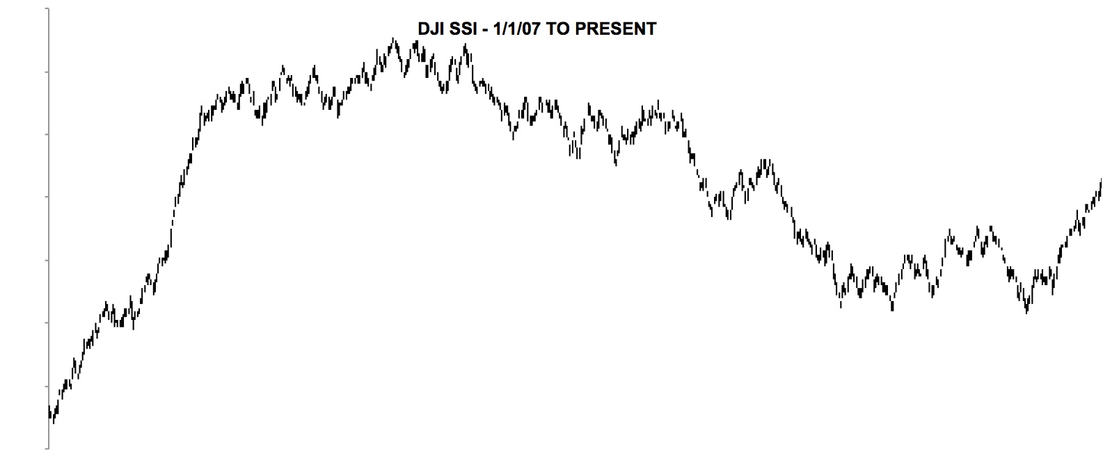
For the first time I’m showing my Super Secret Indicator, SSI (seemed about the dumbest name possible). I’ve calculated this indicator back to 1939 for the Dow Jones Industrials. The purpose of this long data stream was to see its performance over a long period of time. I did this prior to my first computer (1977) and there were a LOT of calculations done by hand.
Don’t bother asking about the SSI’s construction cuz I’m unwilling to reveal it. Although I did drop hints here and there along the way.
- 1939 to present – Dow Jones Industrials
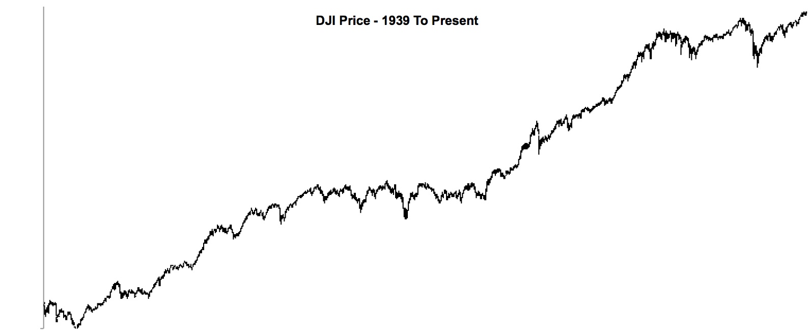
1939 TO PRESENT – DJ IND
- 1939 to present – DJ Industrials SSI
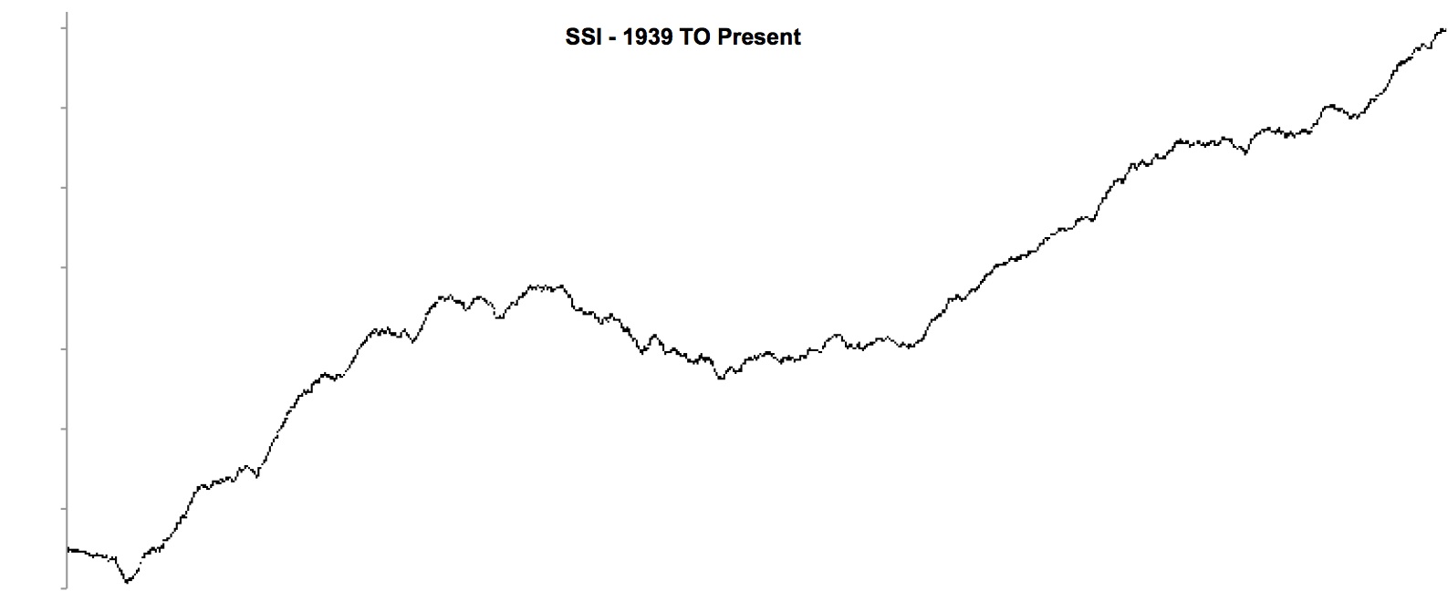
1939 TO PRESENT – DJI SSI
The beginning of the above two charts shows the last of the bear market that began in 1929. 3rd step down ended in 1942 with the WW II Battle of Midway. Check the history of this battle if you aren’t familiar because it’s very interesting. This single battle made Wall Street believe that WW II was going to be won by the Allies.
The middle period where the SSI is going down was 1966 to 1974. This period was marked by 3 price declines ending in late 1974. This period was a full fledged bear market, which was supported by the SSI.
In the long term chart of the SSI, it seems that since 1974, we have been in one very long continuous bull market. It has been interrupted only by small corrections in the SSI. The SSI shows no bear market under way since 2000.
Beginning in 2000, I began calling for a bear market in 3 stages. I believed that it would probably be a megaphone formation like 1966 to 1974. One problem with this scenario is that the bear market is not visible in the SSI. Makes me wonder if I’ve made a wrong call (????) or if something very different historically is going to take place during 3rd step down. The obvious possibility is that we have been in one very long bull market since the bottom in 1974, which has been punctuated by some very large corrections along the way (2000 and 2007).
Step 2 (2007-2009) took place normally in the megaphone and consequently I didn’t see any reason to deviate from my original prediction. The expectation after 2nd step down is to have a longer period of rally compared with that following 1st step down. Presently it appears we are in the later stages of step 3 since March 2009. Time-wise we are in the ball park for the length of the rally period that followed 1st step down in 2000. During the bear market of 1966 – 1974, the rally following 2nd step down was not longer than the period following step 1 down. Rules are just guidelines and meant to be broken on occasion.
I have an alternate scenario after the upcoming correction where the bull market could continue before we enter the bear market’s 3rd step down since 2000. We’ll get into that much later if it applies.
The large steps down since 2000 and their following rallies are of such long term that they have no practical use in investment considerations. One would be nuts to be constantly bearish since 2000 and miss all the fun that has taken place in the two large rallies since 2000. One should play each of the large steps down and following rallies as if the other steps didn’t exist. The only cognizant factor is that each step down “should” take us lower than the proceeding step.
As you can see the SSI can lead a very different life from prices. When viewed in close up, the SSI does diverge from prices and warn of upcoming problems in the uptrend. In the SSI, I track individually the DJ Industrials, Transportations and Utilities.
- March 2009 to present – Dow Jones Industrials
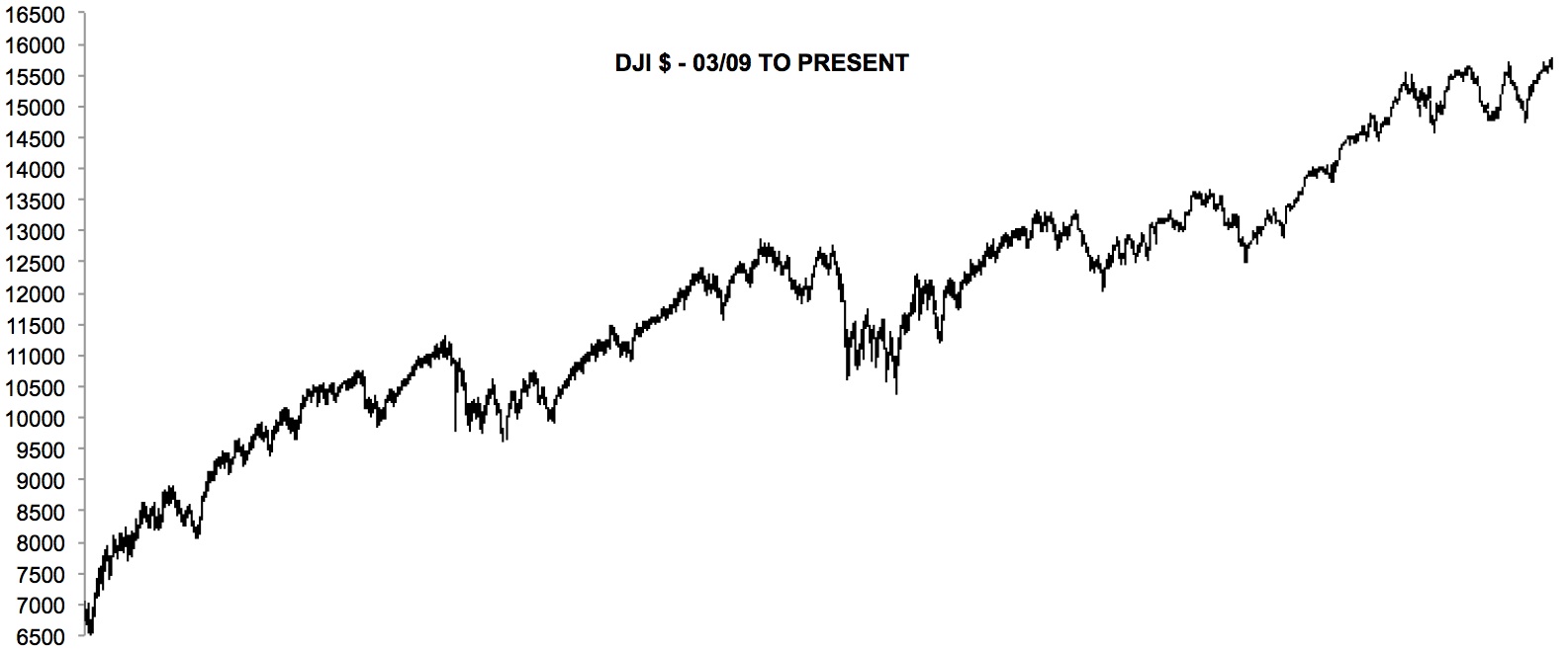
2009 TO PRESENT DJ IND
- March 2009 to present – DJI SSI
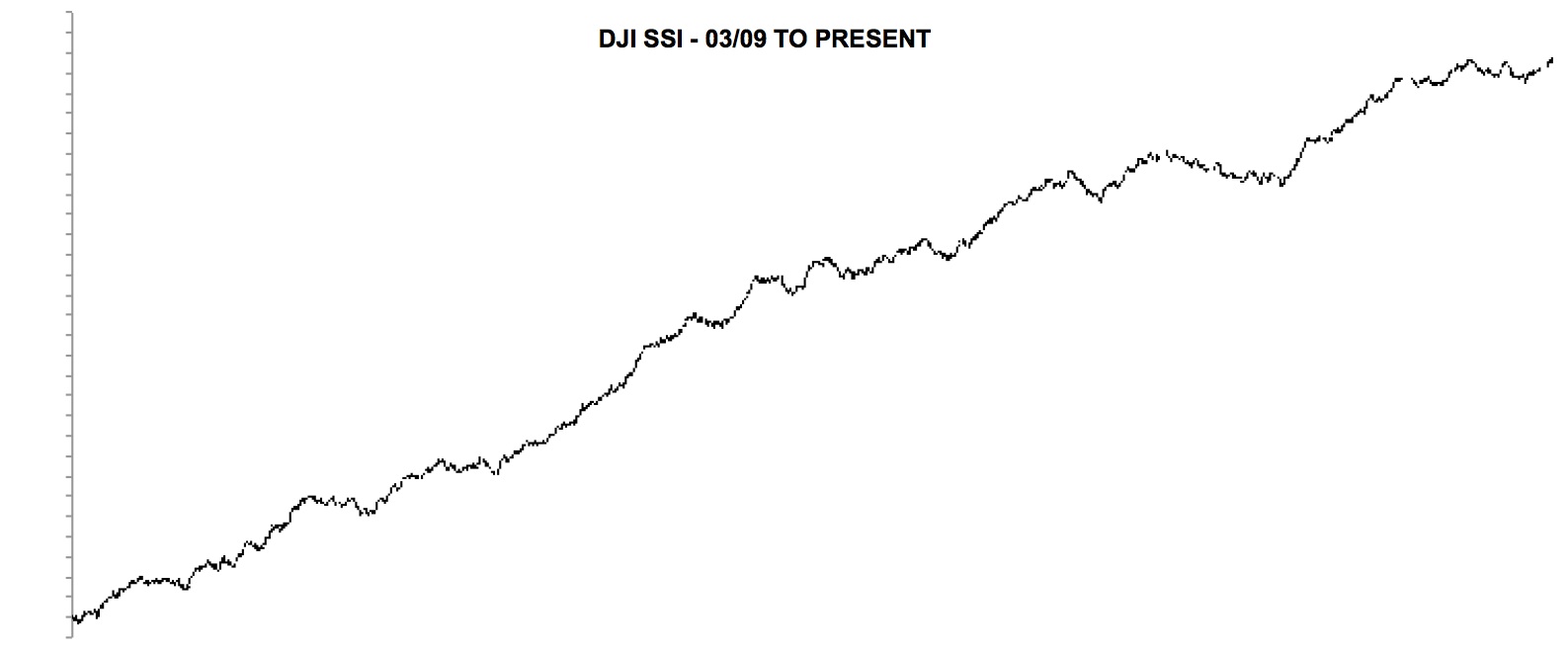
2009 TO PRESENT DJI SSI
Since the 2009 bottom, a close examination will show that the SSI was rising and on new highs while prices were declining in corrections. This was a good example of the SSI leading prices.
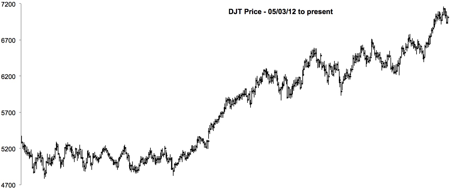
- May 2012 to present – DJ Industrisals

MAY 2012 – DJ IND
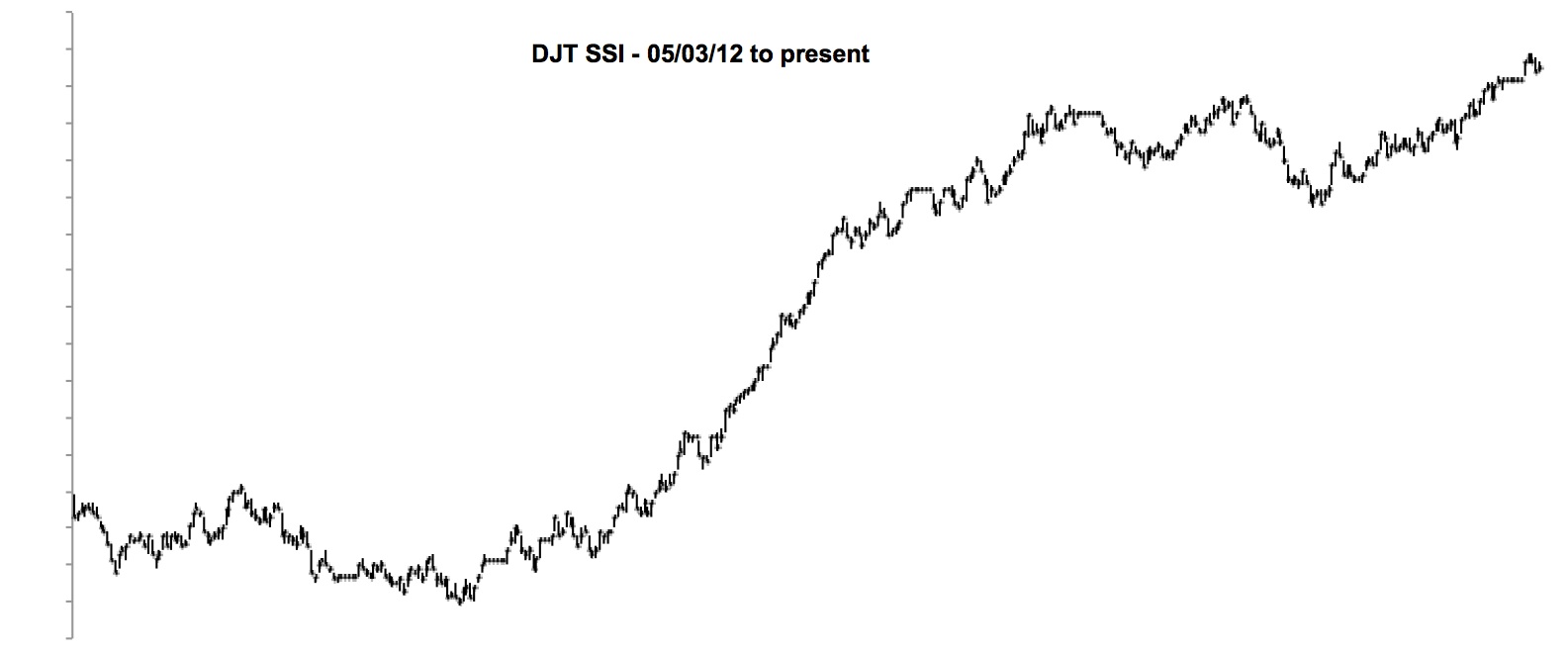
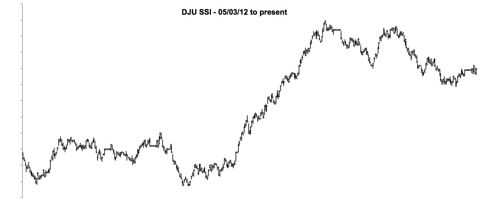
- May 2012 to present – DJI SSI
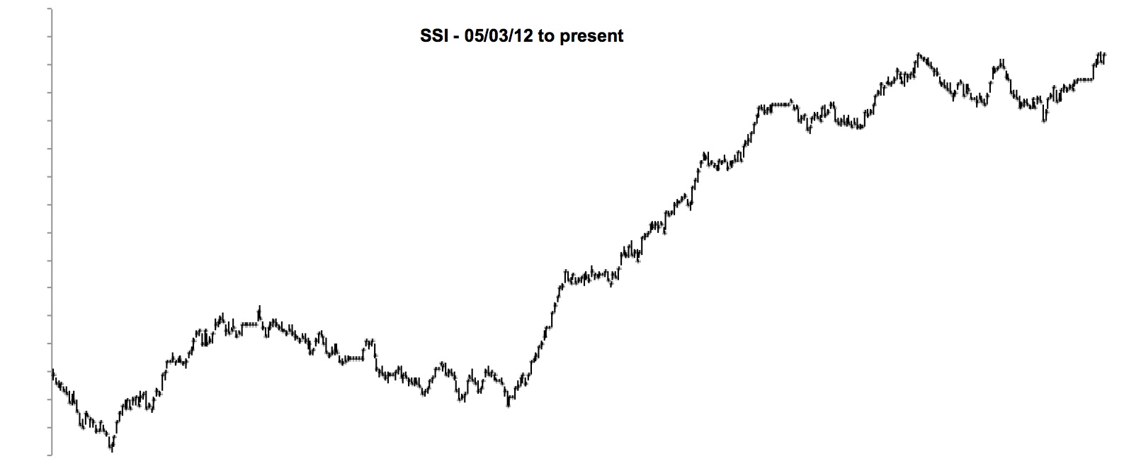
MAY 2012 – DJI SSI
The DJ SSI has been very dynamic since March 2009 making new highs before prices. Presently that isn’t happening.
Lets look at some other indexes for SSI indicator.
- DJ Transports since May 2012
MAY 2012 – DJ TRANSPORTS
- DJ Transports SSI since May 2012
MAY 2012 – SSI
- DJ Utilities since May 2012
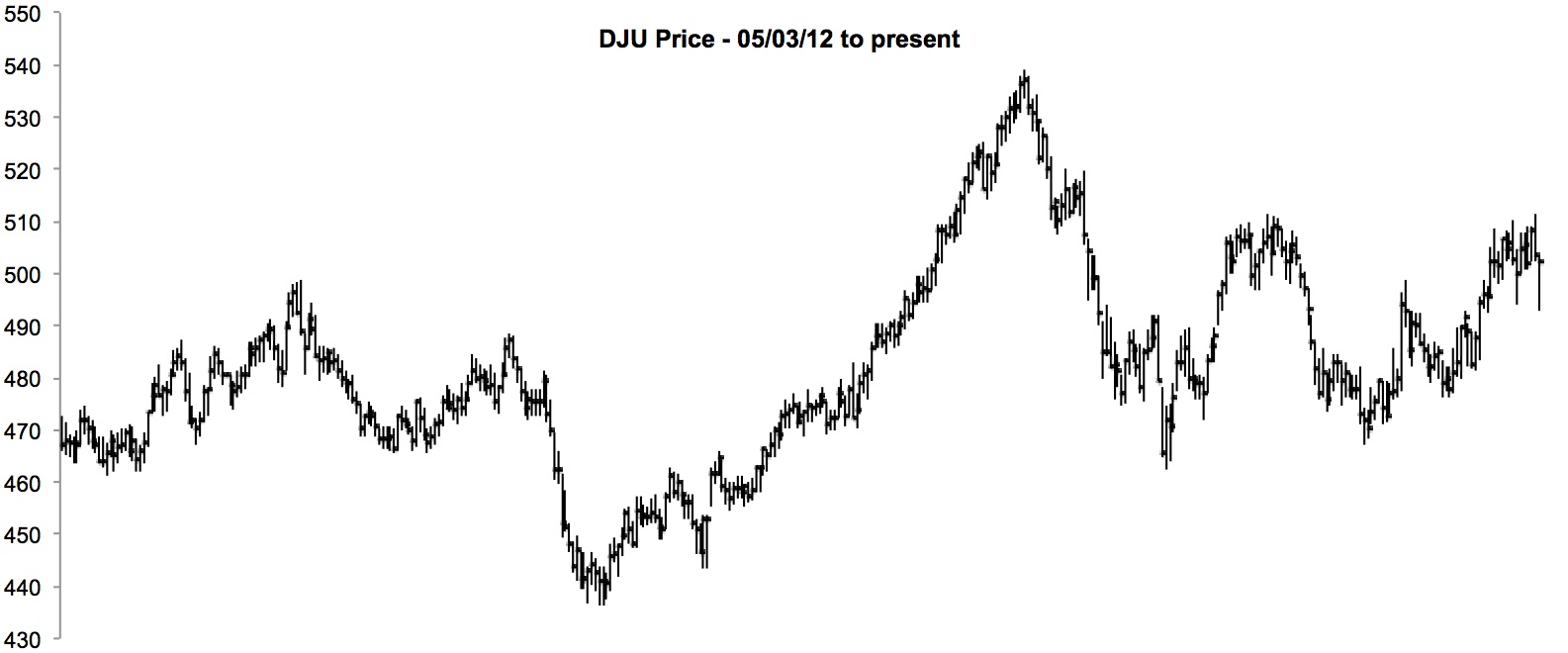
MAY 2012 – DJ UTILITIES
- DJ Utilities SSI since May 2012
MAY 2012 – DJ UTILITIES SSI
Only the utilities are showing any downside price activity, which is confirmed to be continuous by the DJU SSI.
Let’s look at what happened on the top in 2007. All of the following charts have the same time scale beginning in January 2007 to May 2009. Disregard the label saying “TO PRESENT” in the charts. I chopped these charts down from the larger 2007 to present charts and forgot to correct this label. All of the charts in this edition of the blog have been created by Excel.
- DJ Industrials – 2007 to May 2009
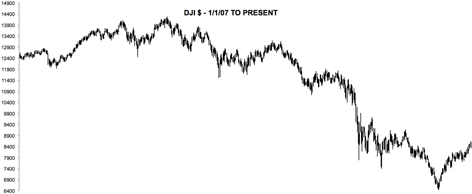
2007 PEAK – DJI
- DJ Industrials SSI – 2007 to May 2009
The DJ Ind SSI was no help warning that the October 2007 rally was false.
2007 PEAK – DJI SSI
- DJ Transportations – 2007 to May 2009
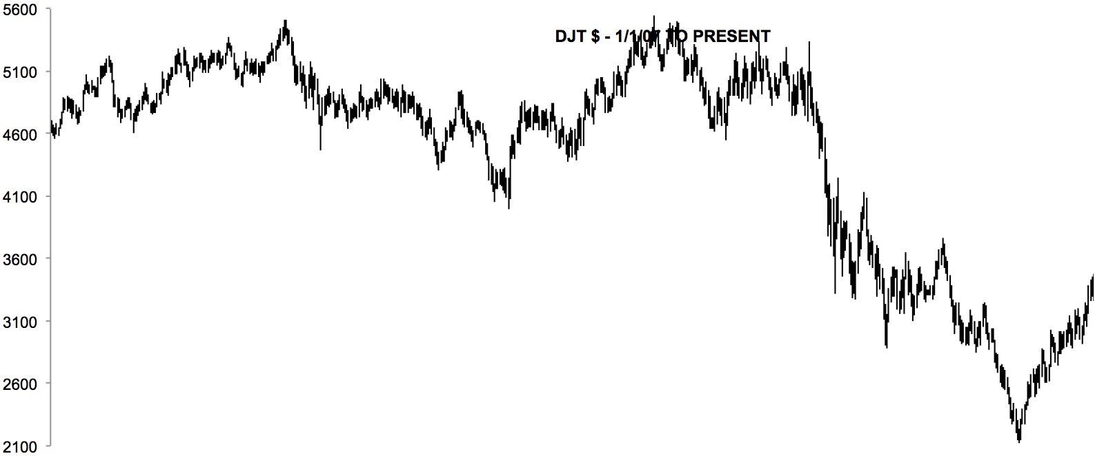
2007 PEAK – DJT
- DJ Transportations SSI – 2007 to May 2009
The DJ Trn SSI indicated a top months prior (about February 2007) to the DJI peak and the new high in the Transports in 2008 was not confirmed by its SSI.
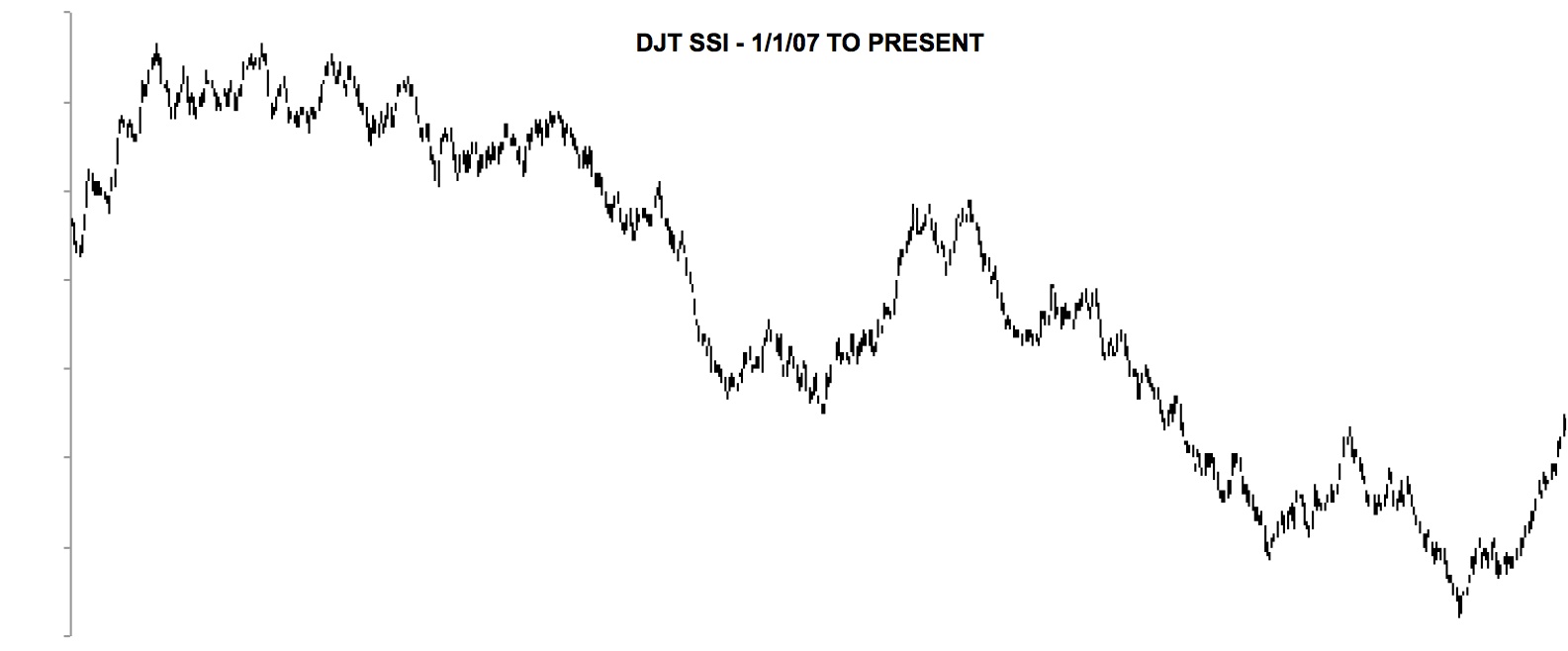
2007 PEAK – DJT SSI
- DJ Utilities – 2007 to May 2009
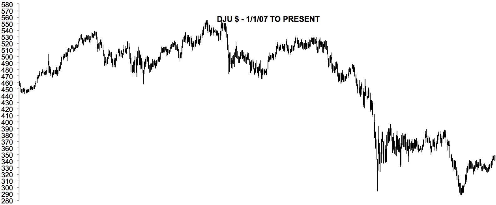
2007 PEAK – DJU
- DJ Utilities SSI – 2007 to May 2009
The DJ Utl SSI indicated a top months prior (about June) to the DJI peak and didn’t confirm the new high in the DJU
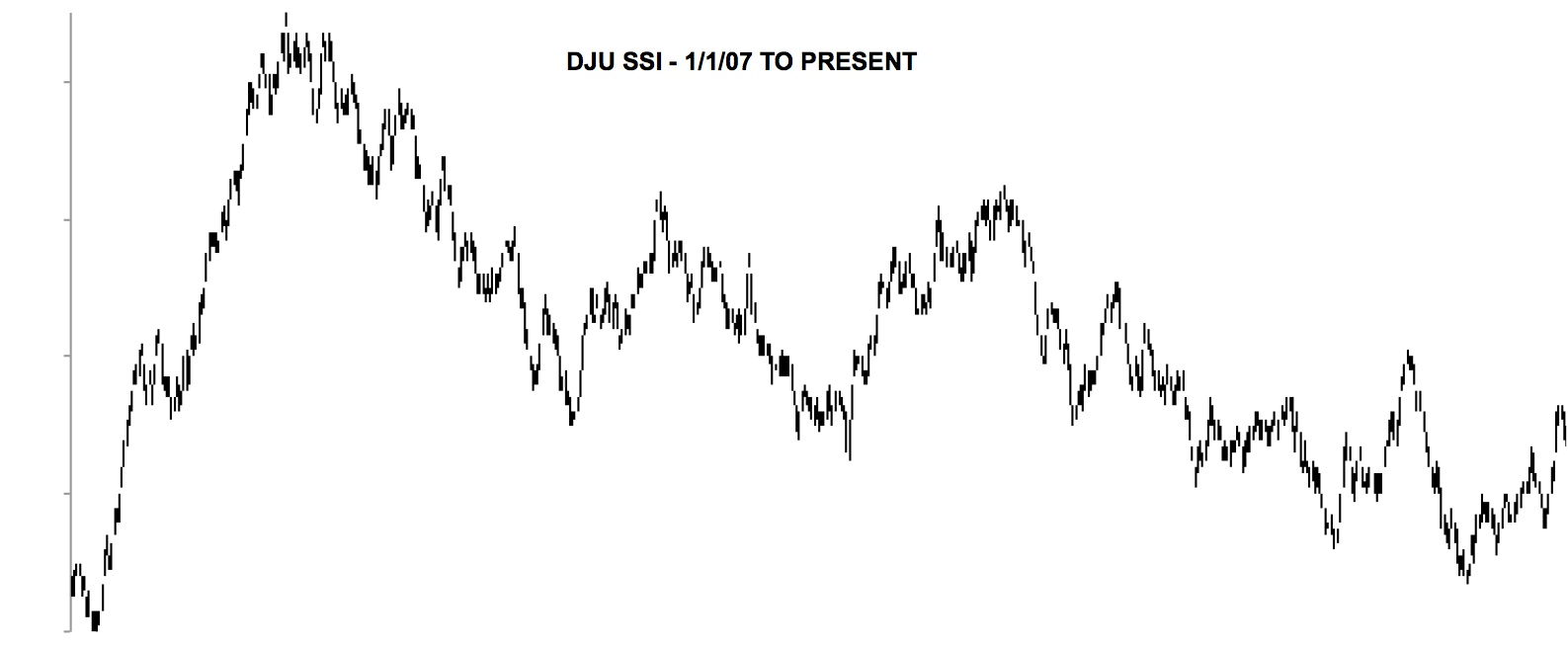
2007 PEAK – DJU SSI
As usual the utilities SSI peaked first followed by the transportations SSI. The industrials came in last with no early indication of a peak. Two of the three SSI did give warning that an important peak was in the process of occurring. You would have been deceived if you watched only the DJ Ind SSI. This is an important fact to remember whenever I show the SSI in the future.
The SSI shows distribution or accumulation which is not evident in the price indexes. I have never seen this indicator anywhere else and I may be the only one that possesses it.
The SSI doesn’t lead on bottoms as it usually does on peaks. Bottoms consist of panic and this overwhelms this indicator’s ability to show accumulation. But a slow rounding bottom would show accumulation in the SSI.
Presently only the utilities show distribution as they did in 2007. A hesitation in the transports SSI was stopped by falling oil prices, which has give them a new kick upward.
I think a top will be preceded by a break to the downside, which will be followed by a good rally that may or may not make new highs. The SSI will reveal if the rally is for real. We’ll see what happens in the future with the SSI.
—————————————————
Since a lot of you don’t follow my tweets, I will show a chart that was in a recent tweet.
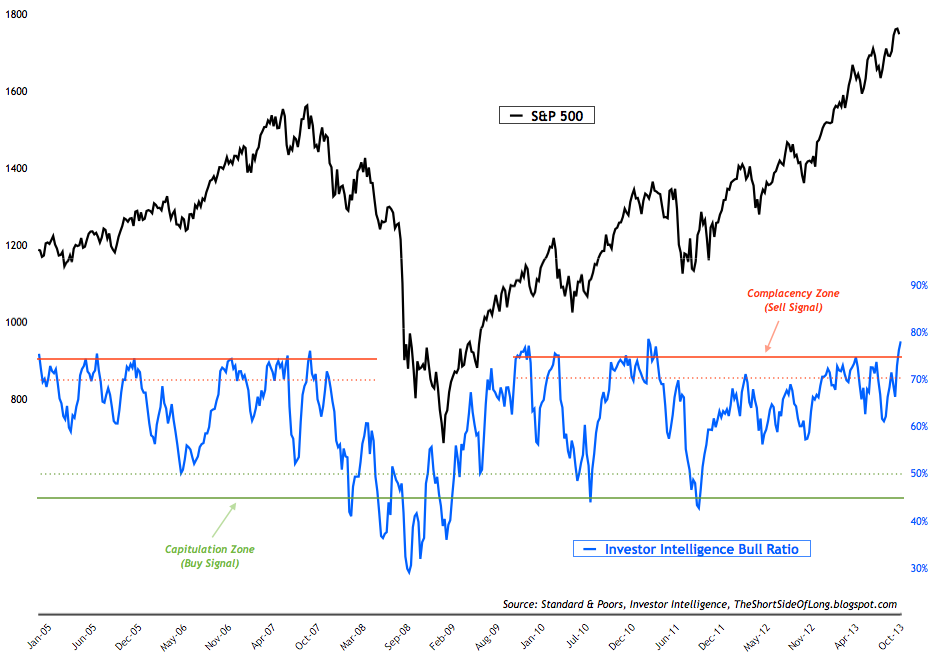
Investor Intelligence Bull Ratio
The investment writers are at the highest levels of bullishness in the last 30 years. At the extremes, these guys are wrong about market tops and bottoms, just like the normal public. No body ever seems to get it right on the tops and bottoms.
One of the problems with sentiment in the above chart is that it can always go higher or lower before the turn is made. Consequently, it isn’t a good timing tool. It just shows you that you’re in the neighborhood of a market peak.
—————————————————
My next blog update should show the latest in the Hurst cycle predictions.
—————————————————
- Click on any chart to enlarge it
- ES is SP 500 futures
- YM is DJ Industrial futures
- NQ is NASDAQ Composite futures
Leave me a comment or question just a few inches below here. If it says “Comment”, click on the comment and you’ll see “Leave A Reply”.
All Rights Reserved © ™

Leave A Reply